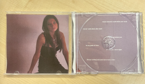
Here is my 3rd draft for the digipak. We used the feedback that our teacher gave us in the screencastify to make the following changes:
- Change the picture on the double inside spread to something with more colour
- Used different filters and colours to give it a grainy, more vintage look
- Changed the layout of the song lyrics for the inside so they’re only on one side rather than scattered across two


Presented above is our digipak in printed form, which is very helpful because it has allowed us to see how visually appearing our album cover is. Now that we’ve seen it in person, we would like to make changes to the placement of the album name of the front cover because it is too high, and as you can see from the picture it is slightly cut off.
Additionally, we’d also like to change the positing of our artist on the inside page and move her more to the left because her hand is cut off in the middle. Another thing we noticed is that the lyrics on the middle page spread are hidden and unable to be read so we name to move them about, as well as making the lyrics bigger because they are also quite hard to read at the moment. Finally, looking at the back cover in person, it looks quite plain so in our next draft we are going to work on adding to that.
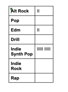
In order to gain opinions on what genre people think our album is, we asked some of our peers to take a look and rate which one they feel it is.

As you can see in the chart above, most of our peers felt that the genre of our album is Indie Synth Pop. This scored much higher than any of the other catorgries, with a few voting for edm which is still good to see because our music is a part of that genre too. We found this feedback helpful because it showed us that we had done a good job of expressing a repotoire of elements through our digipak.