Final Digipak and Reflection

Here is our final draft for our digipak ‘Melodrama’ by Annabelle Anduga.

I am very pleased with the final product because it significantly conveys the synth indie pop genre. I feel that the change of photos from draft 3 suit the style much more and I feel that if we were to survey our peers again, nearly 100% of them would guess the genre correctly. Improvements we have made from previous drafts include, moving the first image of our star double page spread more to the right so her arm isn’t cut off. While, I liked the lyrics that were on the double page spread we found that with the aditional picture it looked too much and we are aiming for a more minimialistic, modern look so we took them off.

Overall, I felt we did a good job of working together to make improvements for the better and I am very happy with the outcome of our digipak.


Digipak Draft 3

Here is my 3rd draft for the digipak. We used the feedback that our teacher gave us in the screencastify to make the following changes:

  • Change the picture on the double inside spread to something with more colour
  • Used different filters and colours to give it a grainy, more vintage look
  • Changed the layout of the song lyrics for the inside so they’re only on one side rather than scattered across two


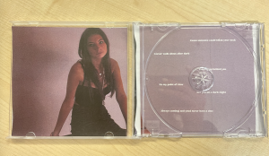
Presented above is our digipak in printed form, which is very helpful because it has allowed us to see how visually appearing our album cover is. Now that we’ve seen it in person, we would like to make changes to the placement of the album name of the front cover because it is too high, and as you can see from the picture it is slightly cut off.

Additionally, we’d also like to change the positing of our artist on the inside page and move her more to the left because her hand is cut off in the middle. Another thing we noticed is that the lyrics on the middle page spread are hidden and unable to be read so we name to move them about, as well as making the lyrics bigger because they are also quite hard to read at the moment. Finally, looking at the back cover in person, it looks quite plain so in our next draft we are going to work on adding to that.

In order to gain opinions on what genre people think our album is, we asked some of our peers to take a look and rate which one they feel it is.

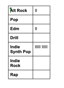
As you can see in the chart above, most of our peers felt that the genre of our album is Indie Synth Pop. This scored much higher than any of the other catorgries, with a few voting for edm which is still good to see because our music is a part of that genre too. We found this feedback helpful because it showed us that we had done a good job of expressing a repotoire of elements through our digipak.

Digipak Draft 2

Here is our 2nd draft for our digipak. Some of the changes we have made include adding inside panes, changing the placement of the album name and encourparating the artists name on the front cover.

Screen casifitify of our teacher giving us feedback:

Improvements to be made for our next draft:

  • Change the font of ‘Annabelle Anduga’ on the front cover
  • Inlcude the name of the title ‘Melodrama’ on the back cover
  • The colour pallette for the inside page is too bland- more colour is needed
  • More shaping and layering needs to be done on the inside page

Personally, I agree with all of the advice that the teacher has given us. I feel as though going forward with our next draft I want to work on the inside page in partucilar because I think that it looks too plain and a pop of colour and some better editing would make it so much better.

Contact Sheets and Shoot Evaluation


Above are all of the photos that Henry and I collected from the photoshoot for our digipak. We used ideas gained from our PMA and our choice of angles were chosen due to the fact that these shots are regularlary used by other artists in the same genre. We also made sure to use a variety of different shots because it allows for some of these images to be used on our social media page too. The images that we are most likely to use on our social media page will be the ones that appear the most casual.

Overall, I think the shhot went quite well because we took more than 150 photos. These are a couple of my favourites:

I like this one in particular because I think the high angle emphasies the star’s powerfullness. I also like the contrast of the deep pink in the background and the lilac top that she is wearing.

I like this shot because the way you cannot see her face yet you can still see her eyes through her hand sends a strong message. I also like the way her head is positioned perfectly, I think it makes her appear bold and sassy.

Focusing forward, in future photoshoots I think we should include a variety of different outfits and also ensure that the star is wearing lots more jewelry. I think layering jewelry would help to emphasise the star’s image because it would help to define her personality.


PMA and Risk Assessment for DP

To ensure that the production of our digipak and photoshoot run smoothly and as planned it is important to make a detailed agenda of our different responsibilities. For example, as you can see in the table above we have planned out the costumes that are star will be wearing and thought about how her makeup will look. We also considered what kind of props we will be using and which shots emphasise our genre the most.

Another important thing we needed to do before we can do the photoshoot is complete a risk assessment. This evaluates any hazards and adds control to minimise any possible risks that could occur.


DP Mockup

In order to gain further ideas on how we will design our digipak we planned and sketched a ‘mockup’ of the front, back cover, spine and inside of the CD. We encoded and analysed all of the features we liked and felt were relevant to our genre.

One important element that we will ensure to include in our digipak is a repertoire of  elements, which is why we have chosen to display rainbow teeth for the spine of CD. We are taking Hall’s approach on preferred reading as you can tell because on the front cover of the album our star image will have three different images of her, all in different costumes and positions. Therefore the audience will read this message as that are star has different personas and attributes that make her especially unique.

Producing this mockup will help us when it comes to our photoshoot because we will use the ideas that we have created here in order to reflect our genre and star image.

Digipak Conventions Analysis

Every famous music artist will have a digipak, and ours will too but to ensure that our star’s digipak is good I needed to understand by reasearching one from an artist of the same genre. I chose to look at Avicii’s and analysed the different features that can be found on the front and back of his CD cover.

The conventions that I learnt are very important to include is the barcode on the back because it helps with the sale and also a track list so that the buyer is aware of what content they’re buying. Including the name of the album and the artist on the front cover is also essential, although in recent times famous artists such as Billie Eilish and Lizzo have left this feature out and still sold a bunch of copies. Having a digipak that is designed to suit your genre is also essential because then it is recognisable to fans of your genre who could become potential fans of your music.

Representation achieved through illustrations and graphics is important so that the audience can gain an idea on the product they’re consuming. It also helps to convey a particular message that words cannot express and draws attention to the digipak.

Looking at my genre in particular, I noticed that 3D imagery and photoshop is used frequently to attract attention and create a sense of uniqueness. For example, on Avicii’s front cover you can see a photoshopped image of an upside down triangle and the font his name is written in is a bold, bubble effect.


The Look Book- The Package

Made with Padlet

In order for us to gain inspiration for both the social media page and digipak so that I can have an integrated, coherent approach to brand and advertising. This is has helped us to understand the brand image we aim to create and will be useful when it comes to designing our social media page. Our social media page will contain a repertoire of elements and style that is unique yet emphasises the electronic and dance genre.

Our Mission Statement- The Package Brand

In order to gain a better understanding of producing an album we created a slideshow where we researched and discussed our audience, competition and unique selling point. This was helpful because it meant we could crack down on the exact demographics and psychographics. For example, we discovered that we aim for our demographics to be mainly teens, young adults and even include some hipster people from an older generation. Our psychographics mostly consists of people from a working class background with independent, open minded attitudes.

I also learnt about the importance of  our star having integrated advertising to increase promotion.

Our Mission Statement:

Our mission is to give the youth the confidence to stand out through our bold star. We want them to feel a freedom of expression in how they dress as well as also being able to flow freely while listening to our pioneering, alternate and infections synth tracks.