
Please click on the image to see a better version
As you can see I have re created an NME Music Magazine on Adobe In Design. Having done this it has helped me improve my In Design skills and I now know how a music magazine is created by using conventional features such as the Mast head, cover lines, Main cover star, the plug, the pug, captions, issue date, price and finally bar code which represent the information that tells the audience the narrative of the magazine. Things I struggled with were finding similar fonts to the ones on the original magazine, stretching and moving text around, especially when the boxes overlapped and importing and moving the image of a bar code was difficult as it kept disappearing.
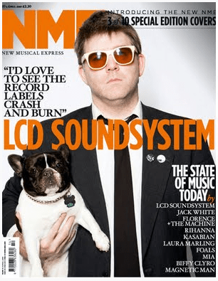
Things I did wrong were in the original the text was cropped around the arm but in my version it is slightly to far to the left because you would not be able to see white font. I didn’t layer the image meaning that the text wasn’t behind the head as it is in the original music magazine. Also the text on the head is to dark so when you open the full sized image you cant read the “3 of 10” and the line is wobbly due to the different fonts that I tried to re create.
Things I did right were making executive decisions to do with positioning of the text and I think in the end I actually did quite a good representation of the original magazine.
Here is the original
Here are 3 videos that will help me to develop and improve my skills in design.