Category Archives: Preliminary Print Tasks

My Tour Poster

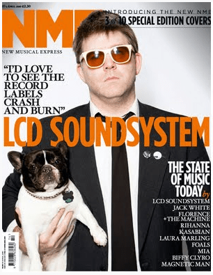
This is a mood board for the genre of folk for my tour poster. These tour posters are colourful and eye catching to the audience. One of the common themes with these posters is that the text is capitalised, bold and the fonts are serif. The biggest text in the posters are the artist names, they attract the reader and they tell the audience exactly who they are going to see. The posters don’t mix many colours, the colour palette is very simple and they use at most 4 colours. Having done an analysis of these posters will benefit me as I will be creating my own Folk tour poster.  I have understood the conventional features of a Folk tour poster for example the different fonts, the colour pallet and how the text is placed to attract the reader.

Please click on image to see a bigger version

In my Tour Poster I used AIDA. The attention is my outfit and my guitar, the interest is my tour dates, my design is the fonts and the pug, and the action is the website.


Feedback on the Brief

My poster fulfils the brief as I have used the right conventional features for a Folk tour poster. Such as; the right colour palette scheme for my poster, using the right format (A4), the correct positioning of text, the right font (serif), adding a pug to the poster, the name of the artist, displaying the right information such as when the tour is and where it is held and where to get the information from.

Feedback on colours:

  • Has the design used a consistent colour scheme?
  • Is there a relationship between the colours in the image and the colour of the graphic design?
  • Do the colours seem typical of the genre?

The design has used a consistent colour scheme which involves colours such as yellow and white for the text and black for the outline of the text.

Between the colours of my image being mostly white from my coat and hat, black from my shoes and jeans and golden yellow from my guitar they  share the same colours of my text from my graphic design.

The colours of my poster fit the genre of my tour poster as they are bright and have a warm tone, I haven’t added too many colours together as this is what the professional tour poster makers have done.

Feedback on typeface:

  • Is all the text legible? 
  • Is the typeface well chosen and does it suit the apparent genre?
  • How many typefaces are used in the design?

The text is legible as i’ve used the right colours and the right font and the right text size so you can read when it is in front of the image.

The type face suits the genre as it is bubbly and bold, and it works for this genre.

2 typefaces are used in my design being bold and black.

Feedback on integration of image and graphics

  • Does the text wrap around the image well?
  • Does the eyeline of the model focus attention?

The text does wrap around the image pretty well as it has the right spacing between each of the different texts.

I have put a square half way down the page and turned it opaque, I did this so the focus point of the model catches the eye at the top of the page.

Feedback on image

  • Does the costume reflect a particular genre?
  • Is the body language of the model appropriate?

The costume reflects the genre of Folk mostly because of the coat and hat being that style.

The body language of the model is appropriate as he is laid back and looks calm and this is a common theme in Folk Posters.


Feedback on copy

  • Do the words on the page prompt a sense of desire?
  • Is there a clear call and a route to action? (AIDA)

Your comment: 

Feedback on connotations

  • What messages and ideas are being communicated in the text?
  • Do those messages and ideas seem appropriate to the genre and purpose of the text?

 The messages and ideas that are being communicated are that the character in the image appears to be laid back and not worried about anything. The messages seem appropriate to the genre as folk music is usually very relaxed and peaceful. Also the text I have chosen comes across to the reader as very calm and friendly.


My Magazine Front Page Swede

Please click on the image to see a better version

As you can see I have re created an NME Music Magazine on Adobe In Design. Having done this it has helped me improve my In Design skills and I now know how a music magazine is created by using conventional features such as the Mast head, cover lines, Main cover star, the plug, the pug, captions, issue date, price and finally bar code which represent the information that tells the audience the narrative of the magazine. Things I struggled with were finding similar fonts to the ones on the original magazine, stretching and moving text around, especially when the boxes overlapped and importing and moving the image of a bar code was difficult as it kept disappearing.

Things I did wrong  were  in the original the text was cropped around the arm but in my version it is slightly to far to the left because you would not be able to see white font.  I didn’t layer the image meaning that the text wasn’t  behind the head as it is in the original music magazine. Also the text on the head is to dark so when you open the full sized image you cant read the “3 of 10” and the line is wobbly due to the different fonts that I tried to re create.

Things I did right were making executive decisions to do with positioning of the text and I think in the end I actually did quite a good representation of the original magazine.


Here is the original


Here are 3 videos that will help me to develop and improve my skills in design.

The camera talks

As you can see these are in my opinion the best photos out of the ones we took yesterday. We chose to use different hashtags with different fonts showing the connotations, denotations and the types of camera shots and framing. By doing this I am adding meaning to my photos with the font adding an extra texture to the image. Having done this exercise it will help me with my Music magazine as I’m already choosing body language costume, camera angles and distance to tell the narrative and create an idea/image.

Here you can see photos that explore different angles, different heights and are captured in different places. We did this so we could experiment with different types of camera shots. This is going to help us in the future as we will then know what shots to use and what is effective.

My final photo

In my opinion this is the best photo out of the several we took to portray a genre decode of Folk for our Music Magazine. This is a connotation of me as a stereotypical  folk artist. The Mise En Scene creates a natural and relaxed vibe and it creates meaning. The costume and the colours I am wearing are very relaxed, layed back, country like and they stand out. The connotation of my costume being my stripey T shirt and my shoes convey the denotation that I am approachable to talk to and friendly.  My body language is very loose and slouched and my facial expression encourages that I am easy going and chill as i’m pulling a straight face. The prop I am using, being the guitar represents I am a musician and the fluffy coat suggests that I am more of a country/folk artist.

This photo will help me with my Music magazine as i’ve researched into  Mise En Scene, Costume design, appropriate body language and props and I have used this in this photograph. My photo will now be edited, fonts will be added and I will have text explaining what my Folk music is like and where to find my music.


Post it Responses

Here you can see a photo of me with post it notes on my guitar, on which the class chose to write and stick on.  Here are some of the vocabulary they stuck on me; depressed, odd, laid back, rebel, statement, groovy, hipster, weirdo, good and sheep herder.

We choose to do this to address the classes denotations on a folk artist and what they thought about my groups recreation of folk through fancy dress.

These labels will help me to create and edit my Music Magazine and also choose the font and writing.

My image that uses mise-en-scene to communicate meaning

Made with Padlet
Mood Board
Our genre we were allocated was Folk, here you can see different photos and different information about Folk music. This Mood board reflects on the earthy, relaxed and environmental genre of Folk Music. This board is going to be helpful as it shows the information that we need to create the music magazine. For example, the Mise En Scene for Folk is mostly natural, as the image portrays the sun, the grass and the trees with the lighting being bright and vibrant this will help our Star image to stand out. The props of a folk magazine usually consist of violins, guitars and banjos and the costume design is made up of people dressed up in brightly coloured and relaxed clothing and the Stars usually wear hats. When we use these techniques it will help represent to the viewers our theme of Folk.

Print media that communicates meaning – A tour poster

This is a tour poster of Ariana Grande for her tour of Sweetener, here you can see I am understanding how to analyse Media Text.

In my Media classes, I have been looking at different Tour posters and analysing and understanding them. For example i have looked at; the iconography of the images, the lighting, The font, the Mise en scene. The denotations of the Tour Poster all have connotations attached too them for example, the pink fluffy clouds illustrate that she is feminin and promotes the fantasy fairy like feel.

By understanding the denotations and connotations of this Tour poster for example the font, body language, costume design and lighting, will help me to create my own Music Magazine as I can use these techniques in my work. The facial expressions in this poster convey a narrative so I will use appropriate facial expressions to illustrate a story in my poster.