Here is my 3rd and final draft of my front page. Since draft 2 I have changed the colour and spacing of the cover lines, I have added a date, issue and price, made the masthead bigger, I have also changed the font of the word “Grammy” so that it stands out and looks similar to the grammy logo.

In my new draft I have completely changed how page looks. Firstly I have added lots more cover lines, I have changed the fonts and text sizes, I have also changed the size of the images and have re adjusted them to fit a three layered grid. Ive also exported it so that the colours look sharper, I have got rid of the pink background and changed it to white. I have also re organised the masthead so its more centred and changed the size of the font, Ive added and edited an extra image and I have made sure the text aligns with the columns. All in all I am very pleased with this final draft.
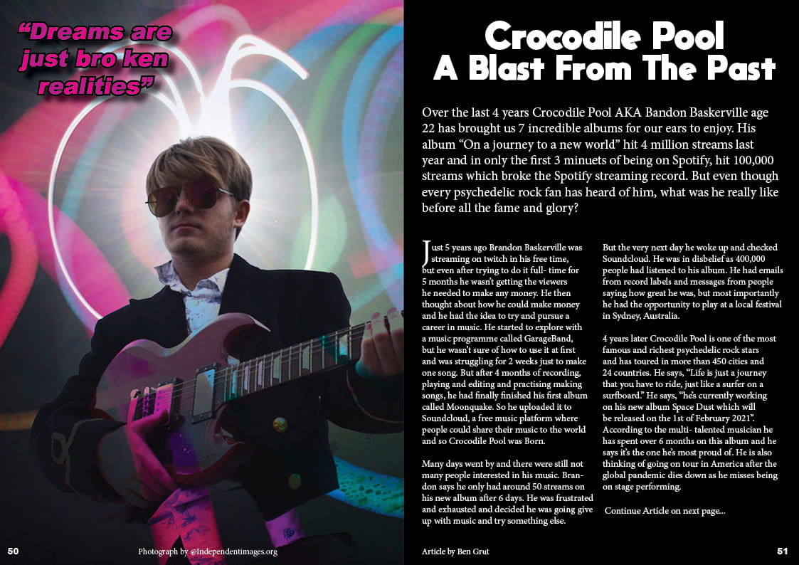
Here is my final draft of my DPS. Since my last draft I have made my image larger, iv’e adjusted the columns so that they align equally, I move the bottom sentence at the end of the article to the right and Ive added colour to the quote in the top left.
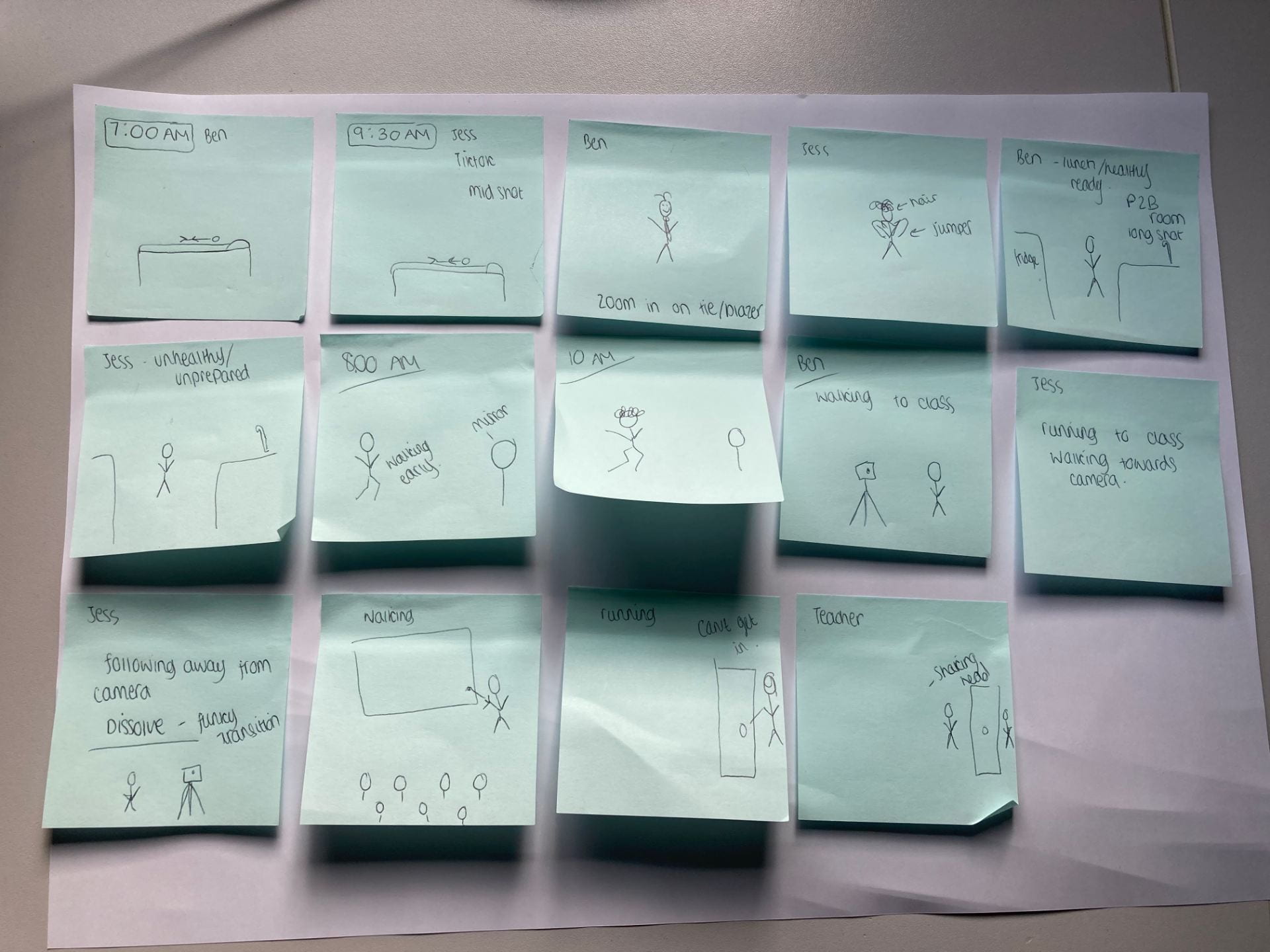
Targets
Front page
- on front page space out the cover-lines
- Capital letters G for Gizzard
- Make image bigger
- Price and issue date
- change colour of letters
- Make masthead bigger
- Contents
- Put Radar small and contents big
- page number 3
- more colours
- more cover lines
- check spelling
- More information make bigger
- Add a give away
- swap around more room
- punctuation
- DPS
- make image bigger
- Equal the columns
- push “continue article” to the right
- Add graphics colour scheme
- logo “rainbow twissle”
- Add Twitter and facebook