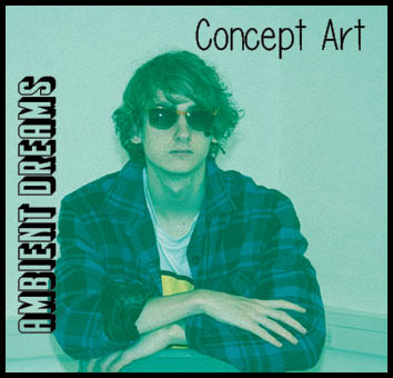
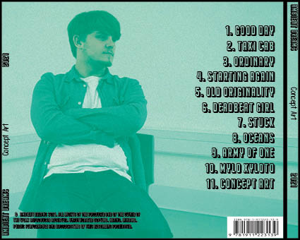
Self assessment from assessment criteria
- Camera is used well for first image to make engaging image for our star image but not in second image.
- Costume design is well done and fits genre
- Lighting is good and gives of a very chill and indie vibe
- Background is plain and simple which is maybe what we don’t want for this genre although it does look organic.
- Text is a bit bland in front panel, but text in back panel works with genre and looks good.
- Colour works for our indie genre and our brand package and works well to show integrated advertising
Targets for improvement
- Scale images bigger
- change album name
- Try and find better image of Brandon
- Find another photo of me as it to pixilated


