
For my updated double page spread, I made my own background. I started off with colouring half the page pink, and the other purple. I then used the mixer brush tool to blend the purple and pink together to create a gradient. This made it less harsh on the eyes. I used pink and purple as it suits my cute and girly concept of the genre I chose.
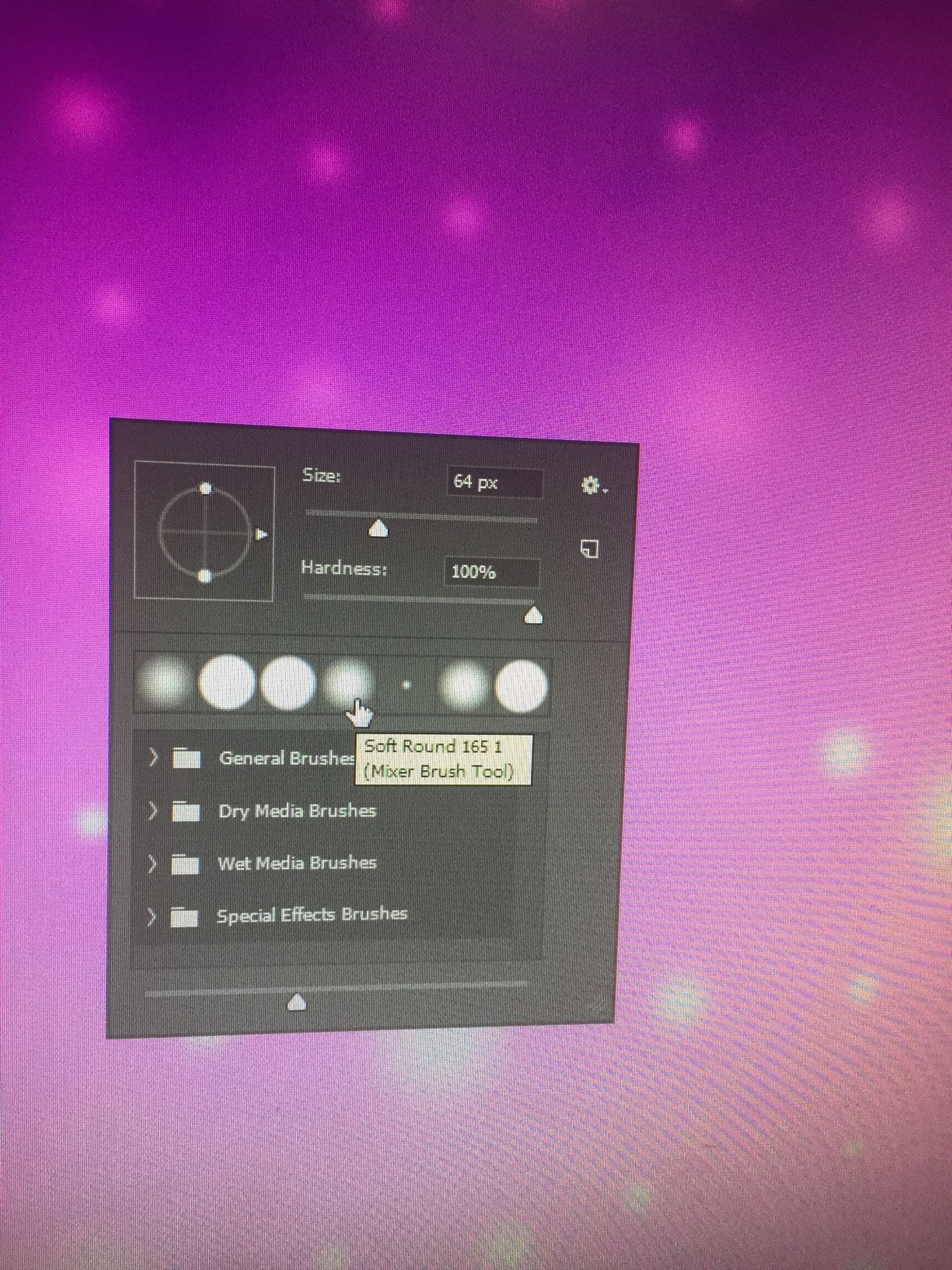
After this, I used a soft round tool to create the star effect. I used white and pink to create them. I believe this adds interest so it’s not a plain background. I changed the size of the circle tool and made it the soft tool as the original one looked too harsh on the eyes.
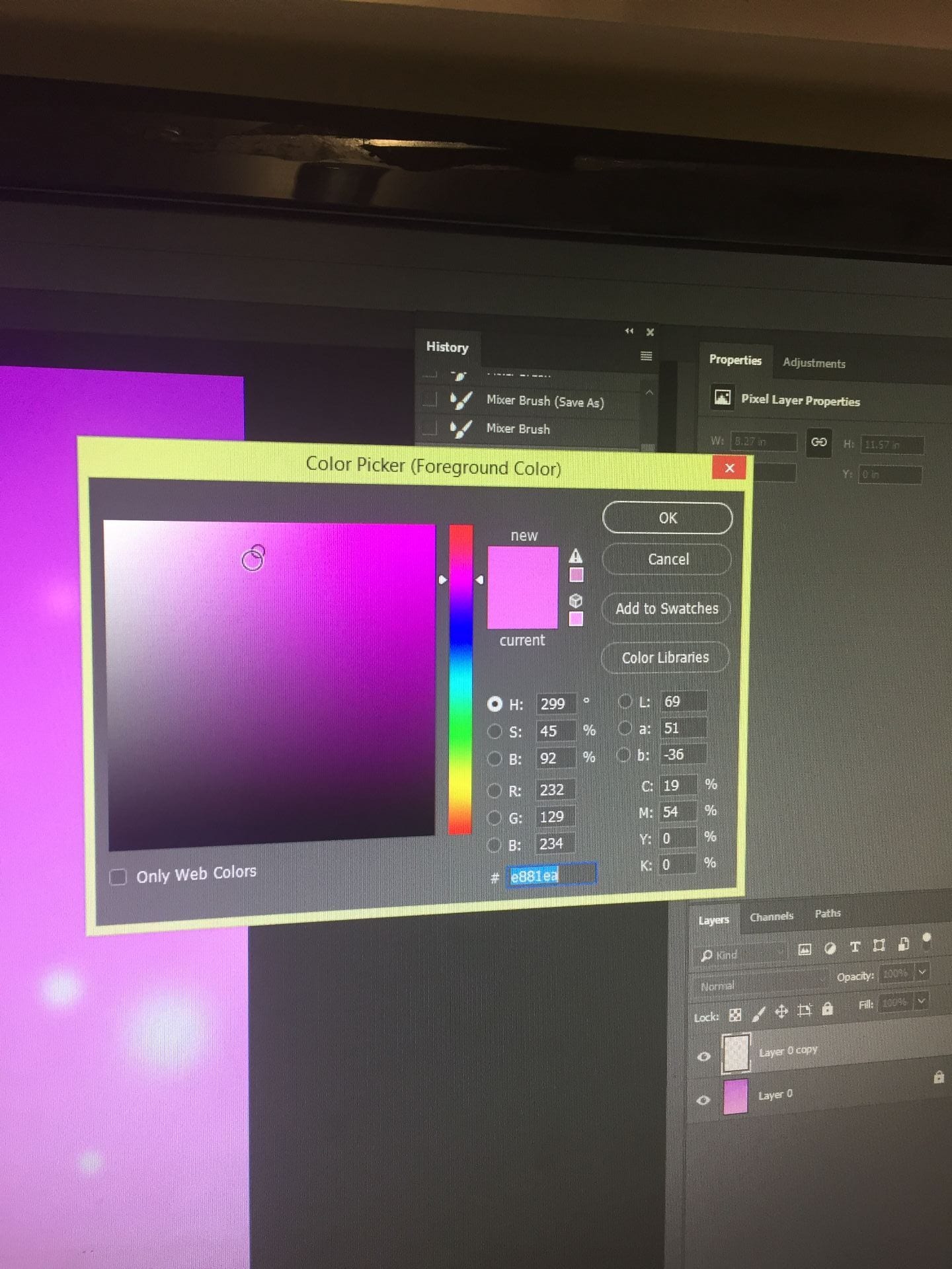
I chose the pink and purple colours as it fits my concept. I believe it makes the model look girly and cute. This also suits my audience’s demographics as the age range is around teenagers. The pink and purple also match with my model’s star image. My model is wearing lighter, pastel pink so the colours don’t blend together.