Social Media Page Draft 2

Social Media Page Draft 2


https://www.instagram.com/official.orla0/

Reflection:

Moving forward taking into consideration our teachers feedback we aim to add more posts around our upcoming album release, collaborating with specific brands and promoting our star image. One of the main posts we are wanting to add is a snip clip maybe 20 seconds of our upcoming music video to excite our fans and keep them on their toes. One amendment that needs to be made is specifically in the post when our star image collabs with Pixie, we need to edit the font we wrote Olrlas name in as it is not the same font that is on the front of our digipack, I feel this is important to do so we relay the same message across our whole package brand. This was a simple mistake but going forward into draft 2 we will be extra vigilant with fonts/colours.

By following and keeping track of our social media post plan we will manage to stay on track leading up to our album release and maintain in line with our mission statement to complete a good social media page going into the second and final draft.

Critical Reflection Essay

Critical Reflection Essay


  • How did your research inform your products and the way they use or challenge conventions?
  • How do your products represent social groups or issues?
  • How do your products engage with the audience?
  • How do elements of your production work together to create a sense of ‘branding’?


When creating a brand it is important that the message that comes across is relayed across the whole campaign, it needs to be easily recognisable throughout all three products. We want to create a brand that our audience can buy into and to create something that fits into the alternative indie genre. The mission statement related to our star image describes her as a quirky alternative independent woman. We tried our best to enforce this idea across our music video, social media page and digipak. One of the main ideas we wanted to communicate to our audience is that a strong independent woman can also be fighting her own battles that sometimes don’t get shown when you are in the spotlight. Showing vulnerability to an audience will open up conversation and make a change.

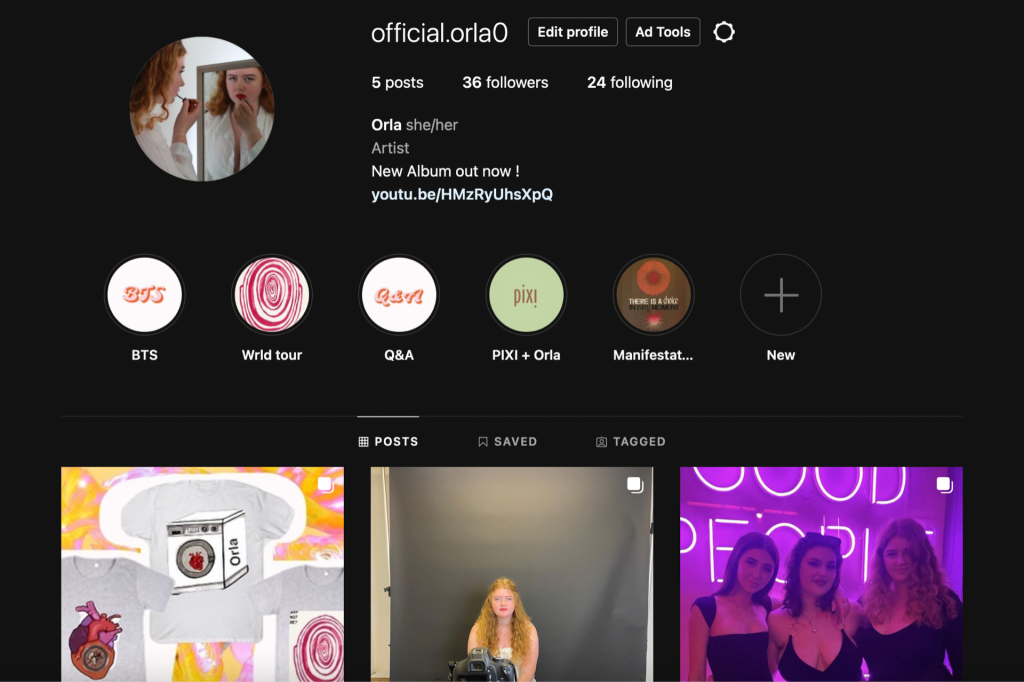
Through our social media page we wanted to push forward the idea of our star being a radical feminist we did this through posting different quotes supporting women’s rights as well as charities that work with vulnerable women.  We relayed the same message across in our digipak with the representation on the front panel being in black and white, we wanted to show a vulnerable side to the star ( being in the black part of the picture ) and then her strong feminist side being in the light.

PICTURES

For my research I looked into the alternative indie genre to look into the key conventions of a professional music video. I realised after looking into a variety of videos a lot of alternative indie music videos consist of lowkey lighting, quirky  props to complement the different types of outfits and majority of the time is purely narrative with little to none performance. In particular we looked into Billie Eilish music videos as she identifies as an alternative Indie artist and she relies heavily on MES to tell her storyline The story we are aiming to tell is about a young arty and eccentric woman . Her music videos predominantly have a narrative with typical conventions, for example outfits that compliment the background lighting, unique and quirky makeup as well as  cutting on the beat of the music.

However going against the normal conventions within a music video of its majority of the time being narrative we also added in performance as well. We thought that doing this would benefit our music video as we had come up with a good storyline we thought would go well with the song. We used a storyline consisting of our star confronting her cheating boyfriend who gets killed by the star, which we felt would fulfil the expectations of the audience. Although we went against typical conventions with the narrative and performance, we followed the conventions of our indie genre and how the stars are often presented  in the music video. For example our music video relied heavily on Mes-En-Scene to tell our storyline. We showed our star’s mood by adjusting the lighting. When our star killed the boyfriend we dropped the lighting to lowkey to show her feelings getting more sombre and dark.

PICTURES

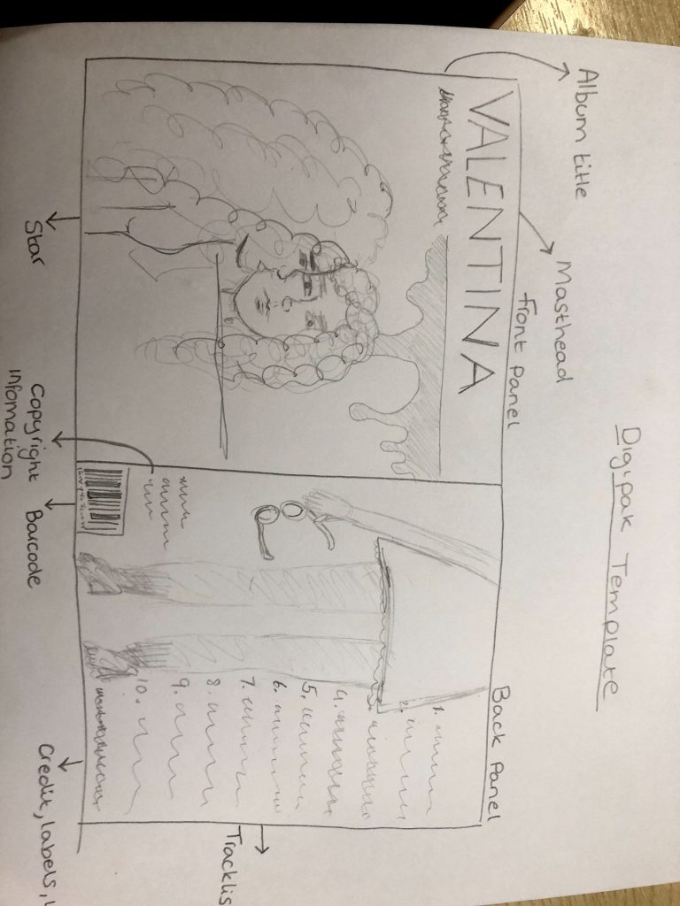
We wanted to represent Orla as a radical feminists supporting women’s rights as well as a quirky, fun independent women wanting to inspire the next generation. When Orla isn’t working hard on her music album she’s working with charities, spending time with her family and finding ways to interact with her fans. We relayed her strong independent side of her through the front cover of our digipak through an image of her looking into a mirror applying red lipstick which is used as a semic code (Barthes).

When we started to mockup ideas for our star image we wanted to represent her as an angel with dark secrets. We incorporated a mirror so it gave the effect that she was looking at her own reflection but she sees the possibilities of who she wants to be, inspires to be but she is stuck as a conflicted, confused woman. We represented this in the image by turning the image black and white, we changed her reflection to the lighter colour and her standing looking into the mirror black. Doing this gives the audience a sense of our star having a split personality. The red lips represent a symbolic code (Barthes) in the aim to create a seductive, sexy and angelic look of an angel. Following on from our mission statement presenting her as a strong feminist, the lips give power and independence to the star. On the third panel we designed a rough cut bloody finger print behind our CD.Through the use of this device we wanted to create a sense of anger, frustration and we included the phrase, “Why not me?”to create a semic code (Barthes) to show the thoughts in her head over the fact her boyfriend had an affair.

When creating our social media page we wanted to ensure that the audience had plenty of opportunities to engage with our stars. As Hall mentions it is important to think about the audience’s demographics and psychographics and take into account what would attract our audiences. For example our star presents herself as a radical feminist and aims for change, therefore in our social media page we aim to send that message across and attract similar audiences who follow the same beliefs. We present our star image as a woman who is talented, emotionally intense and someone who is authentic. We want our star images audience to be able to relate to her and find a common interest. We hope to do this through our social media page, promoting women’s rights and working with different charities who specifically work with young/vulnerable women.

 When producing our social media page it was important to us that the audience was able to connect and interact  with our star, this is why we ensured that the social media page was full of what Blumler and Katz would argue are the uses and gratifications that the audience seek when consuming the media. One they would argue is essential is social interaction. We allowed the audience to interact with our star through doing a Q&A on our star’s story on instagram, this allows the audience to communicate their thoughts and ideas to the star. On the instagram story we posted what kind of content would our audience like to see, sneak peeks of upcoming albums, song release, brand deals? Doing this we got positive feedback from the audience and took that on board when we published content.  We want our audience to be able to communicate with one another. We hope this will be achieved by creating content that will spark a conversation. For example, one post we will be doing before our album release is a sneak peak of one of the songs music videos, this allows the audience to gather a representation of the star which the audience can recognise and discuss. Doing this will create digital word of mouth between the fans and open up an opportunity for other audience members to hear about it.  By looking into other alternative indie artists social media pages we want to do something that will visually engage our audience with something they will find visually appearing. Doing this will broaden our audience profile and inspire young indie fans.

PICTURES

Social Media Page Draft 1

Social Media Page Draft 1

Here is our first draft of the social media page we have created:

Reflection:

When creating our social media page we had a pretty good idea of the layout and ideas we wanted to incorporate within it. Prior to creating it we made a timeline of all the posts we wanted to post and what they were. We wanted to show our star as someone that people would love to work with so we decided her first post should be our star image collaborating with vogue and her debut with the magazine. We also wanted our star to launch her own product so we decided for her to launch her own skincare brand with pixie, in the description we offered the audience a 15% off with their first purchase to entice them in. We have also added behind the scenes of the stars life and what she gets up to as well as behind the scenes of recent albums coming out and upcoming singles.

On the stars story highlights is where the audiences can mostly intercat, we have done a Q&A in which the audience can get in direct contact with the star, we have asked questions such as “who is excited for the album release”,  “what would you like to see in the future” and so on. This leaves the audience feeling as if our star is trying to fulfil there needs and expectations.

Going forward we need to release a tour poster and tour dates following our upcoming album release which we will also do a countdown for to excite and engage the audience.

Digipack Final Draft

Digipack Final Draft

Below is my group’s final digipack draft

Click on it to make it bigger

Reflection:

Here is our final digipack that my group has created. Throughout our final digipack we have recognised the key conventions within the alternative indie genre and relayed them into our final draft, we aimed to achieve a digipack that fits within our audiences demographics and we feel we have accomplished that by creating the different panels in ways that our audience would find appealing. Throughout the digipack we have worked on the color scheme and fonts changing them within each draft to hopefully find the best fitting colors and fonts that complement the indie genre. With the use of photoshop on the front panel it created a unique look with the idea of there being an image behind the front one giving it some kind of edgy/quirky look which makes it stand out from other digipacks and fits within the indie genre.

Looking back we are pleased with the way our digipack has turned out and the fact that our social media page and music video are all nicely coming together to create that perfect alternative indie package brand, promoting the star image and genre.

Timeline and marketing ideas

Timeline and marketing ideas

Reflection:

In preparation of launching our social media page we created a timeline of posts in the build up for our album release. By doing this allowed us to think about how we want to market our brand and think about how we want to entice our target audience onto our star images social pages. Throughout the timeline we want to incorporate brand deals, exciting discount offers to tours/merch and things the audience can interact with, for example putting a Q&A on our stars instagram story so the audience can interact with the star and ask her questions about upcoming singles/album release.

Final Draft / Draft 4

Final Draft / Draft 4

This is the final version of our music video:

Reflection:

From draft 3 and receiving peer feedback we made final amendments to our music video. After receiving peer feedback we realized we had missed out tiny little details that we needed to improve on and different edits we could make better. We feel that in our final draft we have the perfect balance of performance and narrative as well as different editing techniques.  We feel that our music heavily relies on mes-en-scene and that is what tells the story, through props, body language, costumes and makeup. Over all I am really happy with the final outcome of our music video and we feel it fits the alternative indie genre well.

However before starting the creation of our music video there were a few things I wish we had done. For example before filming each of the scenes I feel it would have benefited us to of created a more thorough shot list and camera angles that we wanted to achieve, this would have allowed us to spend more time on filming and editing in the long run instead of trying to figure out at the shoot what shots and camera angles we wanted. Another fault that we should have thought ahead is the first 30 ish seconds of our music is set in the night time but we shot in the daytime, editing this later on to make it look like night consumed a lot of our editing time.

All being done now I am happy with our finished product and happy with what my group has achieved.

Digipack Draft 3

Digipack Draft 3


Reflection:

Following on from draft 2 we have made many adjustments to all of our panels. For example on our front cover of our digipack we have altered and added in more details to convey with the normal conventions of an alternative indie digipack. We have looked into different font types and what we think would work best with our front cover. We decided to do a simplistic font for the album name and a more angelic font for our star images name at the bottom. We are not 100% on these fonts to be our final ones but we like the way that it is going. We also added in on the back panel the normal conventions of a digipack being the barcode, the copyright information and down the spine we added the albums name and our star image.

Targets for improvement:

  • Going into draft 4 we feel we have a strong draft 3 that we can work off of, one of the main things we would like to work on is the first inside panel with the stars symmetry, we wanted to follow on with the symmetry from the front panel and we feel we have accomplished that well. However at the moment just the simplicity of it being black and white we feel we need to add in more detail, for example maybe some alternative looking shapes or some lyrics that feature in some of our tracks on the album.
  • Another improvement I feel needs to be made is on the back panel on our tracklist we need to add maybe a couple more songs to make the two lists look even to fill the space below it. We either add more track songs or maybe incorporate some pictures of our star or maybe a quote she says just to make it look more enticing for our target audience.
  • Another target to maybe consider going into draft 4 is on the third panel with the bloody fingerprint we have the lyrics “why not me” and although i like the positioning of them maybe we could consider adding more lyrics around the fingerprint from more of that specific song “washing machine heart”.


Focus forward:

Going forward into draft 4 we now have a set goal of what we want to achieve in preparation for our final draft. Having specific targets we want to achieve and improvements we want to make allows us to waste no time in getting straight to it.

Peer Feedback

Peer Feedback


What Went Well…

  • Narrative is shown well and is clear and simple to understand throughout the video
  • Acting and lip syncing is really well performed. The model did a great job when filming, there were some really effective performance shots.  
  • Location shoot was good as the lighting and composition was thought out well and was really good quality.
  • Editing of the clips are all on beat and works well with the music. 


Improvements…

  • The video could use some more close up shots in the performance clips for more of a variety of shot distances and frames.
  • Could try playing around a bit more with filters and transitions as it lacks slightly in editing.
  • There is not much camera movement, a lot of the clips are very static although this could be added in post.


Receiving peer feedback has given us the opportunity to look at our music video through the critiques of our peers which allowed us to get feedback from someone who hasn’t watched our music video . For example one of the critiques given to us was to add in more filters and transitions. So going into our final draft we played around with more filters and transitions to better our music video. Now having made the improvements it has hugely improved the overall look of the video.

Digipack mockup

Dijipack mockup


Reflection:

Front cover – 

For our front cover we have created a possible design we want to go along with for our front cover. We looked into many inspirational designs of other digipack’s but ended up coming up with this idea that we thought would work with our alternative indie genre. Our idea was to have our star image looking into a mirror and the camera picking up the stars reflection. We thought this would be a good idea because in our music video our star is portrayed as a psycho girlfriend who kills her cheating boyfriend but in the reflection of the mirror she has angel wings and is portrayed as an innocent angelic women. Also on the mirror we wanted to incorporate fake blood dripping off of the sides as the main point in our music video is the killing scene where lots of blood is involved so we wanted to make that a statement on the front of our digipack as well. This shot of the mirror will most likely be a close up/mid shot to best allow the audience to see the raw emotion on her face.

Back cover – 

The back cover was an opportunity to represent the indie genre by dressing our star image in alternative clothes and making that the centrepiece of the look. We created a lookbook looking at different styles within the indie genre and the kind of color palettes that are frequently used when creating a design for a digipack.  We looked into our artists work mitski and took a lot of inspiration from that when creating this design. We do not want out star image just stood there so we are thinking of incorporating a prop to make the look complete. On top of the image is where we will have all of our song names of the songs that are included in this album and will chose a color that will complement the background image so that it all works well together.

Evaluation of shoot

Evaluation of shoot


Reflection:

Going into this shoot we were well aware of the final pictures we wanted to get for our digipack. We looked heavily into other digipack’s from well know artists even some from our own artist “Mitski” to get inspiration. From having our front cover shoot done we wanted to follow on with some symmetry in the back cover. We did a picture of our model on a stool to then edit a similar image the other side to make it look like they were back to back. For our first inside panel we decided to do a blood like fingerprint to inforce anger, rage and mystery with the words “why not me” around the thumb to symbolise the thoughts in our star images head when she finds out that her boyfriend was having an affair.  For our back cover we chose to shoot a tv which would later on have all the songs inside of the album on it. We thought this was a cool idea for our backcover because we hadn’t seen anything else like that before.