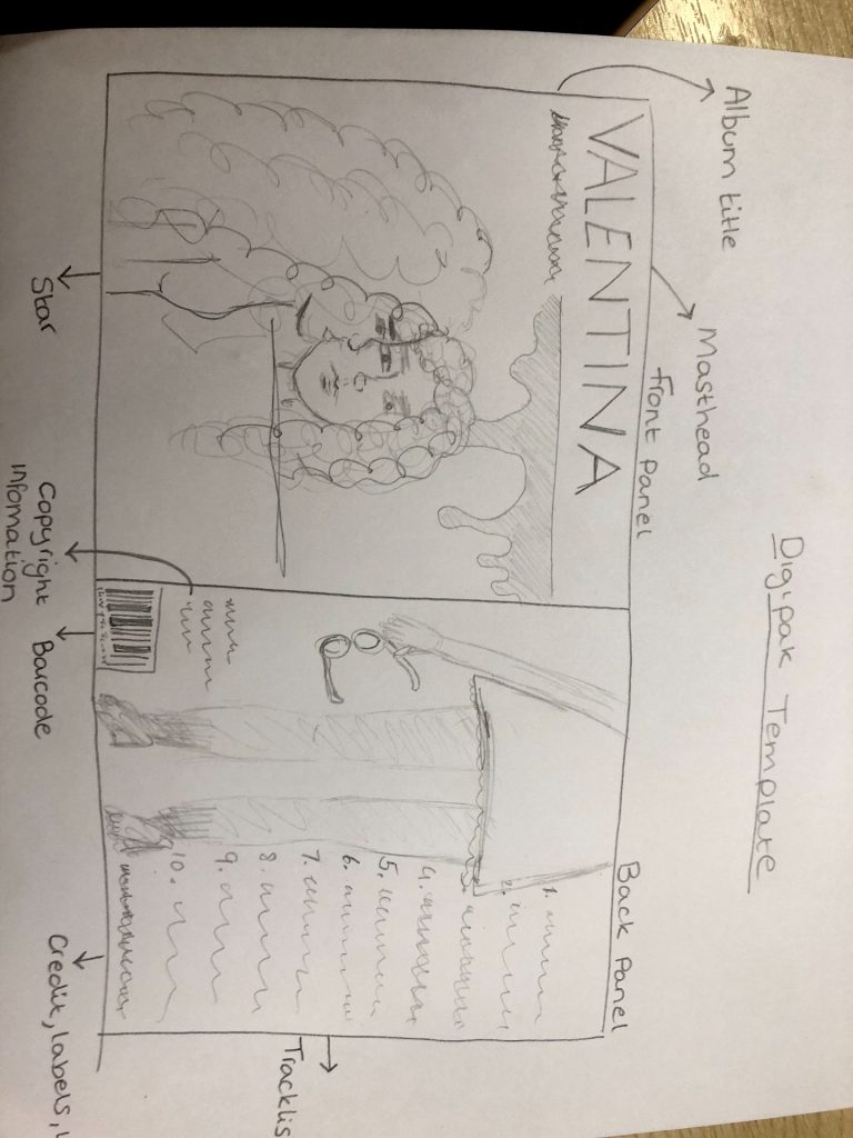
Digipack Final Draft
Below is my group’s final digipack draft
Click on it to make it bigger

Reflection:
Here is our final digipack that my group has created. Throughout our final digipack we have recognised the key conventions within the alternative indie genre and relayed them into our final draft, we aimed to achieve a digipack that fits within our audiences demographics and we feel we have accomplished that by creating the different panels in ways that our audience would find appealing. Throughout the digipack we have worked on the color scheme and fonts changing them within each draft to hopefully find the best fitting colors and fonts that complement the indie genre. With the use of photoshop on the front panel it created a unique look with the idea of there being an image behind the front one giving it some kind of edgy/quirky look which makes it stand out from other digipacks and fits within the indie genre.
Looking back we are pleased with the way our digipack has turned out and the fact that our social media page and music video are all nicely coming together to create that perfect alternative indie package brand, promoting the star image and genre.