Below are some screenshots of techniques we used while editing the titles.
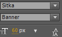
I used the font ‘Stika’ for my titles because it fitted well with the theme of my thriller by looking neat to show the cleanness of the doctors lab coat but it also has pointy edges which makes the words seem mysterious and sinister which therefore ended up looked effective on top of my film.

This is a screenshot of a title being cut down to fit in time with our narrative, we cut it down to have the timings right so that they stayed on the screen long enough but not too long, so that they were easily readable

This is a screenshot of my main title. We used an animation that made the writing disappear away from the screen so that it makes the sequence feel more suspenseful and thrilling. It was important to use the right animation to ensure our thriller looked creative and crisp and that it fitted with the narrative.