It is important that I analyzed a double page spread article, as before writing a draft for myself, I need to understand the conventions of an interesting article that stands out from the rest and is engaging for the reader.
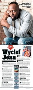
It is important that I analyzed a double page spread article, as before writing a draft for myself, I need to understand the conventions of an interesting article that stands out from the rest and is engaging for the reader.
My first draft of a contents page, was created on Indesign and photo shop. It went well to say it was a first draft, however I wasn’t as certain with my ideas, unlike going into making my front cover.
In order to improve my contents page, here are five targets that I would like to improve on:
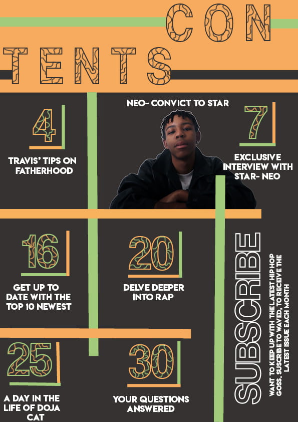
A contents page is designed to inform the reader of the articles that will be included in the magazine. It helps the reader to navigate through the magazine, by using lists of all the articles with labelled page numbers.
While creating a contents page I should include:
Although the contents page is to inform the readers, it still needs to be entertaining and flow with the theme of the magazine. By using AIDA, I hope that my magazine will draw the interest and attraction of the readers. It should also contain an image relating to the cover lines on the front cover, linking all these features together will not only make my magazine conventional, but it will make it more memorable for the reader, especially with the flow. The main image is used to frame the contents page, and the text is anchored around the main image, to connote the main image’s importance
Much like the front cover page, there should be a masthead stating that it is in-fact the ‘contents page’ . The use of a bold title will highlight to the readers the importance of the page.
Here are some ideas for my contents page that I found on pinterest.
In order to get creative and think about what is going to be the best for my contents page, I got a pen and paper and played around with how I would want my contents page to look like. I also thought of some catchy cover lines that would be suitable for my magazine.

It is important to self access work, it allows you to re-evaluate and take the time to critique your work. Even though it seems harsh, in the long run it will make my work look to the best of my ability. Below, is my first self assessment and draft 1 of my music magazine.
I would like to set myself some targets that I aim to improve with my next draft:
Using adobe bridge and photo-shop, I created contact sheets from my first shoot, for my music magazine. I focused on the relevance of my images to the genre, for example making sure that the costume, pose and proxemics are noticeably ‘Hip-hop’.
The star image of my character ‘Neo’ is that he is a chic, fashion forward male rapper who also has evolved from a prison convict to a star. This is portrayed in my images, with heavy chains slumped over his neck and shoulders.
The denotation of the images is that a male is looking at the camera, or side on. However there are many connotations to the images, such as the chains, braids, pose and the leather jacket. This is because they represent different aspects of my stars life, I hope that this will take my stars image from being ordinary, to extraordinary.
At first, I only used one flash, but I came to realise that two flashes would be more conventional as my images were coming out too dark. Although the shadows that were created from this were interesting and they can be seen in many hip-hop shoots as it shows the element of mystery within it.
Overall, I am happy with how my shoot went, in the long run it was a learning curve as I now know how to work the flashes etc.. Even though some images were out of focus and slightly dark, I know how to change that and in future to make my next shoots the best they can be.


Making it to number one, is every editors aim. In order to reach this, you have to have a thorough understanding of the competition. Through looking at the unique selling points of other magazines, it will allow me to come up with a new idea that will separate my magazine from the herd.
This Piktochart I made allowed me to look at what other magazines use in depth, and I came to the conclusion about what features I will include in my magazine. One of which being that the audience will receive information about artists that is seen as controversial or personal’. This will allow the target audience to see the personal identity of the artists, but also make them feel more socially interactive with them.

Loading…
In order to be well organised for my shoot, I have prepared a detailed plan which has been sent to my model. This consists of the:
This plan will ensure that everything runs smoothly and I can focus on getting the best and most relevant images to my genre, hip-hop.

In order to make my music magazine brand ‘waved’ authentic, I will need a masthead that is relative to the hip-hop genre. On In design, I messed around with different fonts to which ones looked best. They have different conventions that create Awareness, Interest, Desire and Action for the audience. Such as the vibrant colours, bold font and different lines within the fonts creating an abstract and eye catching masthead.

I also looked on the website ‘Da font’, for fonts that I am able to download and use later on. Here are my top three choices.


![]()
Although I liked how these mastheads turned out, I would like to use a more personalised masthead, which when I have more time while creating my music magazine, it will something like the image below.

By using the website ‘yougov’ I researched some of the most well known hip hop artists, from new too old. It shows not only the age and gender of the audience, but also their interests and other aspects relating to their lives. This will enable me to create a magazine that is specific to the target audience but also to the genre. In this task, I looked and utilised the Bulmer and Katz theory as it enabled me to encode what my target audience would want to decode for preferred reading.


After researching about the type of people that would listen to the most popular hip-hop artists, I created a profile for a persona that would read my magazine, ‘waved’. I chose to have a ‘road-man’ approach to the wording of his profile. This gives an accurate representation of someone who would stereotypically listen to this style of music. It is critical that I researched my target audience before even thinking about starting my music magazine, because actual magazine producers will have to do this in order to make sure that their issue will sell.
After looking into the hip hop genre and the most popular artist’s currently, I now have a general understanding on the type of personal identity that someone who listens to hip hop would have:

This is my Pinterest mood board, that I created with images that inspired me for my music magazine, for the genre ‘Hip-hop’ but also my brand. While collecting these images, I had to think of the conventions of a music magazine:

I also looked into the colour pallets I would potentially use for my music magazine, by using Adobe colour wheel I was able to take an image that I liked and could get the exact colours from it. The colours that will be used in my magazine will need to represent the genre somehow, for example, the lime green highlights the vibrant natures of the hip-hop artists, and the black represents the deep meanings of the lyrics in their music.

The audience’s expectations, are to see relatable connotations within the denotations that really link to the hip-hop genre. So going forward, I hope to look into the small details that will make my music magazine unique.
Below, is some research I did into the hip-hop rapper Snoop Dog. This mood board shows the metanarrative of the paradox of the star. The information shows his’star image’ and how he is seen by the world, these are what tells the stars apart from being ordinary to extra-ordinary. For example, his interests and personality traits etc…
After researching a well known hip-hop artist, I was able to create a mood board showing the denotation and connotations of my star image. An example of the connotations will be that he will be holding a thick gold chain, to show his ring, but also showing that he would like to show his wealth.
Small conventions such as the styling of the model, including the pose will ensure that I am creating a magazine cover that people who enjoy the genre will buy.