Music Video
Digipack
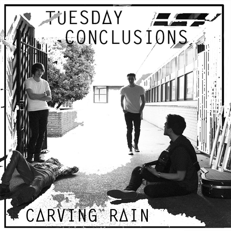
Front Cover:
Inside Left:

Inside Right:
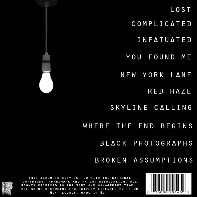
Back Cover:
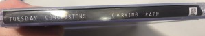
Spine:
![]()
Advert

Music Video
Digipack
Front Cover:
Inside Left:
Inside Right:
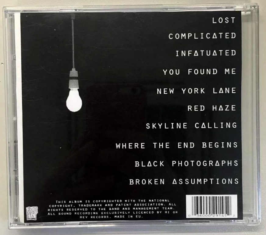
Back Cover:
Spine:
![]()
Advert
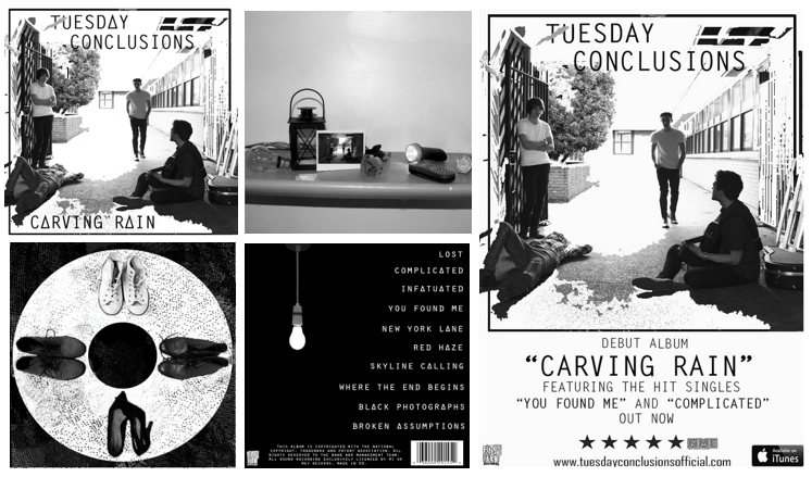
Here I have combined the final versions of both the digipack and advert so we can see how they both fit together as a package.
This is our final digipack and advert:
In this evaluation question, we explored the wide range of media technologies we used in order to complete the research, planning, production, post-production and evaluation stages of our products. Additionally, we explained how we used these technologies and how they have helped us in the process.
Click below to see my Evaluation Question 4 pinterest page:
In preparation for this evaluation question we created a questionnaire including questions to do with all of our products for peers to complete.
As a group we created a slideshow via Google Slides based on the audience feedback we received from our drafts of the music video, digipack, advert and the questionnaire we created. We uploaded this presentation to Voicethread so that we could talk about our feedback in more detail. We included our peer’s opinions and advice along with the type of technology we used in order to capture this feedback such as YouTube and MP3.
This is our Evaluation Question 3:
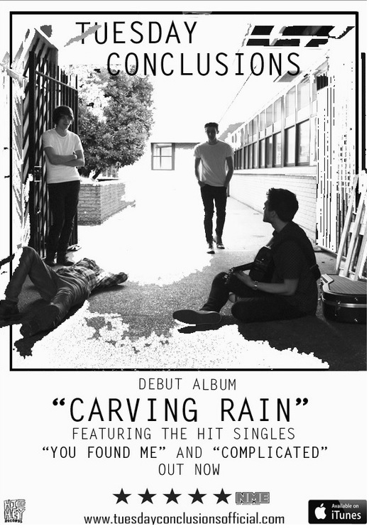
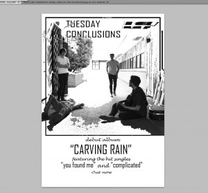
In our advert, we have included the conventional features such as the image, band name, album title, ratings, website, record label, hit singles and where you can find the album, e.g- iTunes.
We had decided to change the fonts as we preferred this and suited our genre better. We also added a rating from the NME magazine as their target audience is Indie/Rock enthusiasts which fits in well with our genre. Additionally, we have included the ‘available on iTunes’ logo so that our audience will be able to know where they can listen to the album.
This is our final advert:
Here is the feedback we received:
Front Cover:
Inside Left:
Inside Right:
Back Cover:
Spine:
![]()
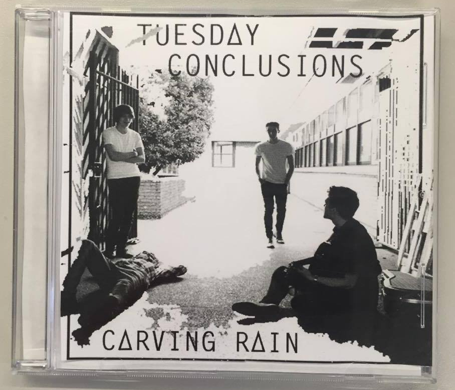
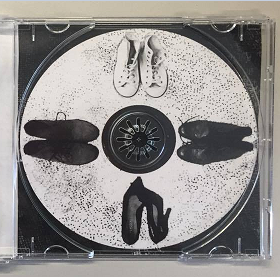
Below is our digipack in a CD case.
Front Cover:
Inside Left:
Inside Right:
Back Cover:
Spine:
Final feedback we received:
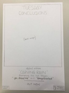
In order to create our advert, we started with mapping out what we wanted to include on our advert by hand drawing it first. We added conventional features such as band name, title of album, image, when the album is out, where it’s available etc.
This is our hand drawn mock up of our advert:
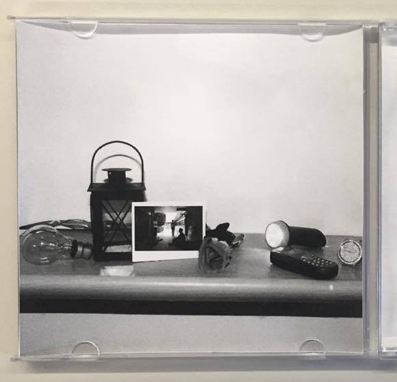
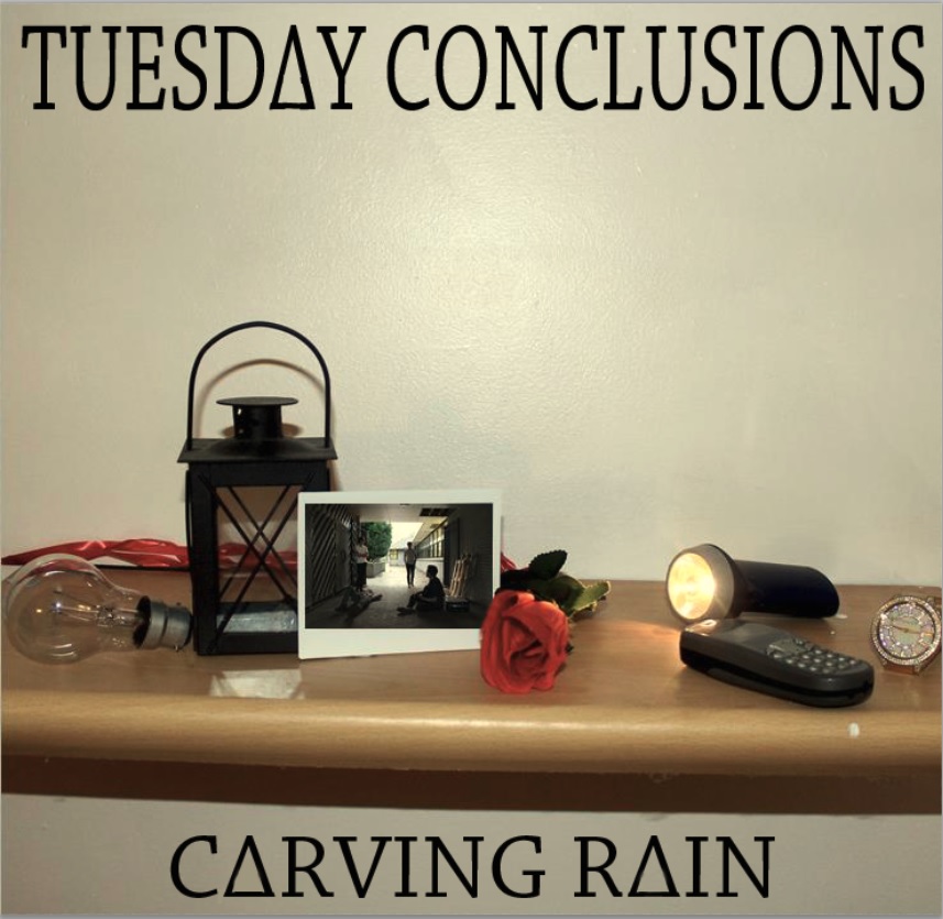
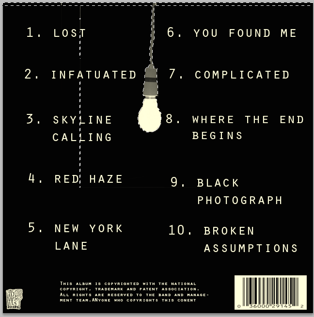
We have created a digipack that fits within our Indie/Rock genre and includes the conventional features of a digipack which consists of band name, album name, image, record label, copyright information and bar code. We altered this version by changing the font on the front cover in order for it to be consistent. Likewise, we changed the A’s to triangles to make it unique and different. Also, on the inside left we transformed the image to black and white so that it fits in with our genre. In the inside right we combined a texture from a blanket to form these black dots which turned out to be effective.
Front Cover:
Left Inside:

Right Inside:
Back Cover:
This is our feedback from Jess:
What went well:
After we had hand-drawn our advert, we then went on to experiment digitally and create a draft 1. I had originally created a border for the image to go into which also the band name went into as well.
We took the photo which is on the polaroid in the digipack and transferred it to the advert which illustrates a link between both the advert and digipack. Viki changed the image to black and white which fits into our colour scheme on our digipack and explored ways of making this image more interesting and creative. She used a tool called the ‘magic eraser’ which added white elements to the image. Her original idea was to erase the image around the border however this turned out better than expected and we decided that really liked the outcome.
This is our draft 1:
This is our feedback:
We had to create a commentary to discuss the relationships between our products. We used Adobe Premiere Pro in order to produce this task. We mentioned how each of the products link together to form a package and how we have used conventional features in order for the audience to have a preferred reading of our products.
This is our evaluation question 2: