MASTHEAD DESIGNS


For my magazine cover, I experimented with a range of different fonts and effects to try and come up with the most suitable masthead for the jazz genre. I tried to make each idea different to each other in a different way to make sure I have every possible option to attract a large audience of jazz enthusiasts. I decided to experiment with different colours but I believe that after my experimentation that a dark red and black masthead may be my best shout because I feel it represents my genre and the colours of red and black are the typical colours you may relate with an underground club. I wanted to experiment with space in between the text as I had gathered from other jazz magazine covers that the text is usually tall and spreads across the whole of the top of the magazine. I tried to include as many features of AIDA as possible, for example I am going to try and include a coloured masthead which will bring attention to my magazine instead of a plain colour like white as it makes my brand stand out to the audience.

BRAND MOOD BOARD & STAR IMAGE


I created a mood board to convey all aspects of the genre of jazz. I found pictures, conventions, typefaces, artists, album art, magazine covers, logos, lyrics, colour palettes, tour posters and magazine layouts that I thought were appropriate to my genre of jazz.

From this mood board, you can see that there is lots of nice colours and the album covers contain a lot of art and drawings which portrays the genre as fun loving and artistic but there is also a strong theme of red and black and a dark theme. I want to give my audience the best representation of the genre and I will include denotations and conventions for new readers which can attract them to become a new customer and fan of jazz. Using this inspiration, I am going to try and include these in my magazine brand so that I can encode this to give my audience a sense of nostalgia which they can decode to provide them with their preferred reading which will live up to the audience expectations.

I chose Miles Davis as my dream cover star for my magazine. It was slightly more challenging to find modern news articles surrounding Miles Davis as he passed away more than 30 years ago but I found some media sources that I was able to use to portray him as a brave, talented, interesting, courageous yet arrogant and self confident musician. I found these articles very important in helping me to find the metanarrative of Miles Davis and the connotations I could withdraw from the news stories and media sources helped portray the star as ordinary yet extraordinary at the same time. These denotations will be useful to portray the paradox of my star image and therefore I can represent the true paradox of a jazz musician through my cover star. On the second slide I have included images of every aspect of my star image from the setting and mood which would be like a jazz club with red and black lighting, the outfit I would like a hat and a suit with a bow tie to make my model look smart and like a vintage jazz musician. It is also very important that they have a jazz instrument such as a saxophone or a trumpet as I need that for the Mise En Scene of the star image.  I would like my model to be looking like they are playing the instrument and I think I am going to try and add fake sweat to represent them as a jazz artist giving it their all in a live performance.

MY AUDIENCE PROFILE AND RESEARCH


For this task, we were researching our audience and their profiles. Using the website Yougov.co.uk, I searched the stars of my magazine and from that I was able to find out the demographic of my target audience that were interested in the artists and other celebrities that they would also be interested in and this information is very useful to determine the preferred reading of my audience to be able to encode the desirable features which will be vital for my own magazine so my audience can decode these and they will enjoy reading it.

Using this data, I created a dating profile as a member of my target audience. I made this dating profile to give me a very good idea of my audience psychographics, as a producer it is very important for me to know my audience psychographics as this will allow me to include the appropriate features in my magazines to create the best magazine for preferred reading. I will now have a better understanding of my audience and I can therefore create a magazine for the purpose of education, entertainment, social interaction and personal identity.


BRANDING IDEAS AND MISSION STATEMENT

I have chosen the genre of Jazz to base my magazine on. I have decided to name my magazine ‘Lounge’. I chose this brand name because when I think of jazz I think of the downstairs lounge to a club, with dark red and black low key lighting. With this image in my head, I will base my magazine with dark colours and a cool and calm theme and this will be my USP. The uses and gratifications of my magazine will aim to entertain and inform my customers while containing plenty of interviews to give a sense of social interaction, and my magazine will also be used to influence the personal identity of a reader as they will potentially inherit new characteristics through the reading of my magazine.  I will include lots of photos and advertisements to appeal to readers of most ages although the jazz genre mostly attracts individuals over the age of 40. I will include the views of critics in my magazine to appeal to the older generation. My mission statement is:

‘Lounge aims to satisfy and bring together jazz enthusiasts from all over the world. We keep you up to date with the latest news in the jazz world while including plenty of interviews and reviews to keep our audience interested. We will bring together jazz fans from all around the world to create a safe, comfortable and relaxed community for fans of Lounge to provide them satisfaction’


MY TOUR POSTER


I created this moodboard of different psychedelic rock tour posters from the past. By researching these posters, this will aid my knowledge of the mood and genre that I am trying to recreate with my own tour poster.

From these posters, I am able to gather that there is lots of colour involved and there is a big theme of cartoon like characters which seem like they aren’t real and are very dream like. The fonts are very swirly and don’t follow a straight line so I will do my best to find an appropriate text and images and I will try and format the text to have the same effect as the text on these posters. I will also try to make my poster as dream like as I can so that people can then determine my genre through the design.


This was the tour poster that I created that portrays a psychedelic rock genre. I made my tour poster as conventional as possible by using examples of old tour posters that related to my genre and referring to them to make sure that I could present my genre effectively. My poster is unique because I edited my image to make it seem more holographic or dream like which relates to my genre which is very dream like and trippy. I included attention to details when I added an effect to the pug to make it stand out from the background a little bit more and and I showed desire as I made a poster that I would be intrigued by as a fan of the genre as well. I am a fan of the background and how it turned out as I wanted my background to be similar to the examples on the mood board and I think I successfully made this work but I would have liked the quality of my chosen to image to look better but I will work harder to improve this when it comes to making my magazine.

AN INTRODUCTION TO INDESIGN AND MY MAGAZINE FRONT PAGE SWEDE

Click on the image to see the PDF


We created a mock up front page of an NME magazine cover that had been previously published. In this task I learned how to use some features of Indesign like editing text, using pugs and text boxes. This magazine had all of the conventional features such as a masthead, main cover star, main cover line, pugs, captions and cover lines.

My 3 strengths were:

  1. Use of images (borders, rotating)
  2. Recognising fonts or using very similar fonts.
  3. Using simple features (text boxes, font sizes/placement, text colours)

My 3 weaknesses were:

  1. Using effects such as shadowing
  2. Making it look realistic and professional
  3. Looking at little details

By doing this task, I got a feel for what the processes of designing a front page of a magazine and this experience has developed my skills using an editing software and I can use these skills to create a great magazine front cover.

I have linked 3 YouTube videos below which I am using to help improve my skills so that I can be confident with all of the features in Indesign and I can therefore make a professional level magazine cover.


A front cover analysed

We were given a selection of magazine covers to analyse and I chose the Billboard magazine cover. I chose this one because I thought it was the one that appealed to me as a reader and I am part of the target demographic for a magazine such as Billboard.

The skills that I learned in this task was the ability to show the link between an image and a target audience from conventional features of a magazine cover and I can also use these features to reach out to my target demographic and psychographic.

I will be able to use these skills to help me in designing my magazine cover so that it can reach out to the target audience which will ensure that my magazine sells as much copies as possible. I will be able to create a magazine that I would read myself and therefore I will be able to attract people of my demographic.


Conventional Design Features of a Magazine

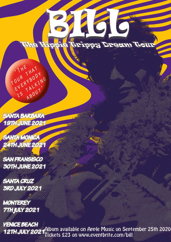
A magazine has several features which make it appealing for customers and make it a magazine in general. These are called the conventional features and I learned what each of these features. The features are as such:

The masthead – This is the title of the magazine and this is usually big and bold so that readers can identify it easily.

The main cover stars – These are the faces of the magazine and can be the deciding factor between two magazines, a main cover star is usually in relation to the main cover line.

The main cover line – This is the text that will catch the eye of the audience. This is usually a label for the main cover star which tells the reader who the cover star is or it gives an insight to what is featured in the magazine.

Barcode – The barcode is placed in the bottom corner or on the edge of a magazine to make it easier to scan when it’s bought.

Price – The price is labelled on a magazine to show the audience what they believe their magazine is worth.

Plug – This is a caption that promotes the magazine by praising it and hyping it up to show the audience how much better their magazine is than the next.

Pug – A pug is a small shape which is usually in a big bold colour to stick out from the background of the magazine cover, it usually contains a number or a figure which attracts the reader.

Captions – Captions are small subtitles which give little sneak peeks for the reader as an incentive to buy their magazine so that they can find out more.

Insets – Insets are smaller images featured on the magazine cover which give a slight bit of context to the captions and the plugs.

Cover lines – These are the captions that are dotted around the magazine cover but are usually featured on the left side of the cover so that it will be displayed when it’s in the shops.

It is important that I am aware of these conventional features in a magazine as when I design y own magazine cover I will have to make sure each one of these features is present otherwise my magazine will be overlooked by the audience whereas if they are all present then I can attract more readers and I will therefore get an increased revenue.


The Camera Talks


We were put in groups of 3 and given a camera and we were told to go off and tell a story through the use of Mise En Scene in photos. We tried to use a wide range of angles, settings, framings, compositions and depths of field.

Angles can create a mood and atmosphere to an audience. A good example of this is that if you take a picture of someone from a low angle then you are creating a mood of power and authority as they will look taller and bigger while if you take a picture from a higher angle then that will give off a mood of vulnerability and weakness because you will look smaller and less empowering to the audience. Different distances can also create a narrative to an audience for example a close up shot means that there is something that must be noticed like a small butterfly and you need a close up image to show you the details, while a long shot means that you are trying to get a wider perspective for an audience and this can be used to show a big area or it can represent loneliness in a character or setting.

We used composition within our images to tell a narrative for a story. For example, the denotation of a body on the stairs tells a story in itself, the connotation is that the man has fallen down the stairs and can’t get up. Mise En Scene and the camera was vital in helping us convey our storyline because we used different types of poses, facial expressions and body languages in the photos so that the image and the idea we were attempting to portray were visible. This will help me when I come to use Mise En Scene and camera skills to portray the story or emotions that I am trying to convey to an audience and to make the best magazine cover that I can.


My Image That Uses Mise En Scene To Communicate Meaning

In groups we were allocated a different genre of music each and my group was allocated PSYCHEDELIC ROCK. 

We were able to use the denotations of the colours, costumes, style, body language and facial expressions and we deconstructed them and how the genre was conveyed to create a mood board. We were able to decode that the genre was heavily associated with the hippie (hipster) movement, peace and loving, acid/LSD and it was very dream like and trippy. Artists associated with psychedelic rock were artists like the Rolling Stones, the Beatles and Tame Impala. I was able to make out all of this just from the denotations on this genre so I will make sure to include as many of these denotations in my own tour poster to convey the genre sufficiently for the audience.

We used the knowledge we had gained through the mood board we created to make a tour poster for our chosen genre. We dressed up one of us a model to appear on the front of the poster, which was me. Then I sat in front of the audience and they wrote down what emotions and moods I was conveying.


This was the photo of me with the post it notes that people had used to label me and how they thought i had conveyed the genre through my Mise En Scene. The post it’s aren’t particularly clear in the image but the post it notes said adjectives such as ‘out of this world’, ‘cocky’, ‘cool’, ‘druggy’ and ‘psychedelic’. I was pleased with the results because through the costume and facial expressions I was able to correctly portray my character to an audience and I can take this experience and use it in my tour poster.


This is all of the drafts that we had when we were taking photos. We tried various poses and expressions to try and give us the best possible options for when we chose our favourite one which will feature on my tour poster.


Out of all of the photos, I think that this one is the best one for the tour poster. The body language is faced away from the camera as well as looking away from the camera. This portrays the arrogant/cocky  and self absorbed side of a psychedelic rock star and you can’t see my eyes through my glasses which represents the mysterious and dreamy theme in psychedelic rock where everything is like a dream and you can’t describe it. This will be evident for the audience when it comes to designing my tour poster as the use of MISE EN SCENE is crucial to truly convey the ideas of psychedelic rock