MY TOUR POSTER


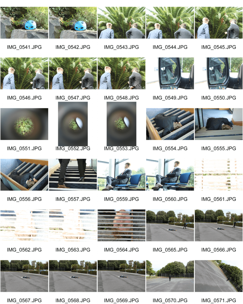
I created this moodboard of different psychedelic rock tour posters from the past. By researching these posters, this will aid my knowledge of the mood and genre that I am trying to recreate with my own tour poster.

From these posters, I am able to gather that there is lots of colour involved and there is a big theme of cartoon like characters which seem like they aren’t real and are very dream like. The fonts are very swirly and don’t follow a straight line so I will do my best to find an appropriate text and images and I will try and format the text to have the same effect as the text on these posters. I will also try to make my poster as dream like as I can so that people can then determine my genre through the design.


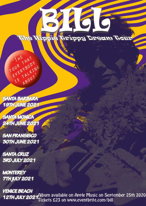
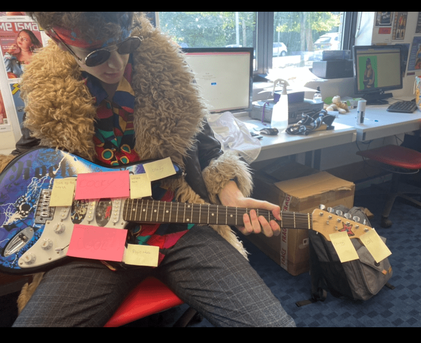
This was the tour poster that I created that portrays a psychedelic rock genre. I made my tour poster as conventional as possible by using examples of old tour posters that related to my genre and referring to them to make sure that I could present my genre effectively. My poster is unique because I edited my image to make it seem more holographic or dream like which relates to my genre which is very dream like and trippy. I included attention to details when I added an effect to the pug to make it stand out from the background a little bit more and and I showed desire as I made a poster that I would be intrigued by as a fan of the genre as well. I am a fan of the background and how it turned out as I wanted my background to be similar to the examples on the mood board and I think I successfully made this work but I would have liked the quality of my chosen to image to look better but I will work harder to improve this when it comes to making my magazine.

AN INTRODUCTION TO INDESIGN AND MY MAGAZINE FRONT PAGE SWEDE

Click on the image to see the PDF


We created a mock up front page of an NME magazine cover that had been previously published. In this task I learned how to use some features of Indesign like editing text, using pugs and text boxes. This magazine had all of the conventional features such as a masthead, main cover star, main cover line, pugs, captions and cover lines.

My 3 strengths were:

  1. Use of images (borders, rotating)
  2. Recognising fonts or using very similar fonts.
  3. Using simple features (text boxes, font sizes/placement, text colours)

My 3 weaknesses were:

  1. Using effects such as shadowing
  2. Making it look realistic and professional
  3. Looking at little details

By doing this task, I got a feel for what the processes of designing a front page of a magazine and this experience has developed my skills using an editing software and I can use these skills to create a great magazine front cover.

I have linked 3 YouTube videos below which I am using to help improve my skills so that I can be confident with all of the features in Indesign and I can therefore make a professional level magazine cover.


The Camera Talks


We were put in groups of 3 and given a camera and we were told to go off and tell a story through the use of Mise En Scene in photos. We tried to use a wide range of angles, settings, framings, compositions and depths of field.

Angles can create a mood and atmosphere to an audience. A good example of this is that if you take a picture of someone from a low angle then you are creating a mood of power and authority as they will look taller and bigger while if you take a picture from a higher angle then that will give off a mood of vulnerability and weakness because you will look smaller and less empowering to the audience. Different distances can also create a narrative to an audience for example a close up shot means that there is something that must be noticed like a small butterfly and you need a close up image to show you the details, while a long shot means that you are trying to get a wider perspective for an audience and this can be used to show a big area or it can represent loneliness in a character or setting.

We used composition within our images to tell a narrative for a story. For example, the denotation of a body on the stairs tells a story in itself, the connotation is that the man has fallen down the stairs and can’t get up. Mise En Scene and the camera was vital in helping us convey our storyline because we used different types of poses, facial expressions and body languages in the photos so that the image and the idea we were attempting to portray were visible. This will help me when I come to use Mise En Scene and camera skills to portray the story or emotions that I am trying to convey to an audience and to make the best magazine cover that I can.


My Image That Uses Mise En Scene To Communicate Meaning

In groups we were allocated a different genre of music each and my group was allocated PSYCHEDELIC ROCK. 

We were able to use the denotations of the colours, costumes, style, body language and facial expressions and we deconstructed them and how the genre was conveyed to create a mood board. We were able to decode that the genre was heavily associated with the hippie (hipster) movement, peace and loving, acid/LSD and it was very dream like and trippy. Artists associated with psychedelic rock were artists like the Rolling Stones, the Beatles and Tame Impala. I was able to make out all of this just from the denotations on this genre so I will make sure to include as many of these denotations in my own tour poster to convey the genre sufficiently for the audience.

We used the knowledge we had gained through the mood board we created to make a tour poster for our chosen genre. We dressed up one of us a model to appear on the front of the poster, which was me. Then I sat in front of the audience and they wrote down what emotions and moods I was conveying.


This was the photo of me with the post it notes that people had used to label me and how they thought i had conveyed the genre through my Mise En Scene. The post it’s aren’t particularly clear in the image but the post it notes said adjectives such as ‘out of this world’, ‘cocky’, ‘cool’, ‘druggy’ and ‘psychedelic’. I was pleased with the results because through the costume and facial expressions I was able to correctly portray my character to an audience and I can take this experience and use it in my tour poster.


This is all of the drafts that we had when we were taking photos. We tried various poses and expressions to try and give us the best possible options for when we chose our favourite one which will feature on my tour poster.


Out of all of the photos, I think that this one is the best one for the tour poster. The body language is faced away from the camera as well as looking away from the camera. This portrays the arrogant/cocky  and self absorbed side of a psychedelic rock star and you can’t see my eyes through my glasses which represents the mysterious and dreamy theme in psychedelic rock where everything is like a dream and you can’t describe it. This will be evident for the audience when it comes to designing my tour poster as the use of MISE EN SCENE is crucial to truly convey the ideas of psychedelic rock


Print Media that Communicates Meaning

I analysed this album cover to show the effects of denotations such as colours, font, mood, expressions and props.

I learned that simple denotations can be deconstructed and decoded to create atmosphere and effects to hook the audience to attract sales and interest. In my magazine, I will make sure that I use denotations to show the audience the meaning behind each denotation which will give them information and they can be interpreted in many ways.