Digipak Draft 3

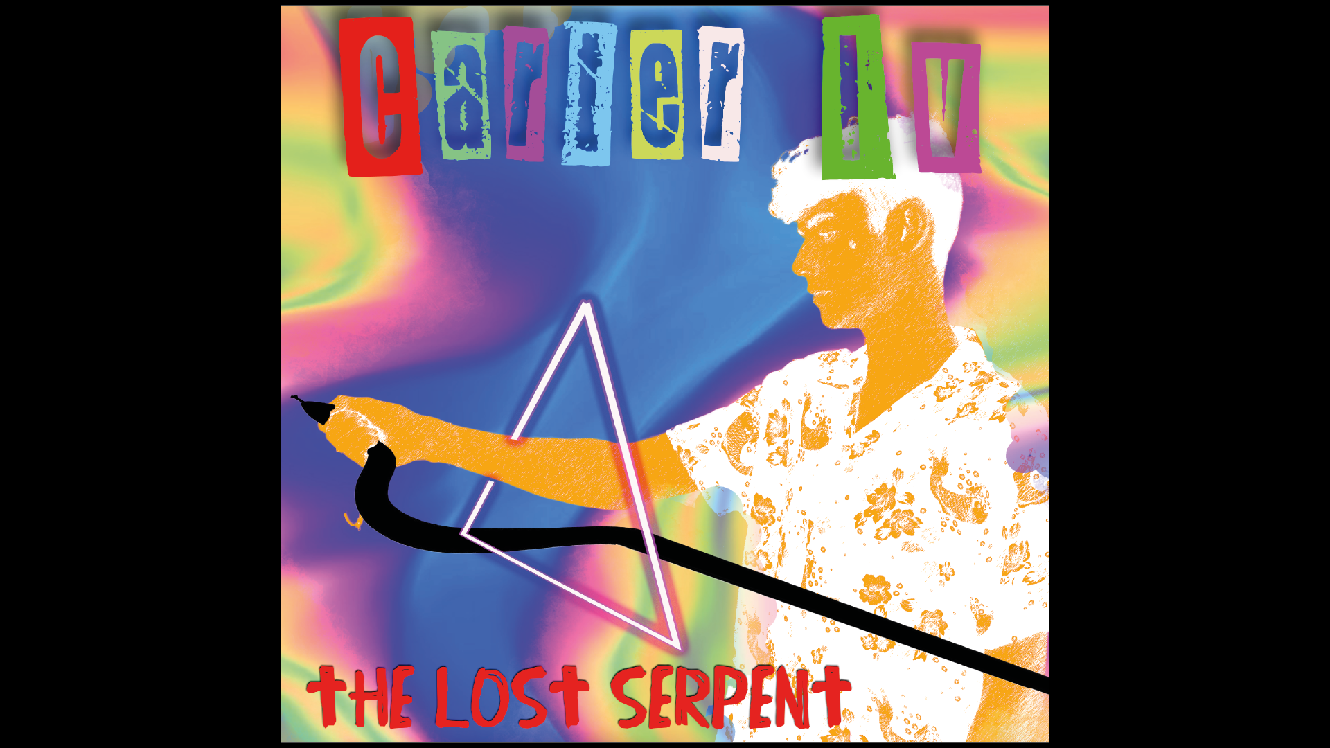
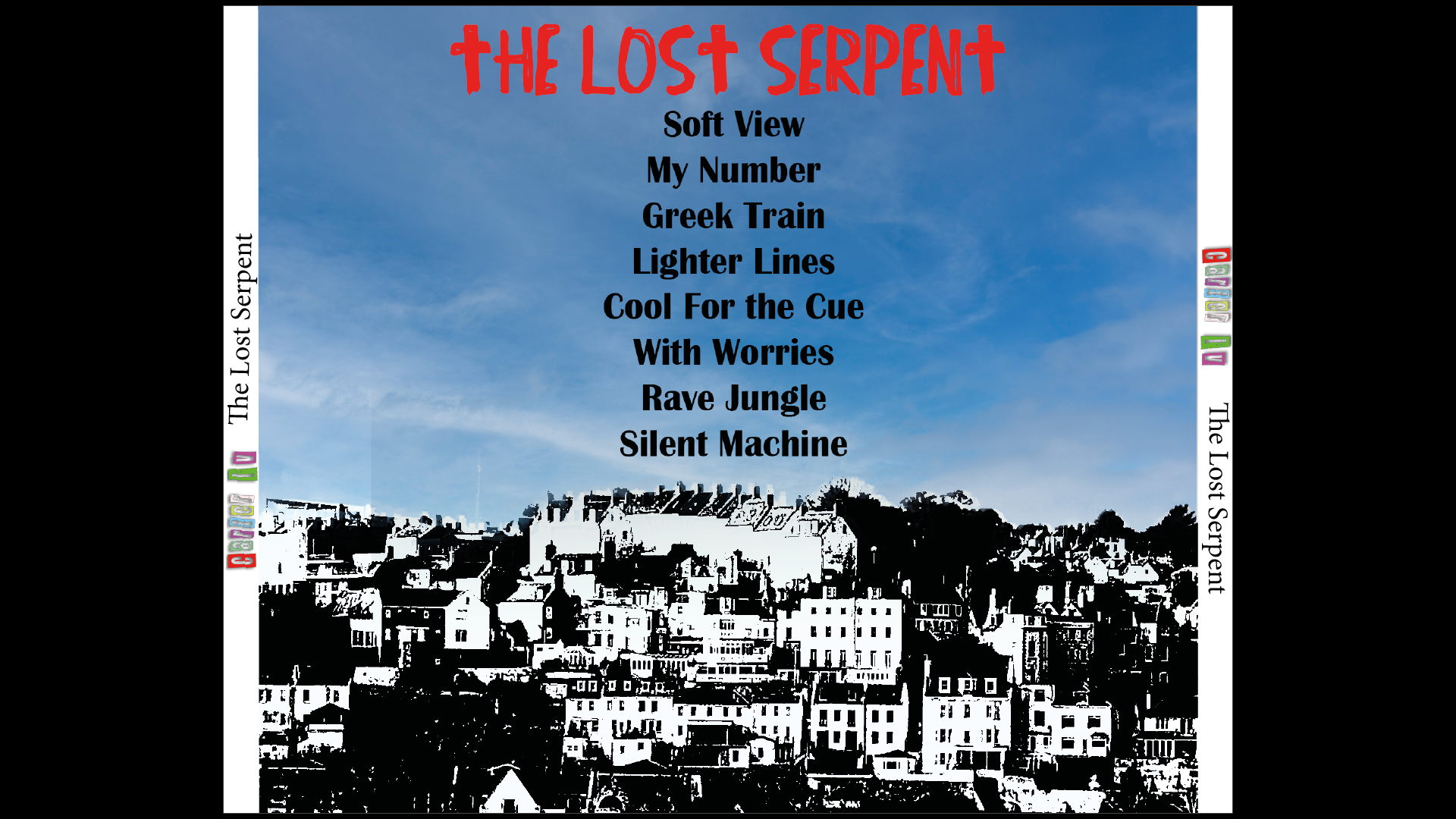
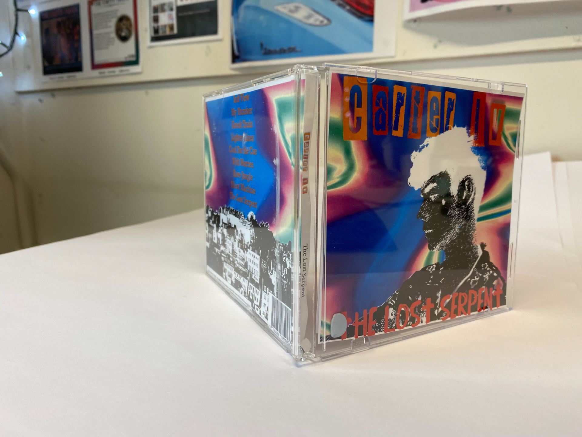
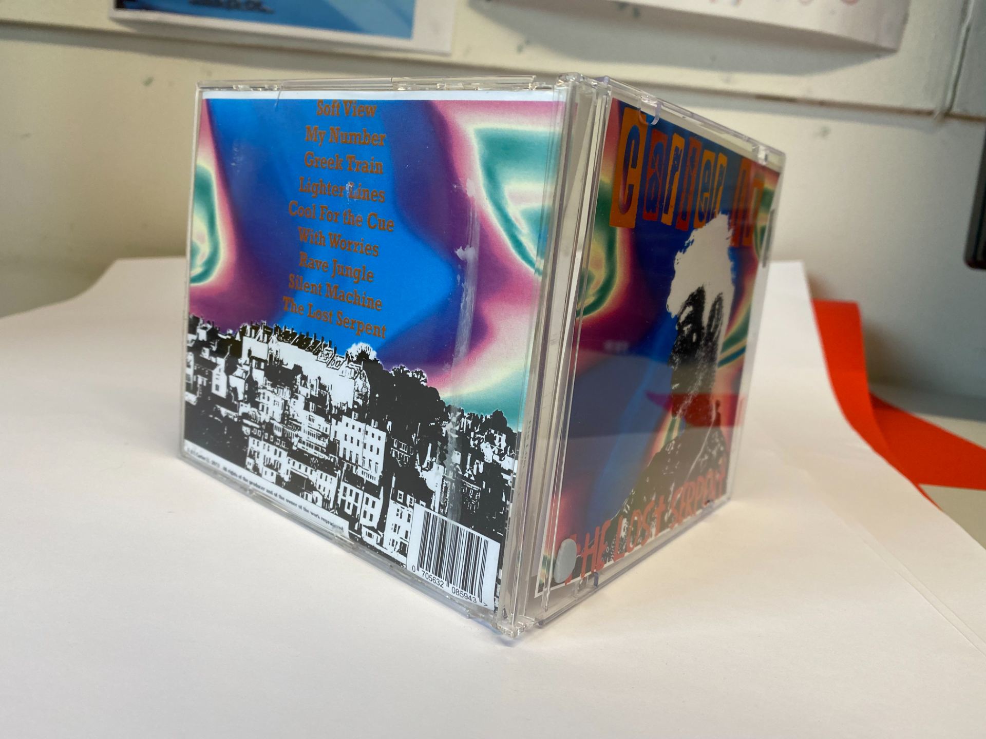
Here is our third draft of our digipak in a physical format of an album. From our screencastify feedback from our teacher, this is what we changed:

  • Changed the background on the back cover to have more coherence with the front cover.
  • Changed the colours of the artists name to match the colours in the inside pages.
  • Put a threshold filter on the front cover star.
  • Tried to make the snake link more in the inside covers.


I asked peers outside of media to get an honest opinion as they will have no idea what genre my group worked on. When I asked 15 of my peers outside of media for their opinions this is what genre they believed the album was from:

Indie – 5

Rock – 3

EDM – 4

Pop – 3

Rap – 0

These results were quite promising as our genre was indie rock and therefore if people were identifying our digipak as these genres. This shows that some of our conventions were successful in representing the genre. I think that people may have thought that the genre was EDM or Techno because of the very colourful background which is associated with EDM however it was used to challenge the genre and be unique amongst other indie rock albums.

Our teacher also conducted a survey with another group who had no idea who had made the digipak and what genres have been worked with, below is a photo with the results:

It isn’t quite the result that we expected as the majority identified the album as an indie pop album. I strongly believe this is due to the neon background, which is what was confusing the respondents. This would possibly be an area to work on if we were to do this again, as it is conventional to more upbeat genres than indie rock.

Digipack Draft 2


This is our full digipak draft which we submitted to our teacher for their feedback. Below is a screencastify where our teacher recorded our feedback.

After reviewing this feedback, our targets are as such.

  • Change the back cover – background needs to follow a similar theme to the front cover, too different to the other pages.
  • Make the snake go through both of the inside covers instead of only circling the cd on the 3rd page.
  • Instead of having the artists name in rainbow colours, instead pick colours from the artists shirt for the artists name.
  • Make the font of the song names more simple on the back page.

Digipack Draft 1

Personally, I believe that our digipak is a low level 4 at this stage. I think the biggest flaw is that the pages don’t link with each other which we need to change.

TARGETS:

  • Have more correlation between each cover, maybe go for a nature theme.
  • Add barcode and copyright to back cover
  • Retake cover star shot as it doesn’t have enough intimacy, it’s too far away.
  • Possibly change masthead font.

Evaluation of shoot or graphic design

Since our shoot on Friday, we have started to edit for our first draft of our digipak. In the process of choosing which photo to use on the front cover, we realised we didn’t get enough shots from a close up angle. This could limit the intimacy that we get from the star which we wanted to portray. Our initial plan was also to shoot our star lying in a field and we didn’t achieve that in the end due to weather however it may have been helpful to get that shot as it could be used as a front or back pane design. It is evident to us that we will probably have to do another shoot. This first shoot was not a waste of time as it has showed us where we need to work on and what will look best for us.

Photoshoot / Design Production Meeting and Risk Assessment


To plan for our Digipak photo shoot, we created a Production Meeting Agenda and a Risk Assessment. I have a lot of experience creating production meeting agendas and therefore I knew what to include. We aim to use a field for our photoshoot however this may be impacted if the whether is bad, which we have planned for and have booked the studio in case of this happening and we will make use of a green screen which could possibly allow us to experiment with more backgrounds that may not be accessible in real life. We believe that we should have enough time to do this shoot in 45 minutes since we have a clear idea of what shots we want to get. The costume we will be using is a floral button up shirt, as button up shirts are conventional to indie rock artists, but we will choose a floral one to make our star unique. We don’t feel that we need to develop the costume more as we will be focusing mainly on headshots and mid shots.

DP Mockup

This is the mockup for our Digipak that my group came up with after researching album covers and bands/artists from our genre (indie rock). We focused on these so we can portray our star in a way that is able to be identified as indie rock, while having a unique selling point to make it stand out amongst several other album covers.

For our own album cover, we decided that we wanted to have the name of our star in newspaper cut out letters as our genre typically has a cartoon and illustrated theme amongst album covers and this would be a creative font to include. Our star will be portrayed as cheerful as he will be smiling and happy while lying in a field. A wide range of the album covers that we analysed had a naturalistic theme within and we wanted to include this as it is simple to create and effective.

The back panel will include a picture of a sunny horizon from a field, with the song list in the sky or in the grass. We felt that a simplistic background would be effective as showing an endless horizon is dream like and many album covers have a dream like idea and we wanted to include a range of different themes and ideas in an artistic way without them clashing to attract an audience with their preferred reading.

Our star will be wearing a button up shirt over a white shirt, this was one of the most popular choices of clothing we found amongst indie rock artists and we may wear a floral/graphic button up shirt which will stop the star from looking too ordinary and boring and make him look extraordinary.

The Look Book – The Branding Package

Made with Padlet

My group created this mood board with inspiration from our genre (indie rock) for what outfits, themes, colours, backgrounds and styles to include in our own indie rock digipak. The digipak is a form of integrated advertising to promote our star image to our target audience, we will be able to promote our star image using a reprtoire of elements to be unique from other artists while staying true to indie rock. We focused on album covers, outfits and props as these are key elements that we will try to integrate into our own digipak. From this look book, we can begin to create a blueprint for our digipak which will be conventional to the indie rock genre.

Our Mission Statement – The Package Brand

Above is our groups presentation where we described our marketing strategy for our brand and identified our target audience and how we would cater to their preferred reading. To promote our brand and star, we will use social media mostly to reach a wider audience and used integrated advertising to access a large portion of the indie rock audience through alternative sources such as CD’s and physical copies.

Digipak Conventions Analysis

Click here to view pdf

To help us in creating our own digipak, we analysed an album cover for it’s formal and technical conventions. If I am able to identify these on any album cover then I will be able to include them in a professional manner when I come to doing it myself. On this Oasis album cover, the whole band is included as well as a range of props. There is a clear focus on Mise En Scene (Settings, props, costumes) to communicate meaning and convey the star image of the band. Having the whole band on the cover infers the idea that they are close to each other and all think of each other as important and this is a desirable image for fans to see. The font is in Arial and is very simple and which shows that they aren’t trying too hard which suggests that they are down to earth and ordinary. I now believe that I am able to use these conventions and use Mise En Scene to convey my star image.