All posts by bradoregan

Article Idea Development

I have been tasked to write up a draft for my Double Page Spread Article .

This is my Article Idea, my article will be based around my rapper ‘Lil Tobes’

The Article is interview based and will mainly be about the life of ‘Tobes, from his original inspiration to his future plans, this will gives the consumers something exciting to read about as it will be things they might not of known about ‘Tobes and it will also gives them an idea into what his future plans in the Rap Industry are.

My Work In Progress

Here all of my pages so far, I have made improvements to both my Front Cover and Double Page Spread. The reasons for the changes are to better my work to suit the conventions of my genre music magazine.

On my contents page I have added borders around some of my text, this is because without the borders it looks like there is no organisation and if the text ha just been thrown in there randomly. Also I aligned the text on the right to the right, this again makes the page look more organised and professional.

For my double page spread I re-positioned my quote on the image, this was because it is now in a more clear spot and looks tidy whereas it was in an awkward small space beforehand.


Language Analysis

‘The Beat (June 15) The Pulse Of Music Right Now

The article in the music magazine is written as an interview with the artist, we know this because there are questions being asked with the artist answering those questions. We are not aware of the presence of the journalist because we don’t get to see the actual questions being asked we can only see his replies to which we could estimate what the questions asked were. The impact of this is that it makes it look less boring and more tidy, for example if we were to see loads of quotation marks asking random questions to drag the article out it might persuade us to not want us to read. The article is written in third person to the artist, we know that there is an author writing this as they refer to the artist as ‘He’.

The feeling I get is that this interview was informal and was in a cafe other than something like a studio, I think this because of the language used and the way that the artist has given the answers in.  The wording again is formal chat and as they are talking as mates rather than in a interview for a music magazine. The wording and language fits the genre well as the genre is relaxed and chill, one of the metaphors that was used by the artist was ‘In a boat without a paddle’ this insinuated that he felt as if he was not going anywhere which was frightening, this shows that he is intelligent and can use good vocabulary. The reader will experience feelings towards the artist as he is talking about his life, the good times and the bad so the consumer may feel sorry for the artist but then again happy as he is succeeding.

Conclusion:

In conclusion I think that the article is written very well and in a way which the consumer will not get bored and stay interested. The choice of words and the mood of the interview works well and fits in nicely with the genre. I would hope that my Double Page Spread is similar to this as I personally think that this informality would also work very well with my genre.


Design Skills 2

Since my last Creative Critical Reflection I have learnt new skills on both Indesign and Photoshop, these new skills have helped me with my Music Magazine.

I have learnt how to manipulate the Border tool on Indesign. I now know how to change the thickness of the border and what it looks like, this helps to make the page look more exciting and it gives texture.

Another skill that I have learnt is that of the Burn tool on Photoshop. This tool helped me to darken areas of my images where I thought they were too bright.

Conclusion:

In conclusion I feel that the new skills that I have learnt have helped me in my work and will also benefit me for the future. I have learnt lots of new skills so far but can still learn more.

A New Improved Double Page Spread

What Was I Tasked With?

I was tasked to improve my Double Page Spread via the feedback i received on my first draft. A few of the improvements made were:

  • Boarder around image.
  • Repositioned image and text to allow good space for quote.
  • Changed the star to the same star as my front cover.

What Have I Learnt?

I hav learnt that giving your double page as good clear layout is important so that it has all of the required information but it also dosent just look all boring and de-interests the consumer.

How Will I Use This In The Future?

I can use this in the future as I now know how to layout a good Double Page Spread and I know all the conventions and how to integrate them properly.

Draft 3 – The Double Page Spread

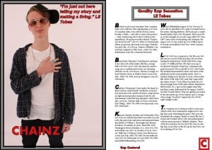
This is my first draft for my Music Magazine Double Page Spread, This includes a photo from my photo shoot. I made this Double Page Spread in Indesign.

Peer Feedback: Holly Langlois, I told Holly to look at various double page spreads as there are many different styles of this particular element of a music magazine. The reasoning Holly needed to research different styles is that so she understood all the conventions. 

Does The Image Create Enough Visual Intrigue?

“The model looks in control and as if he owns the industry, no one can better him. He is holding his record which tells me that he is excited about this record and wants people to hear, this will intrigue consumers as they will want to know weather they agree or disagree with the artists excitement.”

Are There Areas Where The Integration And Copy Is Distracting?

“Nothing is distracting, is all nice and clear for everyone to see and read”

Are The Media Forms Present That Are Conventional For A DPS?

“There are many conventional things about the double page spread, for example the layout is very typical and looks tidy and organised. There are some improvements to be made which would make it that bit more professional as they are subtle things but are still conventions.” Some improvements to be made are:

  • The boarder around the image to be more exciting.
  • Crop the image down to allow more space for the quote.
  • Make the text less boring (Big bold letters at the beginning of a sentence)
  • Text at the top of the writing to be in the center of the page.
  • I would also use the same star as your cover image.

Some Conventions Used Are:

  • Columned Text
  • Drop Capitals
  • Page Layout
  • Headline
  • Standfirst

Summery:

In conclusion I am happy with my overall feedback yet there are improvement I could make to make my Double Page Spread even better.


Design Skills 1

I have learnt many different Design skills and Production techniques while doing my Music Magazine.

One thing that I have learnt is how to add Boarders and Text boxes on Indesign to my pages. This makes my work look more professional and aesthetically pleasing as it will give a bit of Texture to my images and page.

Also I now know how to Arrange my sectors on my pages, for example to create an overlay effect, this can be used very usefully as it creates meaning and something exciting instead of looking stiff with no flow. This is a big advantage when using Indesign as its easy to organize and be creative.

One of the most important skills that I have learnt is how to Layer on Indesign so I can move images and layout my pages how I want them to be. It also assisted with my writing as I could make sure it all fit and looked good.

Lastly I learnt how to cut out images using the Magic wand tool on Photoshop.  This is good as it allows me to put different backgrounds and things with my images from my photoshoots. I also learnt how to use the Eraser tool, This helped me to clean up my image and get the best results possible.

The image below show how to use the arrange tool and the Youtube video shows us how to use the gradient tool.

Conclusion:

In conclusion all of the skills I have learnt throughout on Indesign and Photoshop have really helped me to get the end result that I wanted with my Music magazine.

A New Improved Contents Page

What Was I Tasked With?

I was tasked to make improvements to my contents page via the feedback i received on the first draft. Some of the improvements made were:

  • Contents alignment.
  • Boarders around all images.
  • Background.
  • Less fonts used.

What Have I Learnt?

I have learnt that having a background is hugely important as it gives texture to the page and it makes it look more exciting. Also making sure all text is aligned is key as it makes the contents looks tidy and is conventional.

How Will I Use This In The Future?

In future I will take my time playing around with different backgrounds so that I can ind the bet one to fit my work, I will also make sure all text is always aligned and legible.


Draft 2- The Contents Page

Here is my first draft of my music magazine Contents page, this includes a photo from my photo shoot in town. I made my Contents page on Indesign.

Peer Feedback: Braden Bougourd, I told Braden to research different contents pages so that he could understand the conventions and give me some valuable feedback so that I could make professional improvements to my first draft. 

Describe The Contents Page Cover Star- Their Star Image?

“The model looks very cool and looks like she is independent and charismatic. The look on her face is intriguing as she is very seriously glaring at the camera which connotes that there is a story behind this.”

Are There Areas Where The Integration And Copy Is Distracting?

“It is a plain contents page so everything is clear and easy to read, the bold fonts work well.”

What Aspects Do You Consider Conventional And Conventional?

“The image is conventional as it is large and takes up a lot of the page. Also the actual contents is done well as it stands out and is clear.  Something that is not conventional is that there is no background, even some colour would improve this.”

Some other conventional aspects of a contents page are:

  • Boarders
  • Bold Writing
  • Colourful
  • Clear

Summery:

In conclusion the feedback that I received was positive but there is obviously improvements to be made, the improvements I will make are:

  • All writing is in line.
  • Less fonts used (different fonts.)
  • Background colour.
  • Boarder around image in bottom left.