I was tasked to create a tour poster for my genre of ‘Psychedelic Rock’ so I therefore had to include things like:
Name of Artist
Name of the Tour
Dates and Venues
Info Such as Where Tickets Can be Purchased From.
I have found that manipulating: framing, colour schemes and fonts can help to show and represent the genre/mood you want so you can then pull out a target audience and make sure you are aiming your tour specifically to them.
I will use what I have learnt in my future work as I now know how to manipulate all of the features of a tour poster to attract a specific audience and make sure the poster is legible and aesthetically pleasing.
I was tasked to use ‘In Design’ to try and copy a professional front cover of a Music Magazine and to the best of my ability to get it completely the same.
Three things that went well for me were:
The colouring of the text, I got the correct shade of pink.-This is the video I used to help me figure out what to do correctly.
I managed to cut the image out and get it onto my cover, this means that I had the correct layers and therefore could place all of the text and other things onto the cover in the right places in the right colours.
The sizing of text/ Distances, for example at the top where it says ‘4 OF 10 SPECIAL EDITION COVERS’ looks almost identical to the real version. This shows that I got the layout correct but I did forget to underline the writing which is a negative but not massively important. I used this video help me achieve this.
Three things that could of gone better:
The size of the image, the image I have here is very wide and does not fit the page to scale like the real version, I could use a video to help improve this the fact that the image is to big means that it affected my cover as the layout was messed up, for example iI had to move the bottom left writing down as it was not visible on the image at first, so I either needed to move the text on change the colour.
Use more accurate fonts. I could take my time and explore a wider range of fonts so i can correct this error in the future. Foe example the bold text in the center reading ‘RIHANNA’ is the wrong font this means that it takes some of the professionalism away and the fact that this particular text is in the middle of cover means our attention is bought towards it so it should be correct. The font I used is too close together and bubbly where as it needs to be more spaced and bold. The text is also shorter than the original version.
Make sure I fill in the black gradients in the background, to improve this again I could watch a video tutorial. If I done the gradients properly then it would help the colour pallets to stand out more , as I did not do the gradients I feel that my cover looks plain in specific areas.
In future I will use all of my new learnt skills and hopefully more to create a professional and aesthetically pleasing cover for if I ever need it in my life for given tasks. I can also learn from my mistakes and make sure I do them better next time.
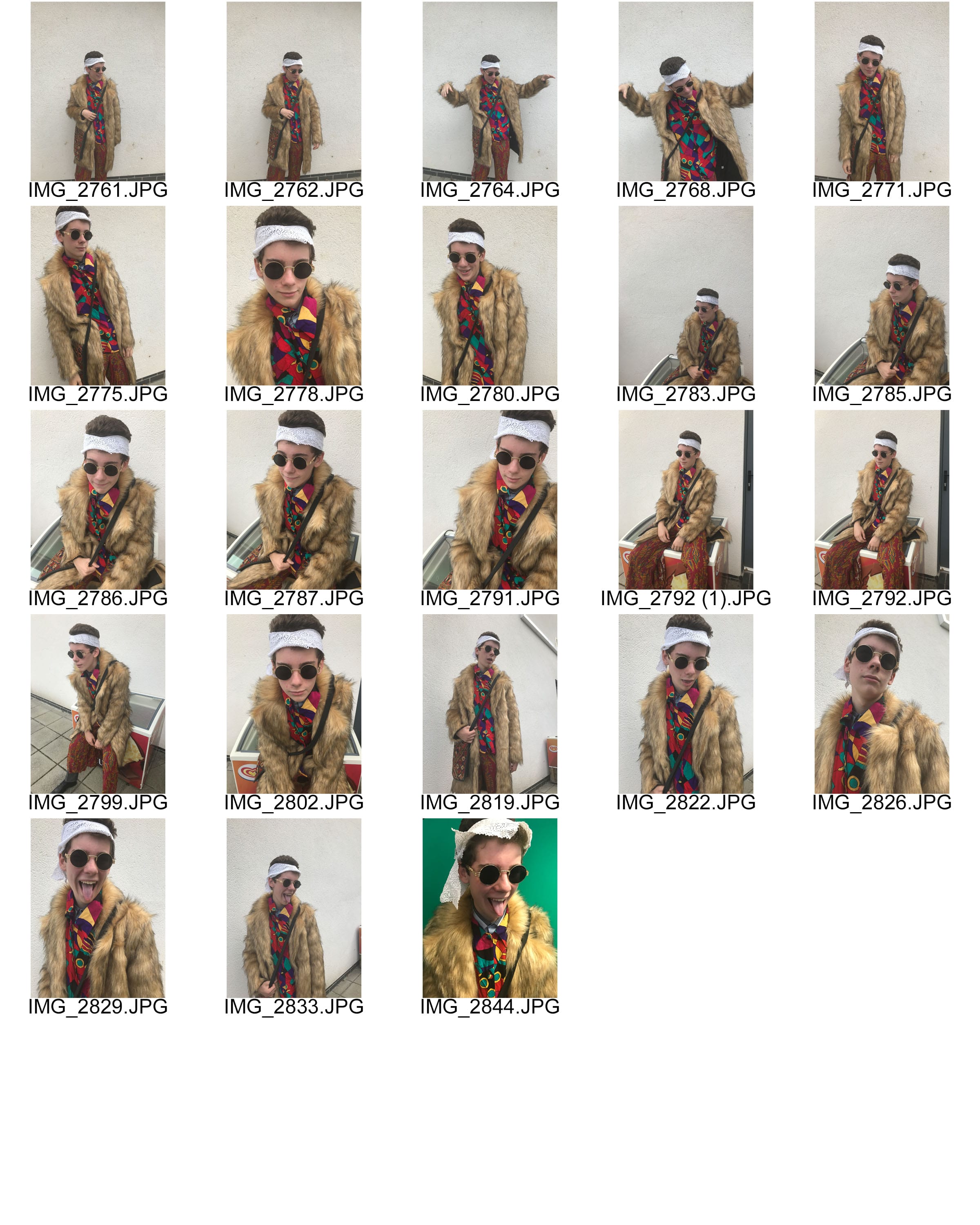
I was tasked to gather 9 photos which I feel create a story/meaning. All of the photos were take in one big photoshoot where around 70 photos were taken in total, this ws so i could pick 9 perfect images from the grand total. The reason I chose these were based on things such as:
Camera angle
Shutter speed
ISO levels
The photo-shoot taught me that by just changing settings on the camera and using different camera angles you can change the meaning of the image to what you want it to mean.
I will use my new knowledge to create meanings in future using a camera, for example my image on the row in the middle would connote loneliness and vulnerability as the model is sat alone on his phone with a closed body position.
I took lots of photo while exploring: camera angles, shutter speed, aperture and depth of field. All of these different elements of camerawork all affect the meaning that the image communicates. We have loads of photos that did not come out as we wanted and the main reason for this was the ISO, you can tell this due to a lot of our images being very dark, some other issues we faced would included things like the photo not being in focus. We had a handful of images which were successful in portraying the meanings and emotions we wanted, some of the emotions we wanted to create included: Loneliness, determination and inspiration.
This task has helped me learn how to manipulate elements of camerawork to create specific emotions and meanings behind photos.
I was allocated the Genre Psychedelic Rock. I found that this genre had the typical attire for rock music but was more colourful and full of life. The artist from this genre are represented as chilled and like drugs, the consumers of this particular music could be describes as relaxed and could look as if they are not in reality. The expectations of people who listen to Psychedelic Rock would be that they like to rebel and take drugs such as LSD and to be very relaxed and chilled people.
Some of the description words we received for our model included: Druggy, Hippie and Funky. These are the adjectives we wanted to improvise with the way we have represented our model. I think that our model fits in very well with other artists of genre due to his similar dress and accessories. Therefore I think as a producer I think as a producer I have made my model look very realistic as if he was a real Psychedelic performer who was about to go out on stage and put on a show.
In my contact sheet I have a wide range of photos with:little facial expressions, lots of facial expressions, good body language, good framing and bad framing. All of our photos are pretty good quality (Not Blurry) and I also think that I have captured the typical psychedelic rock artist during many stages of their concert or possibly just a general day at home. I could of used more extreme close-ups to show specific body parts, I could of also used different angle shots (high and low angle) to capture different angles on my model but I only used level angles.
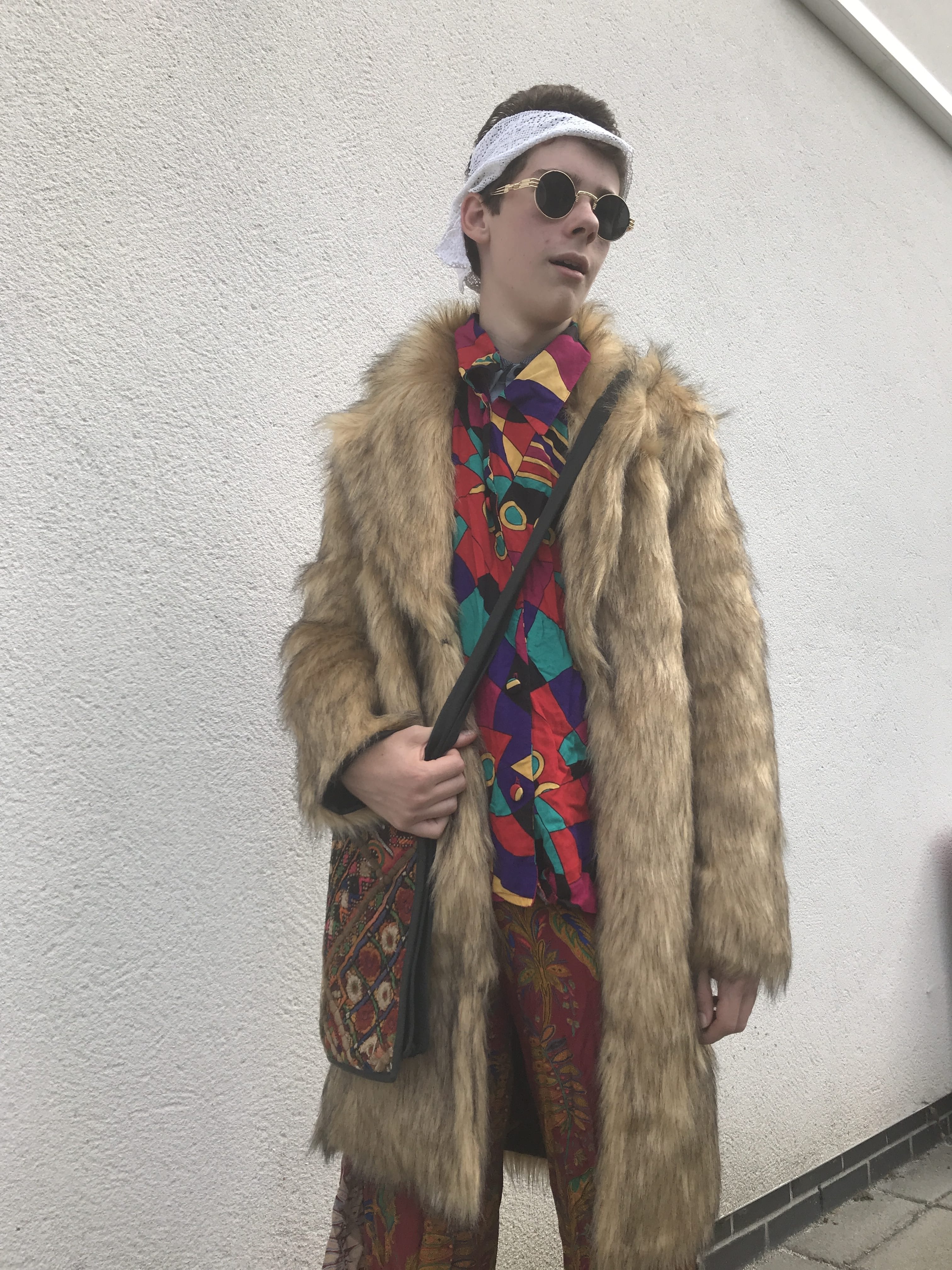
This is my final photo, I have chosen this because I feel that this particular image captures the psychedelic rock genre really well. My models facial expressions and body language connotes relaxation and dazed which is what we wanted the audience to realise. We have used a low-angles shot so we can see his facial expressions better while still showing his body. This photo stands out from the rest because I think the way we wanted to portray my model is perfect and the framing in this image is better than the rest. Using Mise-En-Scene in these photos are really important so that consumers can work out what my model (genre) as they have nothing but the image to work this out. This will impact my planning and research for my magazine cover as I now have better understanding in picking out the elements of Mise-En-Scene in images and can reveal meanings behind images.
I was tasked to analyse the Mise-en-scene for this music poster, so I looked at the: Costume, Lighting and Colour, Acting, Make-up and Hair, Props and Setting. Using these aspects of Mise-en-scene it helped out to pick out the denotations and connotations from fine details.
I have learnt that at first sight you may not understand or figure out the connotation until you break the image down, for example: You may not think Rita is sexualised as she is not showing a lot of skin but her facial expression is very feminine and does in fact sexualise her.
I can use this is my own work because I can now understand how to create more meaning using Mise-en-scene so could therefore make a meaningful piece of media.

 Real Version
  My Version