In the lesson my group was allocated the Psychedelic rock genre of music to research and make a mood board on. From our findings we found that Psychedelic rock was very centered around “psychedelics” and the trippy highs you go on after ingesting these drugs. It’s very colorful, bright and alternative. I’ve noticed a very distinct link between hippies and this kind of rock genre.
Some of the most important Mise-En-Scene conventions of psychedelic rock is bright colours, a general look of drug endued blankness, unconventional stand out clothing,

From the posit notes that I received from other members of the class who observed my outfit I’ve found that most of the class got the impression of what we were going for, with words such as “Funky”, “druggy,” and “High” being some that really represented the look we were trying to pull off. All the responses are as follows:
- Drug Dealer
- Alternate
- High
- Druggy
- Funky
- Hippie
- Content

IMG 276 – 277 I find quite strange, I’m not too sure what’s happening with my arms and I personally think I look rather lost.
IMG 279 I like it’s quite strange and alternative that I’m sitting on an ice cream cooler, but that’s what we’re aiming for, the strange, the weird and wacky.
IMG 283 – 277 (Bottom Row) All the green screen photos I don’t like, it’s too close on my face and I don’t have a very nice complexion to warrant close up photos.

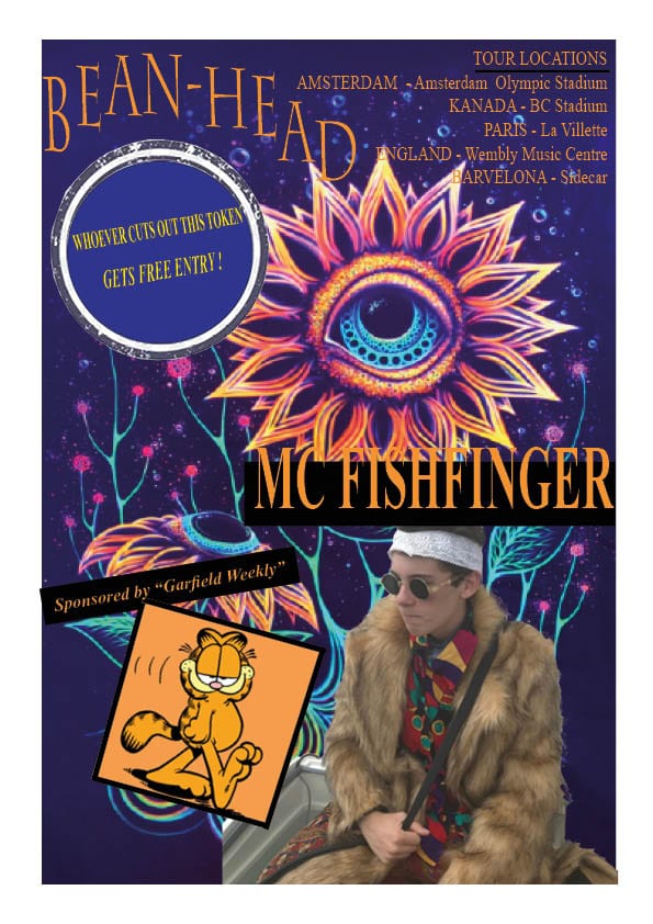
I personally like this photo out of all of them, I’ve chosen this as my final photo because the angle is good, the lighting is perfect, there’s no blur, my facial expression is calculated like entranced in some deep thought. My outfit is clearly visible and the fur coat especially looks great.