Eddie Crawford (Media Blog)

Just another Guernsey Grammar School Sites site

Category: Preliminary Print Tasks

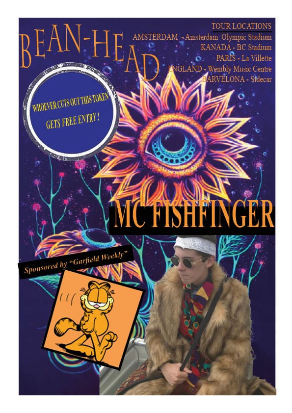
My Tour poster Analysis


Feedback on the Brief

Your comment: Somewhat, my poster includes two and a half articles of the five that I had to include
Feedback on colours:

  • Has the design used a consistent colour scheme?
  • Is there a relationship between the colours in the image and the colour of the graphic design?
  • Do the colours seem typical of the genre?
Your comment: My poster has used a consistent colour scheme of black and orange.There is no correlation of the colours in the image and the graphic design. The colours of the genre are not as refined as the ones I have chosen, the genre is more colourful and contrasting rather than consistent.
Feedback on typeface:

  • Is all the text legible?
  • Is the typeface well chosen and does it suit the apparent genre?
  • How many typefaces are used in the design?
Your comment: The text is very legible. The typeface is also very defined and smart, I don’t believe this is representative of the genre. One typeface is used in the font.
Feedback on integration of image and graphics

  • Does the text wrap around the image well?
  • Does the eyeline of the model focus attention?
Your comment: The background image is ugly in my opinion and I would have changed it is I knew how, the text is in conflict with it and it looks tacky. The eyeline of the model focuses attention on the sponsor message not the title of the tour or artist.
Feedback on image

  • Does the costume reflect a particular genre?
  • Is the body language of the model appropriate?
Your comment: The costume is very representative of the genre. I believe that it is though I cannot describe as to why it is, it simply seems to fit.
Feedback on copy

  • Do the words on the page prompt a sense of desire?
  • Is there a clear call and a route to action? (AIDA)
Your comment: The words on the page don’t really prompt a sense of desire, it looks like a ten year old designed it. What is that?
Feedback on connotations

  • What messages and ideas are being communicated in the text?
  • Do those messages and ideas seem appropriate to the genre and purpose of the text?
Your comment: The messages and ideas being communicated in the text are not there I simply don’t see a hidden meaning in them because I did not write them to have one. Well I included a few countries that have legalised the use of marijuana which is conventional of psychedelic rock, such as Kanada and Amsterdam.


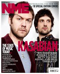
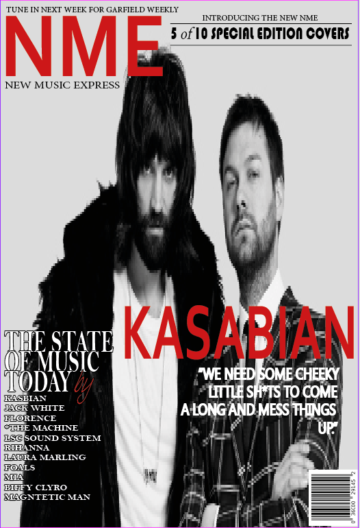
My copy of professional magazine cover

My copy of Professional Magazine Cover


Weaknesses:

– Background is blurry and pixelated

– Some of the fonts are not true to the original

– The red text on my cover isn’t the same dark purple as the original

Strengths:

– The colour palette is consistent


Contact Sheet + Mood Board


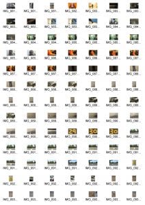
Contact Sheet:

What we did: We were given DSLR cameras and were told to take photos utilizing angles and techniques that professional photographers may incorporate into their work. Such as low angles, high angles, mid shots, long shots, working out the shutter speed, aperture, focus etc.

What have I learned: I have learned to not delete our failed photos when creating a Contact Sheet. We made the mistake of deleting photos that we deemed failures and instead filled our contact sheet with loads of excellent photos. The problem there is that we can’t see our progression as we get better acquainted with the camera equipment.

How will this help me: This experience will help me for the future as I create more contact sheets I will now know not to delete previous works as I need to fill up the contact sheet with my progression of quality photos.

Mood Board


Designing your Music Star


In the lesson my group was allocated the Psychedelic rock genre of music to research and make a mood board on. From our findings we found that Psychedelic rock was very centered around “psychedelics” and the trippy highs you go on after ingesting these drugs. It’s very colorful, bright and alternative. I’ve noticed a very distinct link between hippies and this kind of rock genre.

Some of the most important Mise-En-Scene conventions of psychedelic rock is bright colours, a general look of drug endued blankness, unconventional stand out clothing,


From the posit notes that I received from other members of the class who observed my outfit I’ve found that most of the class got the impression of what we were going for, with words such as “Funky”, “druggy,” and “High” being some that really represented the look we were trying to pull off. All the responses are as follows:

  • Drug Dealer
  • Alternate
  • High
  • Druggy
  • Funky
  • Hippie
  • Content


IMG 276 – 277 I find quite strange, I’m not too sure what’s happening with my arms and I personally think I look rather lost.

IMG 279 I like it’s quite strange and alternative that I’m sitting on an ice cream cooler, but that’s what we’re aiming for, the strange, the weird and wacky.

IMG 283 – 277 (Bottom Row) All the green screen photos I don’t like, it’s too close on my face and I don’t have a very nice complexion to warrant close up photos.


I personally like this photo out of all of them, I’ve chosen this as my final photo because the angle is good, the lighting is perfect, there’s no blur, my facial expression is calculated like entranced in some deep thought. My outfit is clearly visible and the fur coat especially looks great.


Album Cover Analysis

This is my textual analysis of the poster “Demon Days” produced by Gorillaz the fictional band consisting of “Merdoc” a Satanist, “2D” an unfortunate bystander, “Russel” an LA gangster possessed by the demons of his murdered friends and “Noodle” a small Asian girl who is in fact a supersoldier, that arrived at Kong Studios in a Fed Ex box. (I’m not making this up, this is the actual story behind the band.)

My task was to analyze the poster and look deep into the design choices made by the artists. From this, I’ve learned that Gorillaz is a very extroverted refreshing band. Their image is unique and stands out from many of the competing rock/pop bands out there. Not only has Gorillaz made their way to the top, but they are also maintaining their position at the top. From analyzing this poster I’ve learned that in order to properly analyze a piece of media you must look deeper than usual into design choices and pick out the meaning behind these choices, whilst referencing key ideas of media such as the Blumler and Catz theory.

Skip to toolbar