Month: January 2021
Draft 1
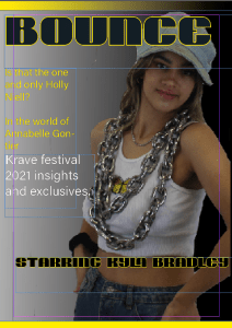
Here I have my first draft of my tour poster…
Upon evaluation of my first draft I have concluded some factors to help improve my work.
To start off my main image needs to be brightened in order to clearly see her face and pull the image concentration towards my main cover star rather the yellow mast head.
The cover line needs to have its font changed to match the other text. It can also be pulled slightly towards the right side.
The text on the left side of the page need to be smaller and pulled down in order to fit a pug and other factors in order to further update my magazine.
Lastly, There needs to be a barcode and issue date somewhere on the bottom of my magazine.
Language Analysis
In preperation of my double page spread I will start to create this week, I will be analysing an article of my choice off our Media Blog. The article I have chosen is just below and is number 5. on our blog (New Band).
