
Loading…
Loading…
Dear future students of A level media ,thank you for reading. This letter is about the media course you plan to attend while in Guernsey. Thank you. The letter should give you the information you need about the course and my own opinion.
Taking A level media in sixth form taught me numerous new abilities. For example, I learnt how to utilise Photoshop and other tools to make DSLR shots tell a narrative. For example, I utilised colour gradients and palettes to emphasise particular portions of the picture to convey deeper connotations. When I utilise the programme later, I’ll use a camera to shoot the photographs I’ll use in the software, along with other important camera settings.
The course taught skills including communication, time management, organisation, and cooperation. These skills are adaptable. To turn in work on time and keep up with it, I needed time management skills. Developing this talent has helped me much in my studies of media and other areas. Our lesson also covered photoshop and how to make an image more appealing and conventional/ general so that people reading the magazine know it’s about hip-hop! Learning to utilise the dodge tool, for example, improved my magazine photographs. I utilised this talent often to make my model’s eyes pop and shine, making her seem bright and optimistic to everyone who viewed the photo. This class taught us three things. We learnt how to use Indesign to design a product using a photoshop picture. InDesign will be used to create a music magazine with a front cover, contents page, and double-page spread. After the first year, you will be able to create a stunning magazine using this programme. Finally, how to generate contact sheets with Adobe Bridge is an easy approach to conserve space while displaying your work online. Each term, you’ll learn the tools you’ll need to create and edit your work. This will aid your technical production and skill transfer.
Using Photoshop, InDesign, and Adobe Bridge has been incredibly beneficial. In the first year, you will study about AIDE (attention, interest, design, and action), mise en scene, story, star image, representation, and audience. I’ve also learnt how to utilise these terminology in my music magazine and blog. Adobe Indesign, one of the technologies we use to create course material, is simple to learn. Making fantastic media and using all the other skills they gain while working on their projects may be done with the help of a few tutorial videos on YouTube. The layout of the page and how photographs are framed are all examples of how creative design can be employed in a blog post. This may effect how an examiner views your work and perhaps your total mark. This school year, my class created a music magazine from start, with no pre-written articles or photos. There are several ways to create sixth-form media studies course content depending on where you reside in the UK.
Good luck with your next two years. My greatest recommendation is to keep up with your work since the sixth-form course never slows down for anyone.
My name is Jacob Jansma, and here is riptide, my music magazine for 2021. The magazine is centred on the fast-growing emo-rap genre.
My publication is well-designed and focused on interacting with readers, expressing their thoughts, and promoting upcoming underground artists. These elements distinguish it from other music and general publications.
Researchers used YouGov, an online platform, to find out who was listening, their ages, preferred bands, and interests. I produced a magazine based on this information that would appeal to my target group. For example, employing internet analytics has helped me increase the quality of my magazine by 15%. Juice WRLD is more popular among millennials than among other age groups. The same may be said for other genre artists. Using this information, I may use colour plates and cultural traditions to make the magazine more appealing to millennials .
Because they’ve had success with magazines like Vogue and Vanity Fair, I’d definitely choose Conde Nast as my distributor. This will help my magazine’s brand get recognition. Furthermore, among the brands Conde Nast already produces, there are few music publications, which advantages ‘RipTide.’ Vogue, The New Yorker, GQ, Wired, and other Conde Nast journals have grown into important media entities.
Because we promote their viewpoints on modern culture and other themes common to the niche demographic I chose, the designated audience will choose my magazine. As an example, we have large giveaways for concerts and record products by their favourite musicians, such as tickets to the next rolling loud concert, which is a significant event in America every year based on a grace yates song. We also talk to our fans to gain their feedback on the magazine and to come up with new and creative ways to promote our brand via media like information, entertainment, personal identity, and social interaction. Aside from that, the magazine’s style entices customers from this demographic to purchase our products.
I chose a Bose headphone commercial and a concert flier for the blog entry above. Using these well-chosen advertisements will assist my magazine in promoting music and in informing my readers about products and where they can be purchased. This will also aid with the promotion of my magazine via sponsorships such as the No Jumper and Narduar talk shows, as well as concerts and festivals such as Rolling Loud, Glastonbury, and Reading. Another strategy to promote our brand is to promote bigger companies such as Bose headphones and clothing brands such as RIPNDIP, Santa Cruz, and others.
For my magazine, I’m looking for online publishers/advertisers. Making social media profiles, items, and giving out freebies are all things I do. Using the internet to develop an online edition of our magazine will also assist us in attracting readers and other types of attention from across the world.
This is my Emaze post on the conventions of the media industry. I have and noted down key conventions and explained them in detail with examples.

Component Brief 2:
A promotion package for the release of an album, to include a music video (major task), together with a
website for the band and a digipak for the album’s release (minor tasks).
Component brief 1 :
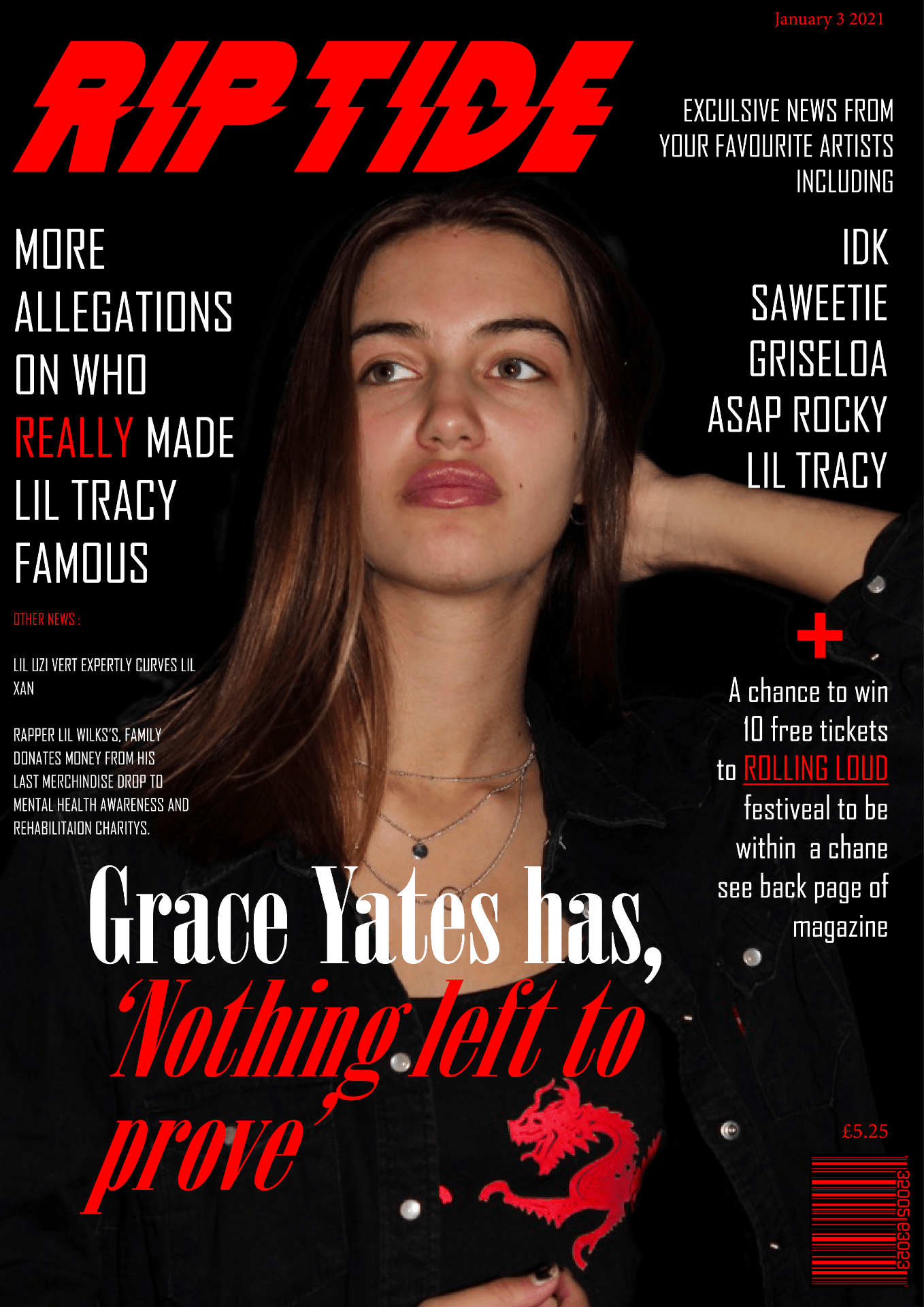
This is the finished product of my music magazine with the flip stack. after listening to my peer teachers peer assessment in screencasting I have amended the issues brought up and changed the placement of some of the text and images to fit the page better.
Front cover:

Contents page:

Double page spread and article:

Flip stack pf complete magazine:
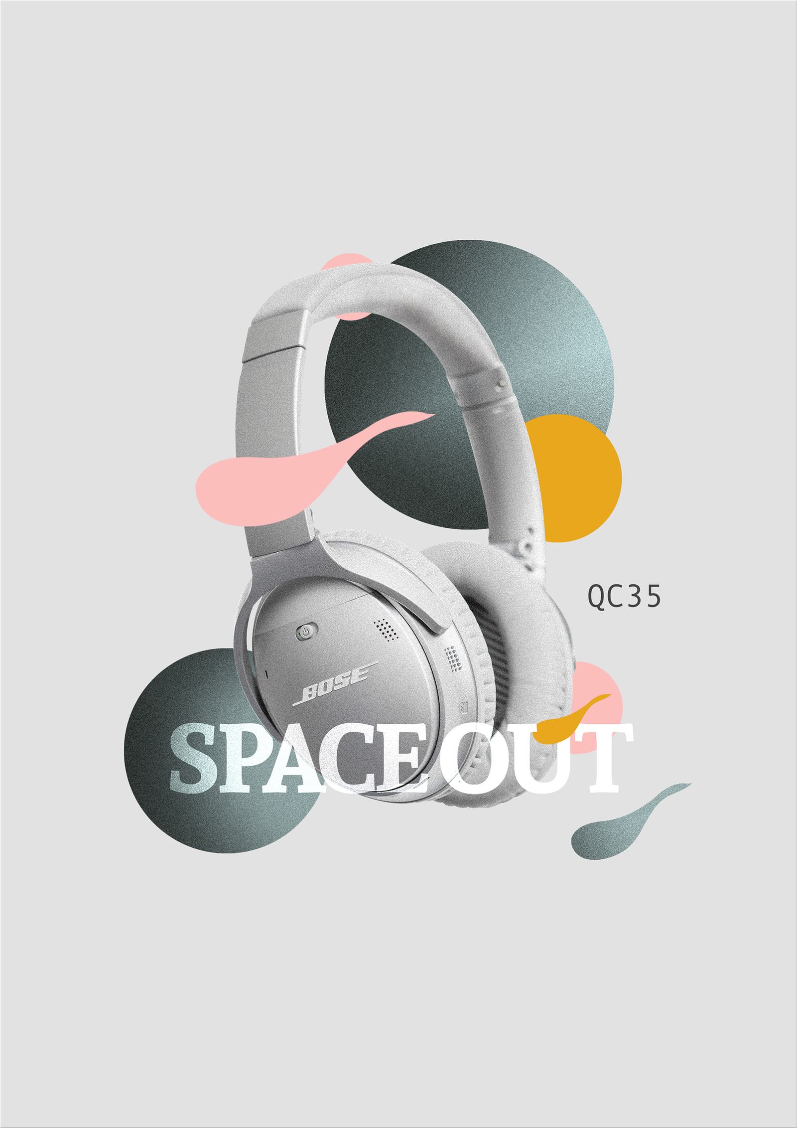
I have chosen this advert for the Bose headphones for my music magazine as they relate well to the magazine I have learned this by studying multiple demographic conclusions of this genres audience. Furthermore, the audience that of which the youthful music genre have chosen will be able to relate well to this product as they often listen to music and hold it close to their personality as well as interests. It will offer them of way to express themselves through music whilst listening to their favourite album using a premium product designed for the best sound. Below I have added a screenshot of demographic graphs that prove my theory about the interests of the audience.


For my second advert, I have chosen a music festival advert from a magazine. It would be a good idea to involve a means of self-promotion for another festival/concert as the audience that is in my chosen genre often go to a concert of their favourite artist whenever they get a chance. Therefore giving the consumer more information about big events or concerts will be considered very help full and could help promote the magazine as a billboard to get the riptide name around.

What’s new:
Added bottom text
Changed the style of the article layout
Used photoshop more the right image
What’s new:
I changed the position and size of the masthead as well as the size and grammar in the cover line.
Most of the design of this draft is the same as the last draft apart from the peer assessment tasks which were mainly resizing.

What’s new:
For this draft of my contents page, the music magazine I changed the top image from an image I found on the internet to my own and photoshopped it to fit in with the colour pallet.
I also highlighted the keywords in the contents headings to make it more eye-catching for the audience as well as making it easier to read.
Furthermore, I added the page number making it more like a real magazine.

What’s new:
move the right image around and moved the article paragraphs more to the right and fixed to the subheading to fit the page better.
proofread the final article and changed the story around a bit, also added the masthead at the bottom of the first page ‘ grace reflects on tragedy to give more context the article.
Screen castify peer assessment:
Looks good and is mostly finished just need to tweak the layout of the pages to make it more appealing to the audience changed some of the grammar and where the subheading and title around the page/ made bigger. Good pictures. tweaked the contents page to make it even and make fonts bigger ad remove the page in the page number from the last draft. make the number match up and give more contested about the DPS article in other parts of the magazine. Move images around to make fit on the page better/ don’t leave empty spaces.
Screen castify link:

This is my 3rd content page draft after changing the previous draft to suit better the the intentions of advertising thought previous peer assessments.
WHATS NEW:
I change the # and the masthead around to make more appalling to the audience.
I added her name and who took the image to the bottom right side on the page for reference.
I changed the front of the number to standout more as well as fit the page design.
Lastly I changed the grammar an most of the contents titles as they there didn’t make sense or were to long for the boxes even/
Peer assessment:

Here is my second draft for my music magazine front cover based around emo rap. below I have include a peer assessment of this draft so that i can improve the product further. As well as what I did differently to this draft.
what is different:
peer as
mast head bigger
main cover line should be Grace yates has ‘nothing left to prove’ and look at line spacing and perhaps a different font for Grace yates
one more cover line under the famous one
make the 3 on the right hand side make sense
issue and price etc.
make the skin tone slightly less flushed?
make her bigger