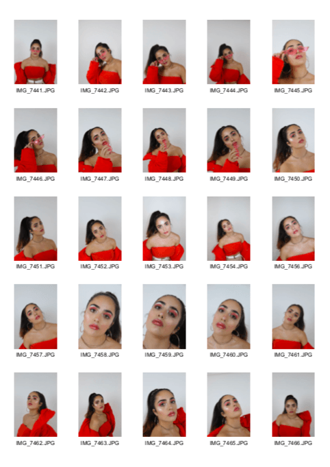
First Shoot contact Sheets.
Below is my resulting contact sheet for my first shoot, relating to the star image for my music magazine front cover. I believe this went very successfully and in the photos I managed to portray the attitude and confidence I aspired for.
In these images I maintained a simple colour scheme. The dominating colour being red which is instantly eye-catching. The other colours which subtly make an appearance are tan and white, these simple and neutral colours emphasise the boldness of the red without over doing it and confusing the eye. I also use a white studio background my models hair is very dark so it will be easy to photoshop her out of the image as these are light and dark contrasting colours.
The outfit I used was fairly simple yet very statement and apparent. I matched the colour of her bandeau to the puffer jacket, both being red. I feel as though this pairing is really what Brough the whole outfit together. In contrast this I dressed her in tan trousers and a white belt with a gold buckle, these neutral colours make the rest of her outfit pop even more and draw the viewer attention upwards to her face. The trousers are almost combat pants styled which goes against female norms and make her appear edgy. Finally for her shoes she wore black, chunky heeled boots. Pairing this with the style of trousers could be seen as unusual therefore putting a girly twist on a tomboy styled outfit. To accessorise, I added a simple neckless and hoop earring both of which were gold to match the buckle of the belt. The hoop earrings add a lot of sass to the outfit and the neckless adds a small amount of delicate detail to such a bold and prominent outfit. Lastly I topped it off with pink vintage glasses which add a slight retro feel to the costume as well giving my model an item which she could pose with and have fun with, using it to create a sense of arrogance and attitude.
I tied my models hair in a slicked back high ponytail. I used a scrunchy to do this as it added hight and volume to the ponytail and I kept her hair straight to make the look appear as sleek and polished as possible. Keeping the hair simple and out of the way bring the focus to her face and makeup. I kept her skin as glowing as possible, applying generous amounts of highlighter. On top of this I applied pink gloss to both her lips and eyelids, adding to the glistening look. Also, the colours I used for this mirrored the red I made apparent in her outfit.
In terms of poses, I gathered a lot of inspiration from images I used in my Pinterest moodpboard and as well as thinking of my own, I recreated many positions which I had found relating to my genre. Overall, I wanted to keep these poses as confident and sassy as possible. I also used accessories such as her glasses to mix up her stances. In addition a used simple white box which I used to create more of a variation of levels in the images, finding different ways to show off her costume. I asked Melissa to keep her facial expression serious and emotionless, sharpening her eyes on the camera. The personality traits I wished to achieve by doing this was confidence, attitude and sassiness.
Lastly, I tried to use a variety of camera shots in my photographs, giving me a greater choice of potential layouts I can select when coming to created my magazine. Although the main shot I used was a mid-shot I also experimented with close ups and long-shots as well as low and high angles; all of which signify different things.
In conclusion I think there are a potential 20 images which I think could be successfully used for my magazine cover. I think my shoot went very well and many of the images look polished and professional. Despite this, to improve I think I should of added some wacky props to add more individuality and strange interest and uniqueness to my photographs.