
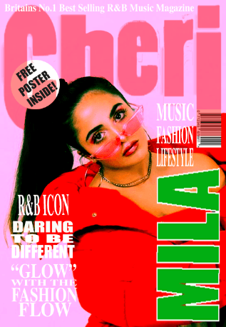
Draft 1 – The Front Page
 Feedback:
What genre of music is the magazine?
Contemporary R&B
Describe the front cover star using adjectives:
- Sassy
- Confident
- Daring
- Arrogant
- Audacious
- Bold
Are there any areas where the integration and copy is distracting?
The text in the bottom left corner looks slightly jumbled and the white is difficult to read against the light violet.
What aspects do you consider conventional and unconventional?
The placement of the barcode is unconventional as it is too high and hard to find on the page so it would be difficult to scan in a real life and practical situation when the magazine is being brought.
How can I improve?
To try and find a more hard-hitting plug and get rid of the amount of contoured white glow on the models nose and forehead.
Pros:
- The colour scheme works well
- Overall the magazine looks clean and sleek
- Good use of mise-en-scene for the main cover star
- There is a strong vibe coming across and it feels very contemporary
Cons:
- The layout of the magazine
- The pug isn’t that bold
- The storylines aren’t that intriguing
Targets for developement:
- I will try find a more hard hitting plug.
- I will get rid of the amount of contoured white glow and shine on the models forehead using photoshop.
- I will get rid of the shading around the masthead.
- I will move the barcode and find a more practical position for it.
- Rearrange the information around the star image.