Category Archives: Component 1

Chosen Adverts

Advert 1

Advert 2


Review

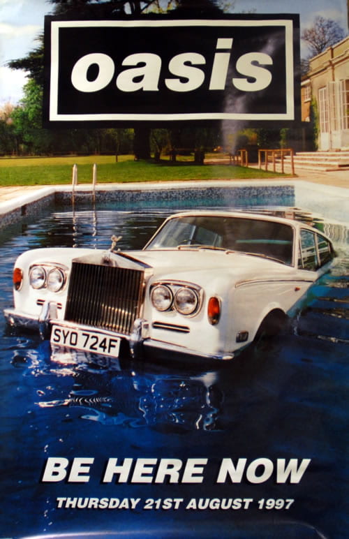
I have chosen these adverts because they are based on two Indie artists/band.  Advert one is advertising Billie Eilish’ tour showing dates. Advert two is advertising an oasis album. I think these adverts are appropriate for my target audience as they are Indie Pop which is the genre of my magazine. Therefore, they will satisfy the audiences interests. The demographics of me audience are young, female, lively, outgoing, etc.

Third Draft of Magazine

Draft 3 Front Cover

click to see PDF

Things I changed from draft 2 to 3

  • I made the eye brighter – I made them more blue and the white more vibrant.
  • I also made her teeth whiter.
  • I de-blemished her using photoshop as well.
  • I added a bit of sparkle to her top.
  • Added more cover lines to fill in gaps.
  • Made the pug a little smaller and moved it.
  • Added in the genre of music.
  • Moved the date to the top.
  • Added some orange text.
  •  Moved the barcode to the right side.

Draft 3 Contents Page

click to see PDF

Things I changed from draft 2 to 3

  • I rearranged the text and images to make it feel a little less squashed. To this I removed and image and a page number.
  • I made ‘CONENTS’ bolder to make it stand out.
  • I gave the actual page a page number.
  • I wrote the names of the people in the insets.
  • Got rid of an image so that there wasn’t two of the same artist.
  • Moved the orange lines so that it didn’t look like a flag and to fill in empty space.
  • Changed the sense of ‘tour dates’ box.

Draft 3 DPS

click to see pdf

Things I changed from draft 2 to 3

  • Made the title more bold.
  • Spread everything out so it’s not so squashed.
  • De-blemished her on photoshop.
  • Moved the insets.
  • Got rid of the empty space.
  • Added text related to insets.

Feedback from Draft 3

Reflection – Front cover

  • I need to sort out my cover lines around her hands and make sure the middle doesn’t overlap her hand. Also make them all capital letters.
  • Smaller spaces between the cover lines.
  • Make Freya Rose cover lines bigger and move more to the right so the jewellery can be seen.
  • Add price and re position barcode.
  • Move everything further away from the spine.
  • Move ‘reeze’ part of Breeze further up.

Reflection – Contents Page

  • Move the titles for the images inside the box and add the page number for where that artist is featured.
  • Make titles bigger and boxes closer together.
  • Edit page number from 2 to 3.
  • Add something along the long line on the cross.

For my final contents, I think I will go back to the layout of my original contents page as I have realised I prefer and fits better with the theme of my magazine.

Reflection – Double Page Spread

  • Make stand first bigger.
  • Move drop capital to where the article starts.
  • Make questions a different font and/or colour.
  • Delete hyphens.
  • Too crowded.
  • Make titles fir images different colours or font and make them shorter.
  • Correct page number.

Second Draft of Front Cover

Second Draft

Click to see PDF

Things I changed from draft 1 to 2

I decided to restart my front cover as I wasn’t happy with my first draft. However, I did decide to still use  a lot from the original one but I also changed a lot.

  • The background photo – I did this because I feel she looks more confident in this photo and it also fills up more space so there aren’t any gaps.
  • I also added some detail in the top left hand corner in the same colour as the background of the DPS to link the two.
  • I also de-blemished and tanned my star model on photoshop.

Targets

  • Raise the masthead or bring her down a little
  • sharpen the image to brighten her eyes  and the sparkle in her top?
  • more cover lines
  • make the pug slightly smaller
  • music…what type…add in the genre
  • January 2021 works well on the graphics but move it away from her?
  • add some orange in there
  • swap barcode to bottom right

Reflection

Doing this second draft allowed me to see how my magazine is going to piece together. I was not happy with how it looked before so therefore felt I should change it. I can now get a better understanding of where I’m going to go with my magazine and what it is going to look like.

Second Draft of Contents Page

Second draft

click to see PDF

Things I changed from draft 1 to 2

  • Changed background colour to go with my double page spread.
  • Included smaller images rather than one big image so I could include amber as well.
  • Changed the layout so that it wasn’t so basic.
  • The text also had to change as it was no longer downloaded, but that is something I will change again for draft 3.

Targets

  • Feel it is all a bit squashed – the photos and numbers?
  • Make contents bolder….
  • Actual page needs a page number
  • Captions on the inset…who are they?
  • Wouldn’t normally have two photos of the same artists…do you have something from your own collection?
  • Feel the orange lines are good but perhaps rearrange as they look like a flag configuration?
  • Gap before hyphens
  • Think about the gap between the cover lines and the boxes as they are very near the edges
  • Tour dates updates – look at the sense of this
  • Think you need some band names….include some that you use on the front cover…

Reflection

Doing this second draft really helped me see how my magazine would come together. Now that the backgrounds are starting to match in colour it looks like each page is from the same magazine.

Second Draft of Double Page Spread

Double Page Spread 2nd draft

click to see PDF

Things I changed from draft 1 to 2

  • Gave the images frames.
  • Created the by line.
  • Put my page numbers in the correct order.
  • Created my article put it on.
  • I started including description for the images.

Targets

  • The copy is good in the columns but the stand first needs to be bolder and bigger.
  • Then the drop capital is where the article starts in full?
  • Replace the insets so that they have captions and the empty space has something in them.
  • The lines are good as is the main photo.
  • Some of the copy seems crowded in the top 1/3 – very near the blackline that goes across.
  • What about putting the insets in the middle or across the columns so that the text wraps around them?
  • Align the main headline and quote as they sit awkwardly at the moment.
  • Remember you don’t have to get all the article in if you don’t want it over crowded. You can add at the bottom. Continued overleaf, or more on page X.
  • Main photo is great…why not make her bigger and add some contrast to it in photoshop and sharpen it so that she really pops.

Reflection

Doing this second  draft really helped me get a better understanding of what  I would like my final draft to look like. There are still many things I need to do to get it to the best of my ability and this is what I shall do for my third draft.

Draft of The Double Page Spread

First Draft of Double Page Spread

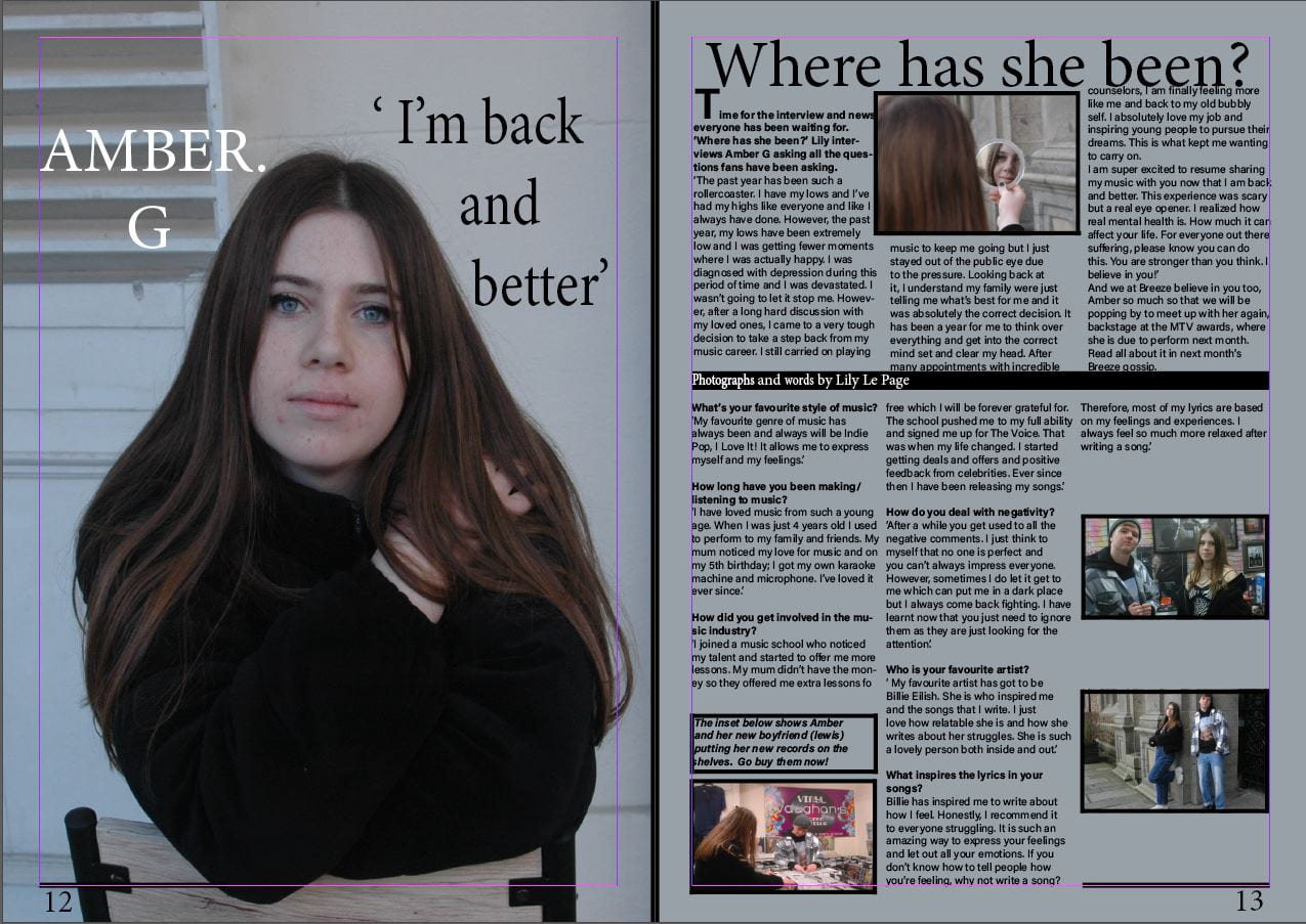
This is my first double page spread. I have chosen this image because I like the relaxed feel to it and I think it’s fits in well with my genre. I have used inserts to help back up my story.

My Targets

  • Unclear which is the headline
  • Stand first needs to be in bold
  • byline…?
  • reorder page numbers
  • insets need captions and borders?
  • main photo needs photoshop filter