Category Archives: Music Magazine

Chosen Adverts

Advert 1

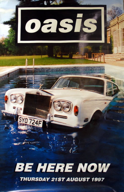
Advert 2


Review

I have chosen these adverts because they are based on two Indie artists/band.  Advert one is advertising Billie Eilish’ tour showing dates. Advert two is advertising an oasis album. I think these adverts are appropriate for my target audience as they are Indie Pop which is the genre of my magazine. Therefore, they will satisfy the audiences interests. The demographics of me audience are young, female, lively, outgoing, etc.

Third Draft of Magazine

Draft 3 Front Cover

click to see PDF

Things I changed from draft 2 to 3

  • I made the eye brighter – I made them more blue and the white more vibrant.
  • I also made her teeth whiter.
  • I de-blemished her using photoshop as well.
  • I added a bit of sparkle to her top.
  • Added more cover lines to fill in gaps.
  • Made the pug a little smaller and moved it.
  • Added in the genre of music.
  • Moved the date to the top.
  • Added some orange text.
  •  Moved the barcode to the right side.

Draft 3 Contents Page

click to see PDF

Things I changed from draft 2 to 3

  • I rearranged the text and images to make it feel a little less squashed. To this I removed and image and a page number.
  • I made ‘CONENTS’ bolder to make it stand out.
  • I gave the actual page a page number.
  • I wrote the names of the people in the insets.
  • Got rid of an image so that there wasn’t two of the same artist.
  • Moved the orange lines so that it didn’t look like a flag and to fill in empty space.
  • Changed the sense of ‘tour dates’ box.

Draft 3 DPS

click to see pdf

Things I changed from draft 2 to 3

  • Made the title more bold.
  • Spread everything out so it’s not so squashed.
  • De-blemished her on photoshop.
  • Moved the insets.
  • Got rid of the empty space.
  • Added text related to insets.

Feedback from Draft 3

Reflection – Front cover

  • I need to sort out my cover lines around her hands and make sure the middle doesn’t overlap her hand. Also make them all capital letters.
  • Smaller spaces between the cover lines.
  • Make Freya Rose cover lines bigger and move more to the right so the jewellery can be seen.
  • Add price and re position barcode.
  • Move everything further away from the spine.
  • Move ‘reeze’ part of Breeze further up.

Reflection – Contents Page

  • Move the titles for the images inside the box and add the page number for where that artist is featured.
  • Make titles bigger and boxes closer together.
  • Edit page number from 2 to 3.
  • Add something along the long line on the cross.

For my final contents, I think I will go back to the layout of my original contents page as I have realised I prefer and fits better with the theme of my magazine.

Reflection – Double Page Spread

  • Make stand first bigger.
  • Move drop capital to where the article starts.
  • Make questions a different font and/or colour.
  • Delete hyphens.
  • Too crowded.
  • Make titles fir images different colours or font and make them shorter.
  • Correct page number.

Second Draft of Front Cover

Second Draft

Click to see PDF

Things I changed from draft 1 to 2

I decided to restart my front cover as I wasn’t happy with my first draft. However, I did decide to still use  a lot from the original one but I also changed a lot.

  • The background photo – I did this because I feel she looks more confident in this photo and it also fills up more space so there aren’t any gaps.
  • I also added some detail in the top left hand corner in the same colour as the background of the DPS to link the two.
  • I also de-blemished and tanned my star model on photoshop.

Targets

  • Raise the masthead or bring her down a little
  • sharpen the image to brighten her eyes  and the sparkle in her top?
  • more cover lines
  • make the pug slightly smaller
  • music…what type…add in the genre
  • January 2021 works well on the graphics but move it away from her?
  • add some orange in there
  • swap barcode to bottom right

Reflection

Doing this second draft allowed me to see how my magazine is going to piece together. I was not happy with how it looked before so therefore felt I should change it. I can now get a better understanding of where I’m going to go with my magazine and what it is going to look like.

Second Draft of Contents Page

Second draft

click to see PDF

Things I changed from draft 1 to 2

  • Changed background colour to go with my double page spread.
  • Included smaller images rather than one big image so I could include amber as well.
  • Changed the layout so that it wasn’t so basic.
  • The text also had to change as it was no longer downloaded, but that is something I will change again for draft 3.

Targets

  • Feel it is all a bit squashed – the photos and numbers?
  • Make contents bolder….
  • Actual page needs a page number
  • Captions on the inset…who are they?
  • Wouldn’t normally have two photos of the same artists…do you have something from your own collection?
  • Feel the orange lines are good but perhaps rearrange as they look like a flag configuration?
  • Gap before hyphens
  • Think about the gap between the cover lines and the boxes as they are very near the edges
  • Tour dates updates – look at the sense of this
  • Think you need some band names….include some that you use on the front cover…

Reflection

Doing this second draft really helped me see how my magazine would come together. Now that the backgrounds are starting to match in colour it looks like each page is from the same magazine.

Second Draft of Double Page Spread

Double Page Spread 2nd draft

click to see PDF

Things I changed from draft 1 to 2

  • Gave the images frames.
  • Created the by line.
  • Put my page numbers in the correct order.
  • Created my article put it on.
  • I started including description for the images.

Targets

  • The copy is good in the columns but the stand first needs to be bolder and bigger.
  • Then the drop capital is where the article starts in full?
  • Replace the insets so that they have captions and the empty space has something in them.
  • The lines are good as is the main photo.
  • Some of the copy seems crowded in the top 1/3 – very near the blackline that goes across.
  • What about putting the insets in the middle or across the columns so that the text wraps around them?
  • Align the main headline and quote as they sit awkwardly at the moment.
  • Remember you don’t have to get all the article in if you don’t want it over crowded. You can add at the bottom. Continued overleaf, or more on page X.
  • Main photo is great…why not make her bigger and add some contrast to it in photoshop and sharpen it so that she really pops.

Reflection

Doing this second  draft really helped me get a better understanding of what  I would like my final draft to look like. There are still many things I need to do to get it to the best of my ability and this is what I shall do for my third draft.

Draft of The Double Page Spread

First Draft of Double Page Spread

This is my first double page spread. I have chosen this image because I like the relaxed feel to it and I think it’s fits in well with my genre. I have used inserts to help back up my story.

My Targets

  • Unclear which is the headline
  • Stand first needs to be in bold
  • byline…?
  • reorder page numbers
  • insets need captions and borders?
  • main photo needs photoshop filter

Second Shoot Contact Sheet

Favorite images

Please click to see PDF

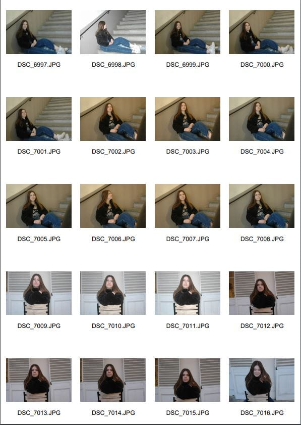
Here are all of my images from my shoot on Tuesday. My location was town which I really liked because there was a variety of places we could go to shoot, each creating a different narrative. I also brought a variety of costumes for my models to try on so that I could then choose the best for my genre.

Top 3 Images

I like this image because my model looks friendly which, after doing my research, is how every Indie Pop model wants to be portrayed. The background isn’t too busy meaning I should be able to add text over the image for my double page spread.

The reason I like this image is because the poses my models are doing is a lot more confident then some of the other. This is because it was more towards the end of my shoot when they started to feel more comfortable posing my the camera. It is important for my models to looks confident as the aim of my magazine is to make people feel comfortable and be able to express themselves.

The background on this image is really fun and creative. It goes really well with my genre. It give the image an edgy feel to it.

Draft Feature Article

Article

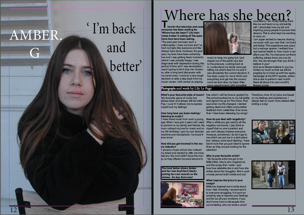
Time for the interview and news everyone has been waiting for. ‘Where has she been?’ Lily interviews Amber G asking all the questions fans have been asking.

What’s your favourite style of music?

‘My favourite genre of music has always been and always will be Indie Pop, I Love It! It allows me to express myself and my feelings.’

How long have you been making/ listening to music?

‘I have loved music from such a young age. When I was just 4 years old I used to perform to my family and friends. My mum noticed my love for music and on my 5th birthday; I got my own karaoke machine and microphone. I’ve loved it ever since.’ 

How did you get involved in the music industry?

‘I joined a music school who noticed my talent and started to offer me more lessons. My mum didn’t have the money so they offered me extra lessons for free which I will be forever grateful for. The school pushed me to my full ability and signed me up for The Voice. That was when my life changed. I started getting deals and offers and positive feedback from celebrities. Ever since then I have been releasing my songs.’ 

How do you deal with negativity? 

‘After a while you get used to all the negative comments. I just think to myself that no one is perfect and you can’t always impress everyone. However, sometimes I do let it get to me which can put me in a dark place but I always come back fighting. I have learnt now that you just need to ignore them as they are just looking for the attention.’

Who is your favourite artist?

‘ My favourite artist has got to be Billie Eilish. She is who inspired me and the songs that I write. I just love how relatable she is and how she writes about her struggles. She is such a lovely person both inside and out.’ 

What inspires the lyrics in your songs?

Billie has inspired me to write about how I feel. Honestly, I recommend it to everyone struggling. It is such an amazing way to express your feelings and let out all your emotions. If you don’t know how to tell people how you’re feeling, why not write a song? Therefore, most of my lyrics are based on my feelings and experiences. I always feel so much more relaxed after writing a song.’

So, where have you been?

‘The past year has been such a rollercoaster. I have my lows and I’ve had my highs like everyone and like I always have done. However, the past year, my lows have been extremely low and I was getting fewer moments where I was actually happy. I was diagnosed with depression during this period of time and I was devastated. I wasn’t going to let it stop me. However, after a long hard discussion with my loved ones, I came to a very tough decision to take a step back from my music career. I still carried on playing music to keep me going but I just stayed out of the public eye due to the pressure. Looking back at it, I understand my family were just telling me what’s best for me and it was absolutely the correct decision. It has been a year for me to think over everything and get into the correct mind set and clear my head. After many appointments with incredible counselors, I am finally feeling more like me and back to my old bubbly self. I absolutely love my job and inspiring young people to pursue their dreams. This is what kept me wanting to carry on. I am super excited to resume sharing my music with you now that I am back and better. This experience was scary but a real eye opener. I realized how real mental health is. How much it can affect your life. For everyone out there suffering, please know you can do this. You are stronger than you think. I believe in you!’

And we at Breeze believe in you too, Amber so much so that we will be popping by to meet up with her again, backstage at the MTV awards, where she is due to perform next month. Read all about it in next month’s Breeze gossip. 

Reflection

I have chosen to do a Q&A for my double page spread article. This is because it make it easier for me to see if I’ve answered everything I need to. It is also easier for the readers because they can see exactly what question Amber is answering. Therefore, if there if one question in particular they want to know the answer to,   they can simple just read that part of the article. The meaning of this article is to find out where she has been, this is why I made the paragraph ‘So, where have you been’ the biggest and wrote it in more detail.

Reading of my article

Production Meeting Agenda for 2nd Photo Shoot and Risk Assessment

Production Meeting Agenda

Please click to see PDF

Reflection

I have made this production meeting agenda table to help me prepare for my shoot on Tuesday. Doing this has really made me think about exactly what I want my models to wear and where I want to shoot. I have also looked in town and had a think about where I think would be appropriate for my genre. This table helps me get organised as it tells me and `my models exactly what I/they need to bring.

Language Analysis

The article

The name of the double page spread I will by analysing is ‘What makes a perfect gentleman’ (September 2017) – Wyclef Jean.

In the article, Wyclef Jean is saying ‘what makes a perfect gentlemen’ and giving his ‘top 10 tips’. He includes some personal stories. Journalistic techniques have been used because we know who it’s about (him, aimed at men), what it about (‘what makes a perfect gentleman’) and it even includes dates therefore when events happened. Blumler and Katz (1975) uses and gratification theory has been applied to certain aspects of this article. It is a source of entertainment ad the audience can read either his personal stories or tips and social interaction because people will wan to give their view on what they think will make a perfect man – causing discussions and binding.

Structure

This article is laid out so that the main part of each of the 10 tips are in bold and then the information or story is in a smaller and non bold font. This is so that the attention is drawn to the main factors to catch the readers eye.

Article

Please click on image to see PDF