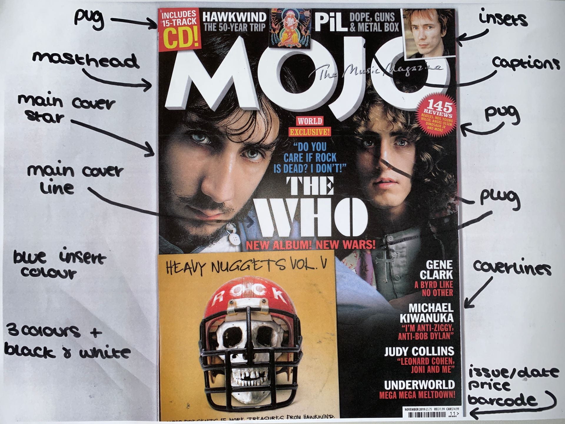
This is a magazine cover for Mojo, I have annotated it by profiling what kind of audience would read/enjoy it.
I feel they have done a decent job of creating their front cover, they have included all the main elements (masthead, main cover line/star, plug, pug, captions, etc.)
Their audience is mainly Generation X and above, therefore the readers are normally well educated and like informative content about music they’re interested in. I found that most of the artists and bands in this magazine are amid at Baby Boomers which is slightly older than the target audience, yet there are also a few bands who are mainly listened to by Millennials. I think the dark gradient background blends well with the bold white, red and yellow writing, creating an eye capturing front cover. Overall I think this is a good first impression on the magazine, as I believe the appearance will motivate people to buy it.