Self Assessment Criteria; MES, camera, photoshop
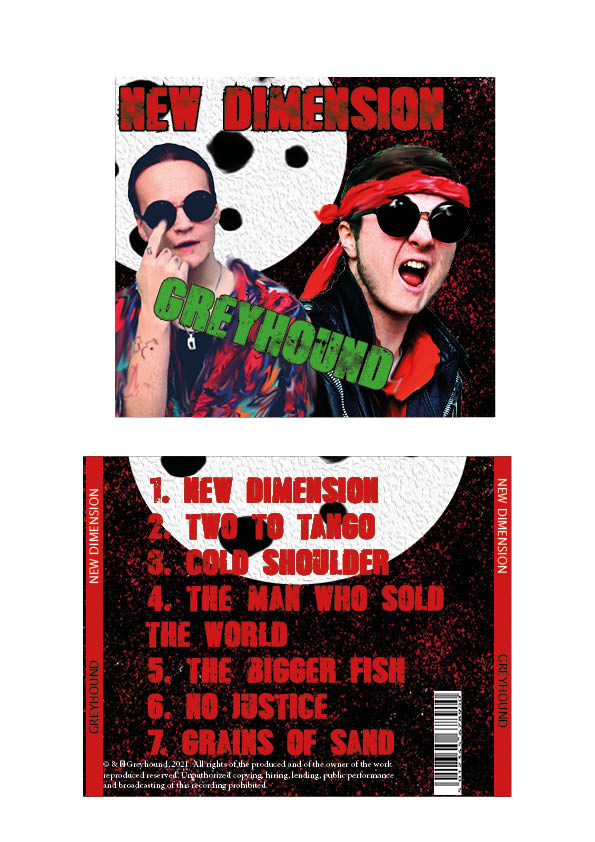
- I believe our usage of photoshop to manipulate the images in order to make our stars “pop-out” helps them contrast to the background more, rather than “mesh” too much with it
- Our brand has been made clear; a more modern take on punk, with conventions such as violent colour scheme, but unconventions such as the bright shirt and sci-fi inspiration.
- Framing; Both Stars are clear in view and in focus, but I seem to be more faded than Lewis.
Improvements;
- Photoshop/editing; I need to stand out more, and I think the smudge is a bit too much. Especially when it contrasts with how much Lewis has been sharpened and is in more focus.
- The font’s colour scheme needs some adjusting- especially the red text and how that feels a bit extreme given the rest of the colour scheme- and how the green looks fairly ugly. The 2nd panel especially looks quite amateur with the red text. Definitely needs some tweaking, and maybe usage of a different font.