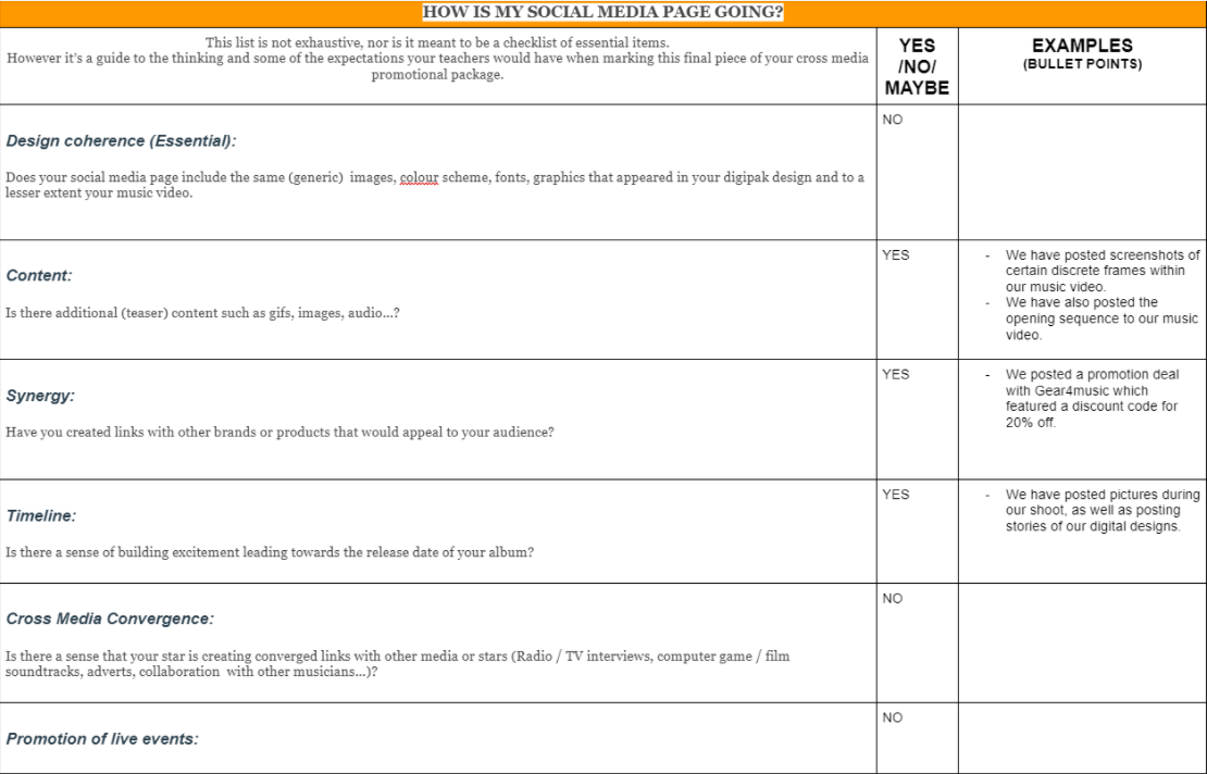
Social Media Page – Key terms
The main point for a social media page affiliated with a brand is to promote the product and creators related to the subject.
A key part of this is the marketing campaign (promotion), in which the “reach” of the product grows as more people interact/discover the band through this new found awareness, tapping into the target audience, or expanding it via this social media platform
Screen Castify (Feedback)
Here is the screen-castify
Summary Points:
- More replies needed
- Good hype/teasing
- Interaction with fans
- Politics engages personal identity = better relationship with fans
- Could do a behind-the-scenes post
- Missing synergy (teaming with band/product) = cross-media convergence.
- More “animation” (i.e gif)
- Need to promote via other platforms (i.e TV/Radio)
- Tour promotion (relate to fans, engage with them)
- Design of posts/overall page could do with some change (i.e theme/darker tone of posts)
SMP 1 + Marking Criteria
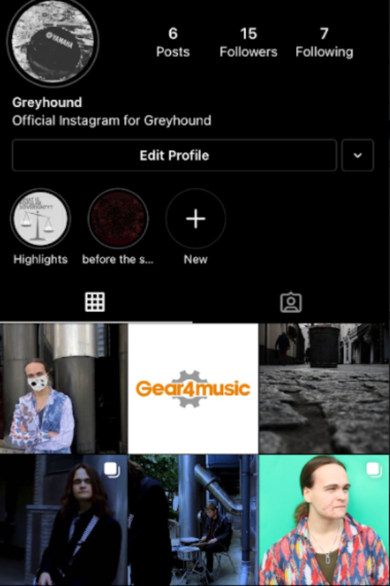
We have compared our SMP with teacher feedback and filled in our self-assessment in regards to what elements should be in an SMP.
For example, we have included elements of a “Call to Action”, where in we publicized our brand-related face masks, with a link to purchase them. As well as this, we posted “teaser” content: snippets of the music video (i.e sc of segments, the intro sequence) .
Click [here] For Link


Critical Reflection Essay
- How do your products represent social groups or issues?
Ideology is constructed through micro and use symbolic, semic and cultural codes which can be decoded by the target audience.
In regards to our social media page, posts help to engage with the users and wider audience through social interaction, connecting via that social aspect. Of course, with the page being based on a music group, we want there to be a level of entertainment through sneak-peeks, teasers, and relatability through spreading awareness about issues that connect with the audience, linking to their own personal identity and in-turn potentially increasing both audience participation and reaching that optimal level of engagement. In this attempt, making sure that the audience has a degree of fulfillment when ticking off the uses & gratifications metaphorical box will engage them consistently and keep them returning. Specifically, I wish to target those of younger demographics and of course those who already listen to the rock genre, but I feel as though a thematic “breath of fresh air” would be good for those who are more open-minded with their music tastes, but also philosophy. This combination, I feel, could really hook our preferred audience in.
On posts such as the “Branded” COVID-19 mask advertisement, we have chosen to engage with the audience on a relatable level through the global pandemic, while offering a unique spin on the masks everyone is so used to wearing through branded products that can both protect people from the virus and also spread our own influence through casual marketing. This provides a level of entertainment, which is our main goal for this brand
Through the usage of a social media page, we can naturally spread awareness of our own products, especially music and album releases. This focus on information combined with other “Uses and Gratifications” (a theory by Blumler and Katz) helps to relate information with personal identity; if someone connects with the music, the genre, or the band and the stars themselves, then maybe they will be interested in the product that is in creation, and engage them in the lead-up to release, generating “hype”.
Speaking of “hype”, it is an effective tool in engaging the audience for an extended or short period of time. It has to be utilised shrewdly, as too much hype can burn out if the product is not released soon enough- especially if the product itself is sub-par and not up to the standard set.
2. How did your research inform your products and the way they use or challenge conventions?
Conventionally, Rock stars are depicted as aggressive, energetic, and clad in leather and drab clothing. Countering this, we have gone with a long coat contrasting with the white tie on a navy-blue shirt. For our other star, we have gone with the “green-day” outfit; a black costume with red tie to draw attention. This dynamic of dark clothing helps the ties catch the viewer’s gaze, and bring some uniqueness to the brand and music video. In my own words, this is akin to a “neo”-rock style, but not out-of-bounds for the genre as a whole.
Through our group research, I have determined that the conventions and the overall “repertoire of elements” (as suggested by Lacey) that the rock genre does not always match with the theme of my band or music video. To me, more abstract and “alien”/mysterious themes are much more interesting than following the Rock Zeitgeist to a T. This Zeitgeist can be found throughout results when Googling “rock”, which is where I found most of my discoveries: the internet. As well as this, I found conventions through researching bands and the music video associated with them. This “label” is often constructed via the “blueprint” (according to Altman) old Rock bands, and how they portrayed themselves in the music industry and within videos.
For my music video, having a more philosophical approach develop into a blueprint that is used to go against the conventional Label is interesting. “The Man Who Sold The World” itself was written and produced by David Bowie, who describes this time during development as one when he was spiritually curious and researching buddhism. To reflect this, I have included themes of cycles and rebirth; a constant rotation. While the “bin” may seem like an ordinary rubbish disposal centre, it really reflects the burden the main star holds; the “world” itself. While on a more metaphorical sense, I believe this adds a certain level of complexity that is often not found in Rock, a genre defined by its tenacity and foundations following great change through war, and was challenged as a result.
3. How do the elements of your production work together to create a sense of ‘branding’?
When designing the product, an integral part is recognition; “how easily can this be identified?” and the like. Targeting specific demographics and psychographics can really help develop a blueprint of what to lean towards; a target audience. For this process, a unique brand image which is tailored towards this specific audience through a “repertoire of elements” (such as genre, “theme” of the band, how music videos are shot and edited et al. and the overall style of the products) must be created, coming together to produce a sense of branding.
In this case, “Greyhound” and its music video on “The Man Who Sold The World” is aiming to encode philosophical and metaphysical elements within the “text”, aiming for the audience to decode, reaching the “preferred reading” of the bin being a metaphor for the world itself, and the symbolic burden growing ever stronger as time passes. Our mission statement is to deliver an authentic atmosphere, utilising Greyhound’s inherent individuality to effectively change the world of rock as we know it, and to make it entertaining in the process. To do this, we have tried to make our brand more unique and develop into its own perfect sub-genre of “deeper-rock”, meaning more personality and abstract thoughts take place in music, forming its own foundation of success.
The aim of this to hopefully achieve a sense of branding as we progress through the product, developing a coherent “image” that can be read and decoded easily, though with a special attention to awareness- if we want to possess an image that makes people think, we don’t want to encode it so lightly. The music video is an introduction to this philosophy and overall blueprint of the band and its message.
Combining elements of the rock genre (the mystique and grandiosity) with a more abstract “art-style”, “Greyhound” and its surrounding works are intended to reach an audience with a keen interest in the rock genre as a whole but also, potentially, more unique and “alien” elements the genre has wiggle-room to explore within. The aim itself is to target the younger demographics and those with a more “change”/open-minded stance to really understand our preferred reading (coined by Hall)
4. How do your products engage with the audience?
In regards to our social media page, posts help to engage with the users and wider audience through social interaction, connecting via that social aspect. Of course, with the page being based on a music group, we want there to be a level of entertainment through sneak-peeks, teasers, and relatability through spreading awareness about issues that connect with the audience, linking to their own personal identity and in-turn potentially increasing both audience participation and reaching that optimal level of engagement. In this attempt, making sure that the audience has a degree of fulfillment when ticking off the uses & gratifications metaphorical box will engage them consistently and keep them returning. Specifically, I wish to target those of younger demographics and of course those who already listen to the rock genre, but I feel as though a thematic “breath of fresh air” would be good for those who are more open-minded with their music tastes, but also philosophy. This combination, I feel, could really hook our preferred audience in.
On posts such as the “Branded” COVID-19 mask advertisement, we have chosen to engage with the audience on a relatable level through the global pandemic, while offering a unique spin on the masks everyone is so used to wearing through branded products that can both protect people from the virus and also spread our own influence through casual marketing. This provides a level of entertainment, which is our main goal for this brand
Through the usage of a social media page, we can naturally spread awareness of our own products, especially music and album releases. This focus on information combined with other “Uses and Gratifications” (a theory by Blumler and Katz) helps to relate information with personal identity; if someone connects with the music, the genre, or the band and the stars themselves, then maybe they will be interested in the product that is in creation, and engage them in the lead-up to release, generating “hype”.
Speaking of “hype”, it is an effective tool in engaging the audience for an extended or short period of time. It has to be utilised shrewdly, as too much hype can burn out if the product is not released soon enough- especially if the product itself is sub-par and not up to the standard set.
Screen Castify Summary
Summary
- Change text, i.e order, placement (e.g behind star), font (e.g song name too large- 2 lines)
- Spines should have publisher logo
- Middle Pane background good. Orange/Gold should fit with back font colour. More gold
- Middle Pane font should be aligned. Text should be readable
- Middle Pane grey box should just fit the band/lyrics
- Have the moon on the front cover.


Digipack Draft 1
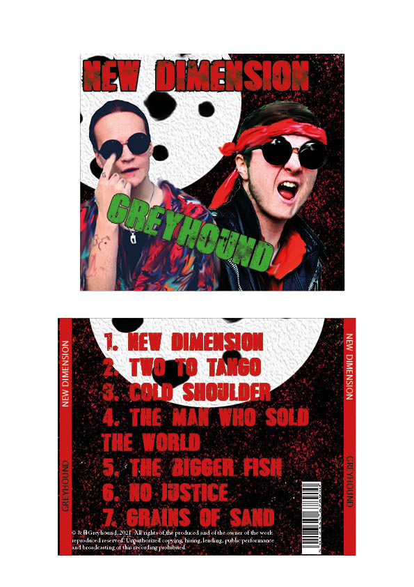
Self Assessment Criteria; MES, camera, photoshop
- I believe our usage of photoshop to manipulate the images in order to make our stars “pop-out” helps them contrast to the background more, rather than “mesh” too much with it
- Our brand has been made clear; a more modern take on punk, with conventions such as violent colour scheme, but unconventions such as the bright shirt and sci-fi inspiration.
- Framing; Both Stars are clear in view and in focus, but I seem to be more faded than Lewis.
Improvements;
- Photoshop/editing; I need to stand out more, and I think the smudge is a bit too much. Especially when it contrasts with how much Lewis has been sharpened and is in more focus.
- The font’s colour scheme needs some adjusting- especially the red text and how that feels a bit extreme given the rest of the colour scheme- and how the green looks fairly ugly. The 2nd panel especially looks quite amateur with the red text. Definitely needs some tweaking, and maybe usage of a different font.
DP Mockup
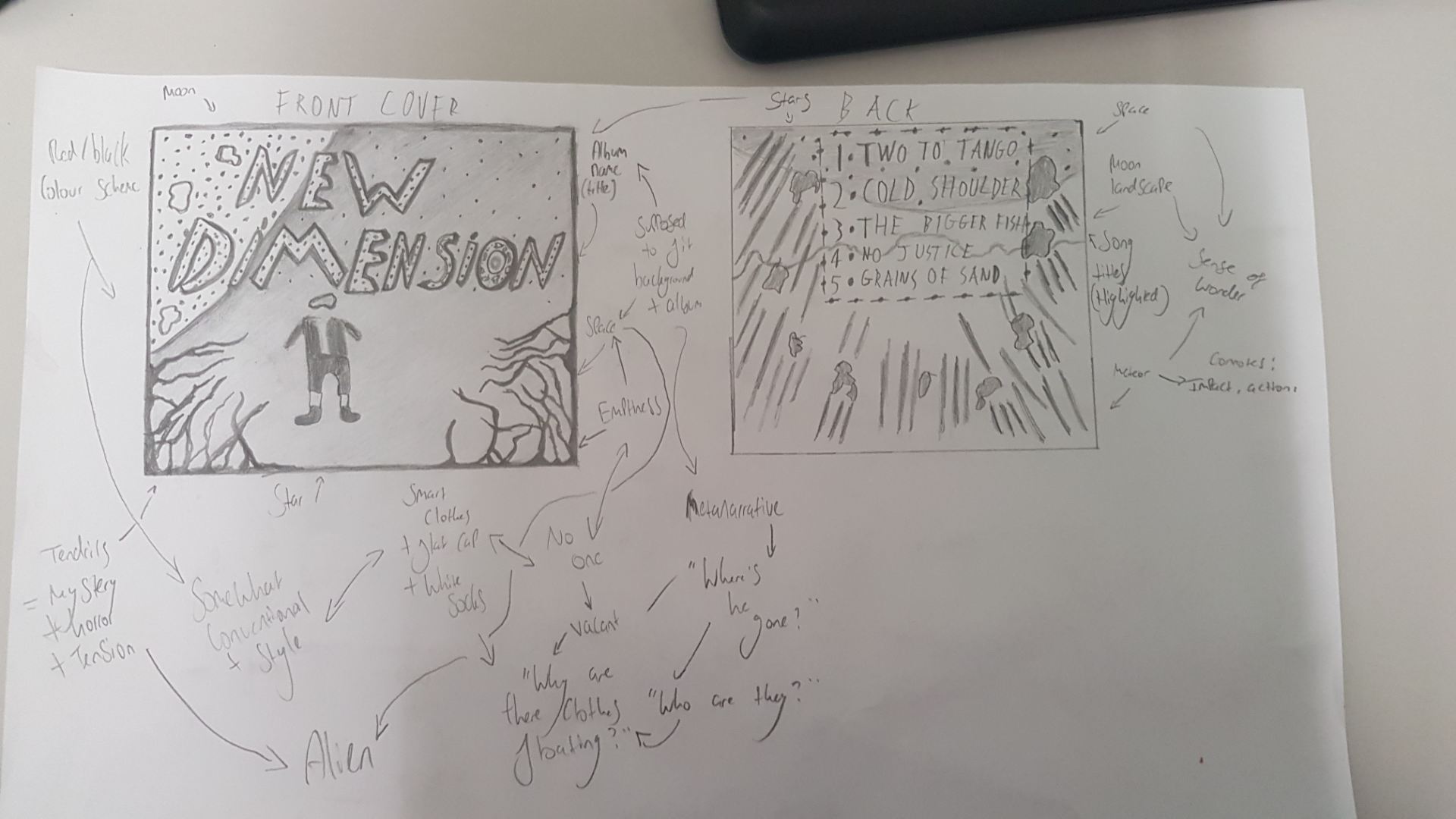
This is our DP mockup of both front and back covers, with some annotations of basic descriptions, as well as more inductive gatherings
In regards to colour scheme, red + black is the main focus, but perhaps some blues and purples would match the space theme; but most likely, the latter will be utilised for a more aggressive tone.

Edgy fonts with sharp outlines would help add to the tone as well, fitting with the eerie tendrils found creeping on the side of the corner. This isn’t the “classic” space theme; it’s been corrupted, and the font, colour scheme, and entities found on the cover will help communicate this.
Contact Sheets & Evaluation of Shoot

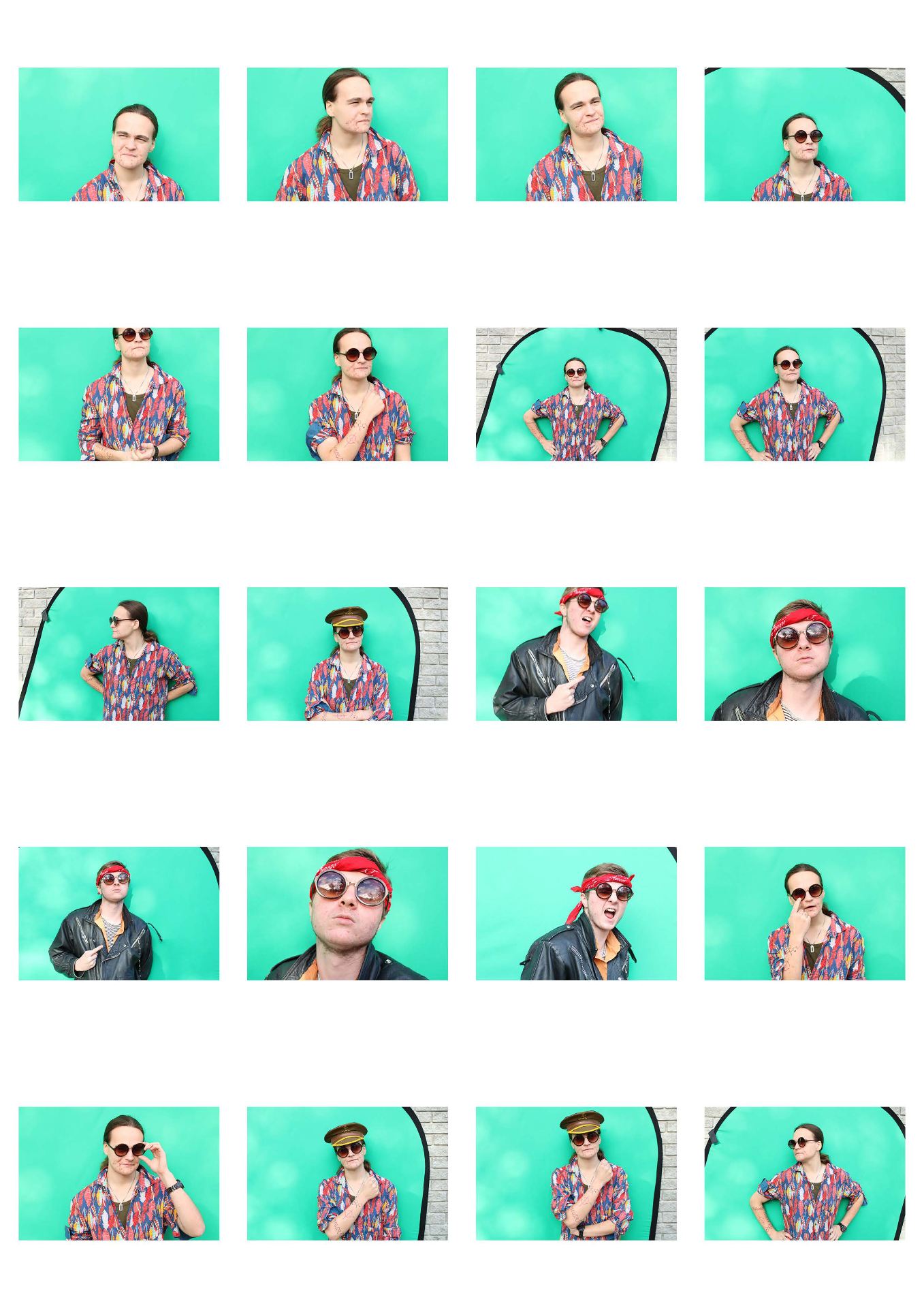
Overall the shoot went much better than our previous one. Mise En Scene, lighting, framing, and using a greenscreen (which was much easier) helped us with developing our narrative and style. I really like some images in particular which (I believe) fit our genre quite well- primarily ones with aggression (like Lewis’ scream), and the careless demeanor present in much Rock. It helps to convey a sense of confidence. Going forward, we have to edit the photos to fit with our “space” theme; contrasting to our outfits, it may be difficult, but with some filters our design process should run smooth.