Chosen Adverts
I chose this advertisement because of how cringe-inducing it is. It hooks in the viewer, grabbing their attention and interest, then giving them a sense of second-hand embarrassment due to the nature of the pun used. Also, Lucozade is linked to sports and fitness, which in turn is linked to hip-hop and energy drinks. My target audience are people who listen to hip-hop, with the demographic being young-adult people, from lower-middle class, to middle class who focus on fitness and music, who are liable for advertisement and influencing to buy the product.

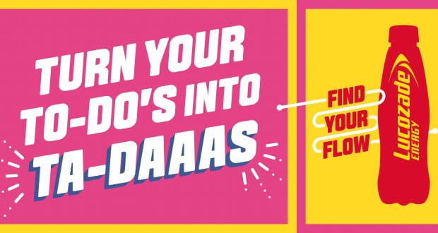
I chose this advertisement because of how simplistic it is, and how the colours (black, white and red) mesh well. It enters with a bold statement- targeting anyone from Chicago specifically- then informs them that the new shoes are being released soon. The design attracts the viewer, gaining their interest in what is coming or being advertised, and informs them about a new shoe brand. My target audience are people who listen to hip-hop, which, again, is often linked with sports and has several different ‘styles’ of fashion, with brands being focused on, with the key demographic being (again) young-adult people who range from lower-middle to middle class backgrounds, and have an interest in sports and fitness, as well as the latest trends in both subjects.
3rd draft of DPS

What’s different?;
- The image has been changed again
- The structure is slightly different
- I’ve added a different headline
- The standfirst has been differentiated from the other text through a larger font and italics
3rd draft of Contents Page

What’s new?;
- I’ve gotten rid of the blocks behind the text
- The colour scheme is much different- white and red, to make the text stand out more
- The star has been de-colourised, to make both him and the text ‘pop’ out a bit more
- I’ve changed the layout of the text, and added in a few graphics to differentiate/cordon the text
Improvements;
- I feel like the layout of the text could use some work and change
- I could add in a ‘border’ like I did with the line for “contents” (on the side) for Archives- just to make it stand out a bit more.
3rd Draft of Front Cover

What’s new?;
- The background is now black, to make the text and star stand out more, and ‘pop’.
- White and red are utilised much more, being the only colours used for text.
- This draft is more simplistic in presentation, though I feel this works more in its favour compared to previous drafts.
- Other than the red outline and inner ‘circle’ of the vinyl, a black and white filter has taken the colour out of the star image. I feel this adds more style to the front cover, and helps to differentiate the different aspects/elements of the cover.
- Rather than having awkward blocks and circles, I instead used red lines to ‘cordon’ off the different titles.
I will come back to this draft and add in some more elements i.e more text.
2nd Draft of Double Page Spread

What’s different;
- The image used is different
- Segmented into different graphic boxes
- I’ve added a circle (like a halo/crown) around the star to signal they’re the one being interviewed. Their name is also specified.
- I’ve added in the actual article instead of placeholder text.
Targets;
- More variation with graphics
- Make the stars stand out a bit more- I could even add an outline around him/them
- I want to restructure the spread, rearranging some of the layout and text.
- The 2nd page (left) is quite empty; I need to add some more text/graphics.
- Drop capital for where the article starts
- Smaller page numbers in size but larger in quantity as DPS would be further on from this
- The standfirst – the opening to the article needs to stand out and give more information than the headline so make it bolder, bigger and near the main headline.
- Is the main headline King (J)? And if so you need it to make more sense…add some play on words…King J pots the black on the MTV awards?
- the two boxes of copy vary in width which is unusual so why not put it all in two columns?
- could cut the photo in half so that you have white space across the spread in top half for all the copy to go
- why the circle over his head?
2nd Draft of Contents Page

What is new?
- I changed the image used to a much more professional looking image, where the lighting is much darker and allows for more graphics and text used without contrasting too much
- Adding graphics, I placed the text onto each block with the opacity lowered.
- I added some colour variation using text, with each different block having a unique colour
Improvements;
- The text need to be spread out more
- Graphics need to be more varied/also spread out
- I need change the layout somewhat to make the contents more prominent in the page
Targets:
- justify to the right coverlines on rhs
- who does the quote belong to re Once you find?
- make archives smaller and no need for the month
- make Ben (that’s Nathan) pop…add some FX or contrast?
- not sure about the coloured texts?
- numbers in a different font to make them stand out?
- dehyphenate
2nd Draft of Cover

What’s new?;
- I kept the general graphic amount the same
- Overall I changed some of the layout
- Added in a red outline behind the cover star.
- I mostly just changed how it looked, not adding much to information and design.
- There is now a much more prominent contrast between the image and graphics, the tone and the colours used. — I will need to change this so the image fits in much better with the cover, as at the moment it looks very out of place and ‘janky’.
The cover itself is very amateurish, with very out of place graphics and colours used. I much prefer the original draft, however, I feel the neon outline on the star can actually work well if tweaked and fitted better.
Teacher feedback; Like the image but can you sort the hat and red line out there? and perhaps play with the actual image to make it more stylised as it is naturalistic with a neon glow which is an odd juxtaposition?
- Masthead needs to be bigger
- Like the image but can you sort the hat and red line out there? and perhaps play with the actual image to make it more stylised as it is naturalistic with a neon glow which is an odd juxtaposition?
- Main image can be bigger – dont cover the chains as they are key and make a cover line to use them as a hook….chained to the rythmn?
- Not keen on the fonts. with boxes behind them.
- Price and issue
- More cover lines and look at justification…very near the slug and bleed perimeter.
- Reposition the plug at the top
Draft of Double-Page Spread


I wanted to try and wrap the text around the crown, however, this will take some more time to get used to InDesign and gain more experience. I will look into tutorials to learn how to do this for the later drafts/finished spread. I feel that the shots themselves used will help “save” the spread.
- I need to use columns to segregate the text, as the third page contains text which takes up all the room- it also doesn’t “mesh” well with the background.
- To fix this, using blocks placed underneath the text (which will be split into columns) will hopefully make the page look better.
- I also need to use some more variation in font.
- I will need to add in page numbers
- Names of people involved e.g writer of article, models used (as the stars).
- More graphics, images, overall more “substance” needs to be added

I added in some new graphics, blocks underneath the text which has been broken up into different paragraphs and shifted. I have also added the page numbers at the bottom, including a Drop Capital.
Draft Feature Article
Plan for article
In the article, I want to add on and tell a story that can be denoted through the images/photos taken. I want to hook in the reader, entertain them and provide information about the stars involved/discussed in the article itself. I want the story told to be engaging, and with the themes of decadence and ambition, have the reader relate to the topics discussed- linking to their personal identity.


I want to do a Q&A within the article, taking up a large portion of the page(s) itself, whilst also detailing their recent events and overall give and overview into the star themselves, and hopefully hooking the reader fairly early on. While I want to do a Q&A in the article itself, I don’t want to only do a Q&A. I am considering writing a mini-review for their latest song/album, trying to hook back to the start perhaps later on in the article.
Draft;
“High goals and the ambition to make it big is required to be successful, and in the music scene, this couldn’t be more true.
In today’s issue, someone who’s got little ambition has broken onto the scene, while not giving a f***; King J or ‘K.J’. Combining old style west-coast rap with a new brand of hip-hop, he’s managed to make it big within a short amount of time, though even his new fame hasn’t phased him; so what is his secret? However, the first question on our mind’s when thinking about things to ask relates to the theme of ambition and competitiveness which makes up the music scene was; ‘How long do you think your ‘reign’ will last?’.
K.J – ‘I’m not too bothered about it- someone’ll come along at some point and take the crown. Honestly it could even happen tomorrow. We’ll see’
‘You seem quite relaxed- is that due to your overall attitude to music, or just disregard for titles and fame?’
K.J – ‘Not sure; I’ve always had a certain annoyance with titles and that- ironic given my name. I think it might be a bit of both though, since music is my passion so I don’t wanna get it mixed up in fame so I start hating it.’
‘You say music is your passion, and that you don’t want it to start being just a job. So how do you think it has affected your mentality when going on tour or making/writing songs?’
K.J – ‘I’ve noticed a couple occurrences where it starts to feel more like a job or money maker, but then I usually just get a grip and focus on having fun. Main reason I do it after all…’
Nearing the end of the interview, we started noticing that, while K.J means ‘King J’- it’s more of an intentional oxymoron which contrasts with his personality. We wanted to press more into this part of his character
‘How exactly do you keep so calm?’
K.J – ‘It’s just because- like I’ve said before- I do music for a passion. The tours and events are all just ways of me making music and having fun. Fame and that comes last.’
This unique outlook on the music scene and fame has made K.J attract many fans, who enjoy his nonchalant attitude and view. His recent burst of popularity and continuous successful releases has made us confident that he will continue to rise- and while he appears to not have changed as a result of his new-found fame, he will need to make sure it does not get to his head.