Screen Castify Summary
Summary
- Change text, i.e order, placement (e.g behind star), font (e.g song name too large- 2 lines)
- Spines should have publisher logo
- Middle Pane background good. Orange/Gold should fit with back font colour. More gold
- Middle Pane font should be aligned. Text should be readable
- Middle Pane grey box should just fit the band/lyrics
- Have the moon on the front cover.


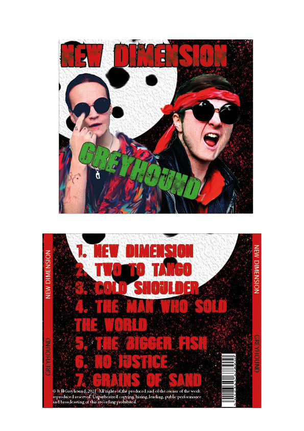
Digipack Draft 1
Self Assessment Criteria; MES, camera, photoshop
- I believe our usage of photoshop to manipulate the images in order to make our stars “pop-out” helps them contrast to the background more, rather than “mesh” too much with it
- Our brand has been made clear; a more modern take on punk, with conventions such as violent colour scheme, but unconventions such as the bright shirt and sci-fi inspiration.
- Framing; Both Stars are clear in view and in focus, but I seem to be more faded than Lewis.
Improvements;
- Photoshop/editing; I need to stand out more, and I think the smudge is a bit too much. Especially when it contrasts with how much Lewis has been sharpened and is in more focus.
- The font’s colour scheme needs some adjusting- especially the red text and how that feels a bit extreme given the rest of the colour scheme- and how the green looks fairly ugly. The 2nd panel especially looks quite amateur with the red text. Definitely needs some tweaking, and maybe usage of a different font.
DP Mockup
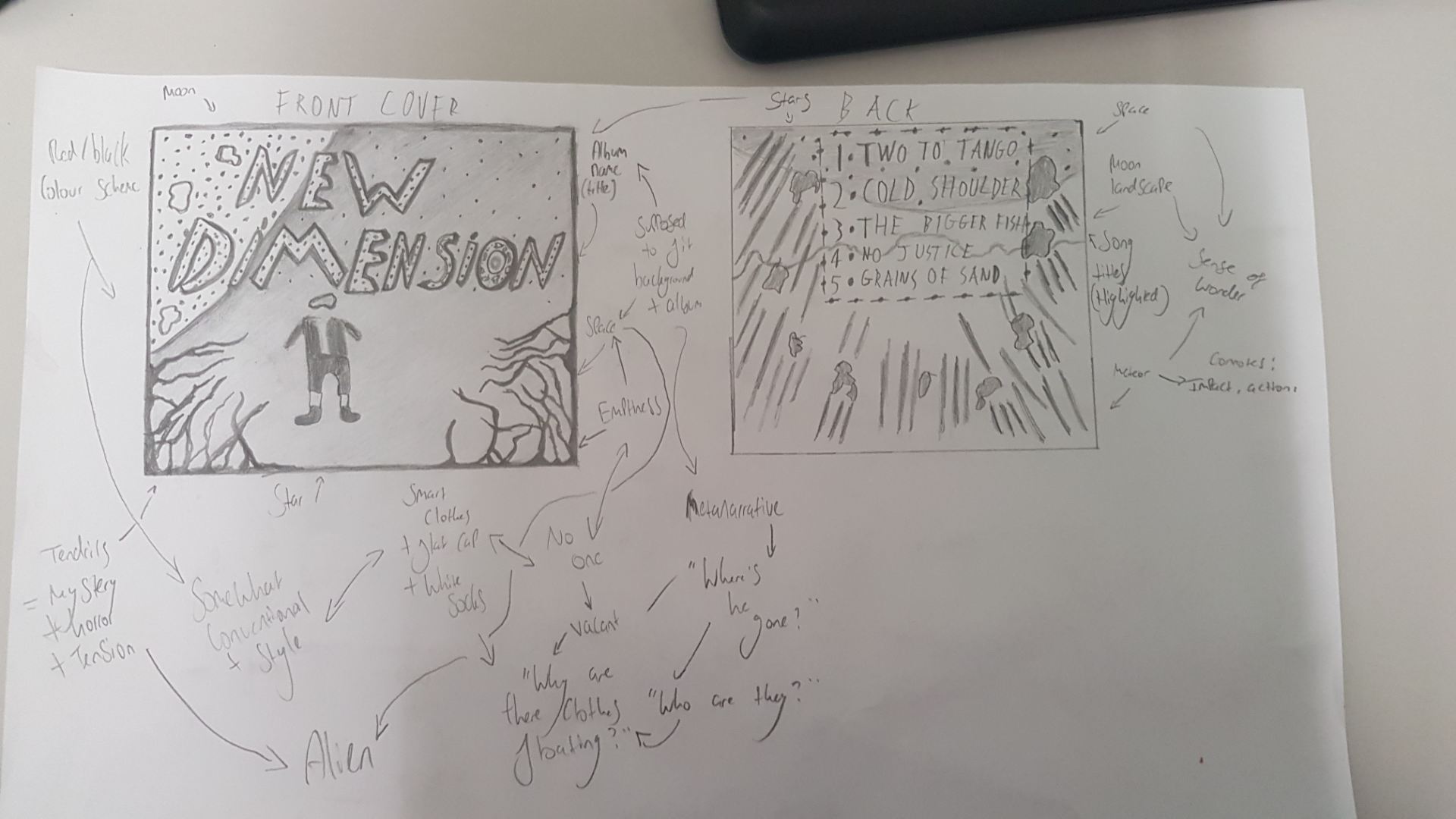
This is our DP mockup of both front and back covers, with some annotations of basic descriptions, as well as more inductive gatherings
In regards to colour scheme, red + black is the main focus, but perhaps some blues and purples would match the space theme; but most likely, the latter will be utilised for a more aggressive tone.

Edgy fonts with sharp outlines would help add to the tone as well, fitting with the eerie tendrils found creeping on the side of the corner. This isn’t the “classic” space theme; it’s been corrupted, and the font, colour scheme, and entities found on the cover will help communicate this.
Contact Sheets & Evaluation of Shoot

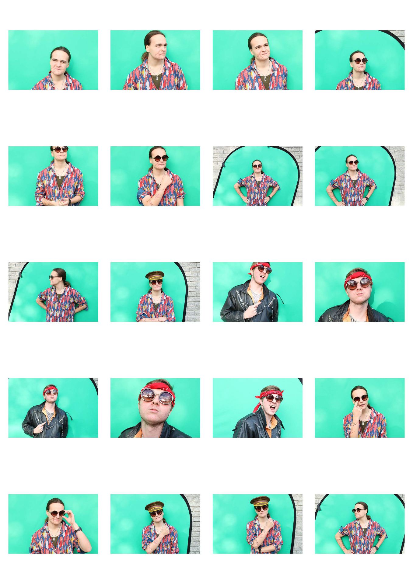
Overall the shoot went much better than our previous one. Mise En Scene, lighting, framing, and using a greenscreen (which was much easier) helped us with developing our narrative and style. I really like some images in particular which (I believe) fit our genre quite well- primarily ones with aggression (like Lewis’ scream), and the careless demeanor present in much Rock. It helps to convey a sense of confidence. Going forward, we have to edit the photos to fit with our “space” theme; contrasting to our outfits, it may be difficult, but with some filters our design process should run smooth.
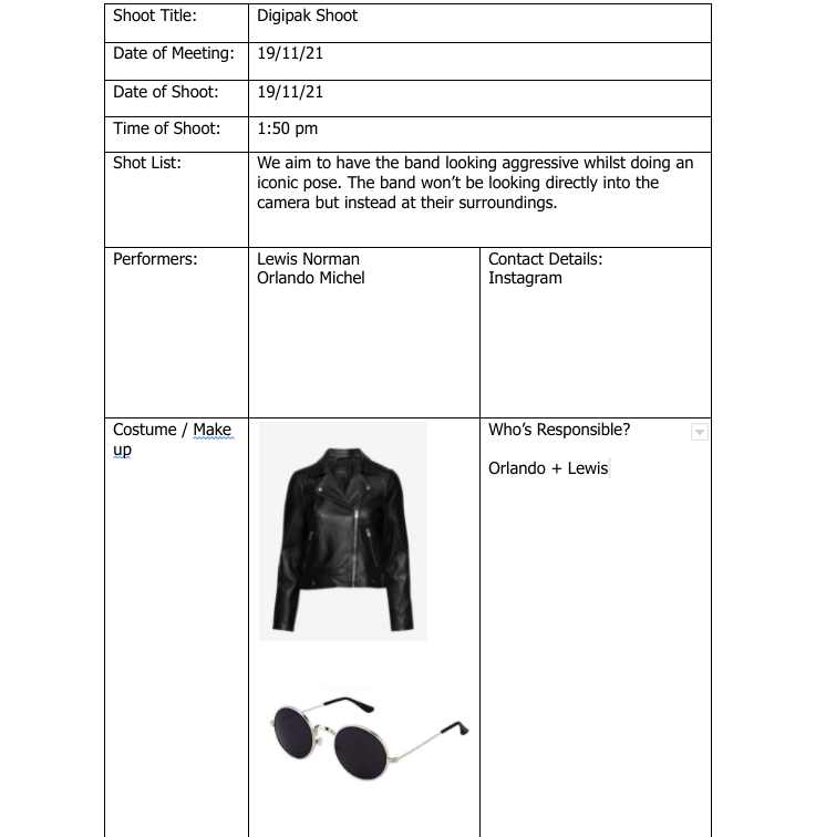
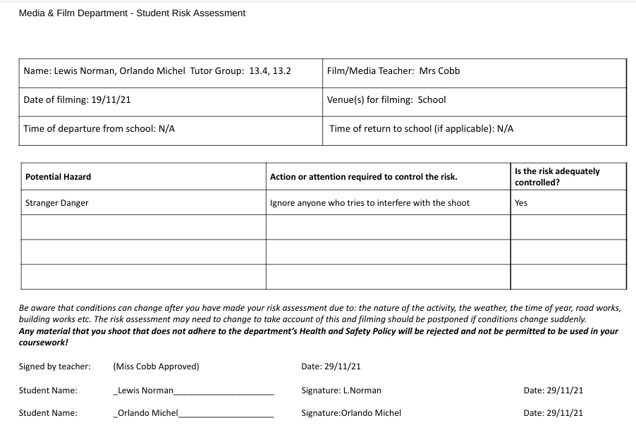
Risk Assessment + Meeting Agenda
Below is my group’s meeting agenda, followed by our risk assessment. The latter will help us identify and organise our MES, time management, and keep track of our progress.

Moodboard – “Look Book”
Me and my partner developed a moodboard of our genre (Rock), taking inspiration from AC/DC, Music, Space, and key technical terms and conventions to produce a blueprint we can use to develop our brand and reach our target audience, tailoring our style to their generalised interests.
Marketing Strategy + Mission Statement
Me and my partner produced a slideshow on what we aim to achieve, and how we’ll go about doing this.
Through the making of this slide, we have managed to develop ways of promoting our star through the usage of their brand and how it (and the text) relates to our target audience, but also via Integrated Advertising and other forms of marketing through the “digital world”.
Digipak Conventions Analysis
This is my Textual, Content Analysis on the Led Zeppelin – Mothership front and back covers, focusing on conventions, and the interesting narrative they portray through this form of media.