Here is my personal mood board for an indie rock band album cover, this pdf suggests the colours, typeface, illustrations and photoshop work that is used to create a digipak. I added buzz words to emphasise the feelings, emotions and key themes shown with all covers from an indie band, words such as affectionate, unstable, unique, alternative and many more.
I noticed for almost all indie rock band album covers they include pale colours such as light greys, whites, light blues and pinks. This keeps the digipak simple, subtle and unique to other genres.
Indie rock band album covers are consistent with the heavy use of photoshop, illistrations to tell a narrative and strange and random props within the image, for example a hay bail and mirrors to create the idea of a body having no end. The band is rarely featured on the album front cover for indie rock digipaks.
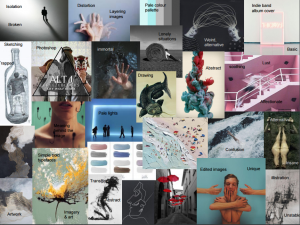
From this mood board I think that illustrations and photoshopped photos would work best for my genre. I like the idea of including a catfish in the digipak and a glass bottle resembling the idea of the band trapped in a world of their own. I also really like the idea of the hooks hanging around the model’s face because it connotes a strong hidden story, which could be he is trapped. I really like the idea of the triangle being black and white and involves into colour outside of the the
I like the idea of more surreal photographs for the digipak because its different, strange yet oddly appealing to look at.
Below is the link to Chanel’s moodboard:
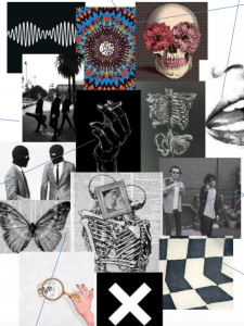
Chanel’s mood board all represents a pale, black and white colour palette. I really like the colours she has used and they are also fairly similar to mine, as they are conventional of the indie rock genre. I am keen on the hand drawn illustrations especially the idea of drawing onto newspaper as it instantly gives a busy and interesting background. I like how she has incorporated images of band members as it will help us to take a photograph of our band.
Below is the link to Kris’ mood board:
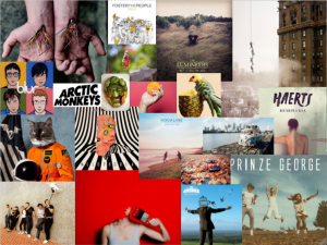
Kris’ mood board is extremely contrasting to mine and Chanel’s, through the use of vibrant contrasting colours. I do not believe the colours he has used are conventional to an indie rock band theme however the ideas using photoshop have worked well. I like the idea of the wrists having wires coming out of them, it gives a quirky and weird effect to the image.