LOCATION SHOOT- CONTACT SHEETS


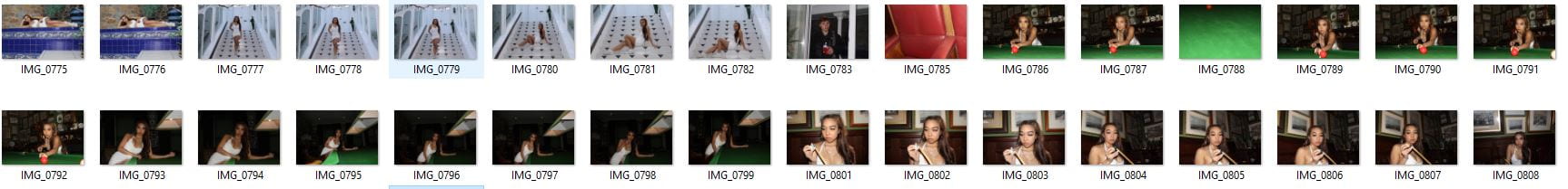
Above, are my contact sheets from my location shoot in town. My images were taken in an old Guernsey town house, previously owned by a merchant. This worked well with my theme as this building is very grand and reflects wealth, which is very much the vibe that I wanted to achieve with rap. The costume and surroundings worked well with my genre, however, next shoot I need to work on the focus of my camera, because as you can see, many images are slightly out of focus.

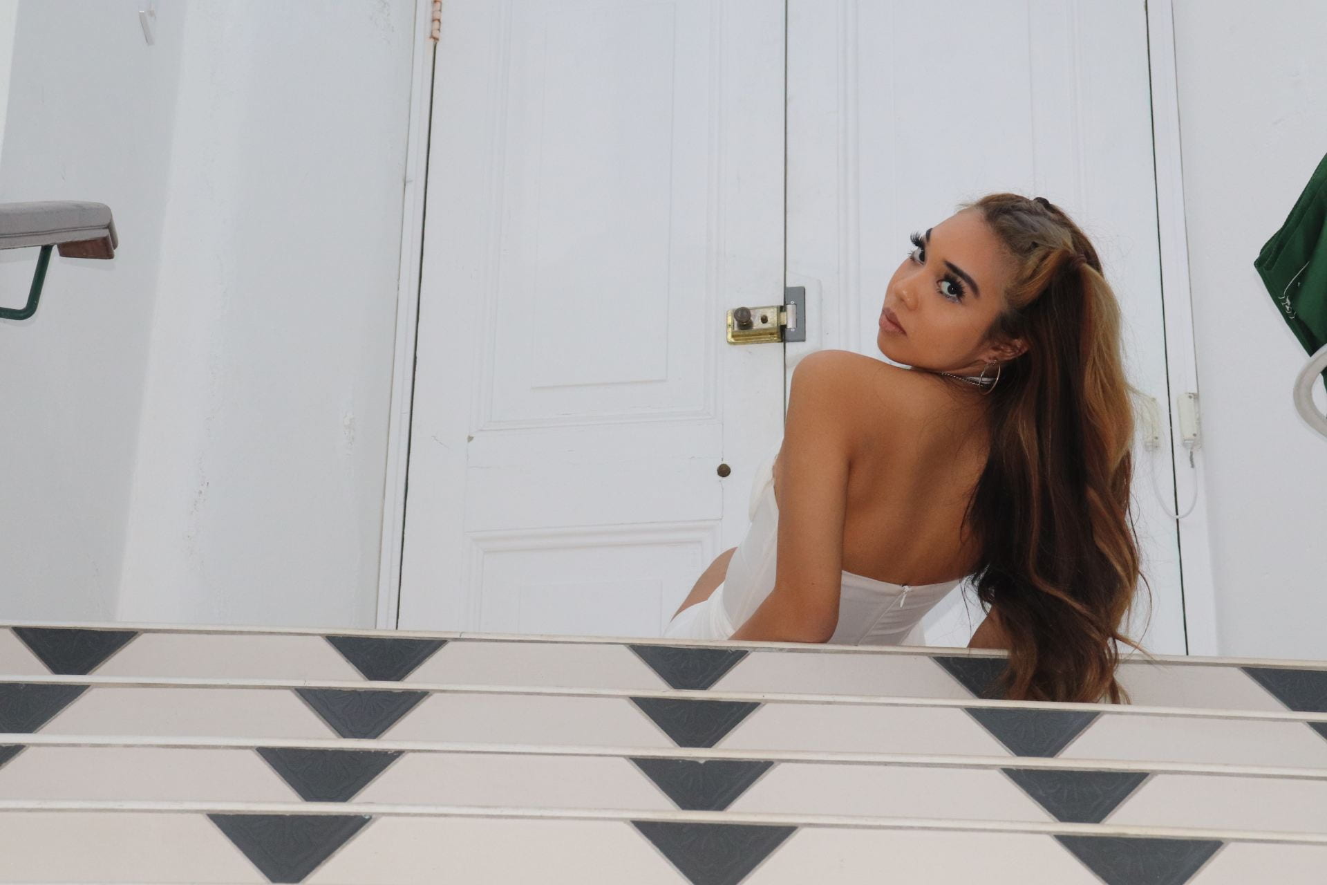
These are my top two images from the shoot, as I think they represent my genre well, my models facial expression suggests how she is showing off her wealth, and the dress she is wearing also expresses this, as she is not in casual clothes (even though she is in ‘her’ house). In the top photo, the white is very bright and in your face, the model is also looking down onto the camera, telling the audience of the riches she has. This is very much like the rap woman, Cardi B and Doja Cat.

PRODUCTION MEETING AGENDA FOR 2ND PHOTOSHOOT

In order for my shoot to run smoothly, it is essential that I made a plan for it. Stating who is bringing the:

  • make up
  • costume 
  • props

But also that the location, date and time is known.

During my shoot I would like to take images that, shows the girls as being vain, and proud. I will do this by making their body language and facial expressions very strong. For example have one  model applying lipstick, looking slightly to the side. The costuming of the images will also show this, hence why they will be wearing very mature and dressy outfits.

By using props, it will show the wealthy side of hip – hop, and by using filters and effects, giving off a euphoric vibe will highlight the edgy side of the genre.

DRAFT FEATURE ARTICLE

Before even writing a draft article, it is important that I have a rough understanding of what my article will be about, this is why I have made a small plan of what I would like certain sections of my article will include. By doing this it will allow me to get the basic principles and conventions of an article, but also start to show the personal identity of the journalist and artist in the early stages.

Having a hook is key to showing the reader, but also the pitch to the editor. This is because it gives a snippet of the style that the journalist will write in, but also the type of entertainment and information that will be included in the article. 

Below is my first draft of an article, I have made sure to relate to the hook and brief notes of planning that I made. But also relatable quotes that would be seen in this type of article.

Here I got my friend to read aloud my draft article, this allows me to hear mistakes and wording that could be changed. 


CONTENTS PAGE- PEER ASSESSMENT

My first draft of a contents page, was created on Indesign and photo shop. It went well to say it was a first draft, however I wasn’t as certain with my ideas, unlike going into making my front cover. 

In order to improve my contents page, here are five targets that I would like to improve on:

  1.  Add another image 
  2. Add more text that fits to the genre 
  3. Make it more simple and less busy
  4. Play around with the squiggles inside the ‘contents’ masthead
  5. Add in a page number at the bottom of the page to make it conventional


CONTENTS PAGE- WHAT IS IT ?

A contents page is designed to inform the reader of the articles that will be included in the magazine. It helps the reader to navigate through the magazine, by using lists of all the articles with labelled page numbers. 

While creating a contents page I should include:

  • Editors hello
  • Page numbers
  • Hyperbole and superlatives in headlines
  • Images and word clues
  • Graphic illustrations and designs
  • Reminder of the magazine’s name and mission statement

Although the contents page is to inform the readers, it still needs to be entertaining and flow with the theme of the magazine. By using AIDA, I hope that my magazine will draw the interest and attraction of the readers. It should also contain an image relating to the cover lines on the front cover, linking all these features together will not only make my magazine conventional, but it will make it more memorable for the reader, especially with the flow. The main image is used to frame the contents page, and the text is anchored around the main image, to connote the main image’s importance

Much like the front cover page, there should be a masthead stating that it is in-fact the ‘contents page’ . The use of a bold title will highlight to the readers the importance of the page.

Here are some ideas for my contents page that I found on pinterest. 

In order to get creative and think about what is going to be the best for my contents page, I got a pen and paper and played around with how I would want my contents page to look like. I also thought  of  some  catchy  cover  lines  that  would  be  suitable  for  my  magazine.

  1.  Neo- Convict to star 
  2.  Delve Deeper into Rap
  3. Travis’ tips on father hood 
  4. Top 10 Newest tracks
  5. Your Questions answered 

DRAFT OF FRONT PAGE AND SELF ASSESSMENT

It is important to self access work, it allows you to re-evaluate and take the time to critique your work. Even though it seems harsh, in the long run it will make my work look to the best of my ability. Below, is my first self assessment and draft 1 of my music magazine.

I would like to set myself some targets that I aim to improve with my next draft:

  1.  Make my star larger and more the focus.
  2. Change the background to a more contrasting colour (potentially orange)
  3. Make the green pen drawings more sharp and precise.
  4. Play around with they eyes and facial features of my model to be brighter (photo shop-liquify)
  5. Overall make it look as authentic and ‘magazine like’ as possible.


FIRST SHOOT CONTACT SHEETS

Using adobe bridge and photo-shop, I created contact sheets from my first shoot, for my music magazine. I focused on the relevance of my images to the genre, for example making sure that the costume, pose and proxemics are noticeably ‘Hip-hop’.

The star image of my character ‘Neo’ is that he is a chic, fashion forward male rapper who also has evolved from a prison convict to a star. This is portrayed in my images, with heavy chains slumped over his neck and shoulders.

The denotation of the images is that a male is looking at the camera, or side on. However there are many connotations to the images, such as the chains, braids, pose and the leather jacket. This is because they represent different aspects of my stars life, I hope that this will take my stars image from being ordinary, to extraordinary.

At first, I only used one flash, but I came to realise that two flashes would be more conventional as my images were coming out too dark. Although the shadows that were created from this were interesting and they can be seen in many hip-hop shoots as it shows the element of mystery within it. 

Overall, I am happy with how my shoot went, in the long run it was a learning curve as I now know how to work the flashes etc.. Even though some images were out of focus and slightly dark, I know how to change that and in future to make my next shoots the best they can be. 

SO WHAT AM I UP AGAINST!

Making it to number one, is every editors aim. In order to reach this, you have to have a thorough understanding of the competition. Through looking at the unique selling points of other magazines, it will allow me to come up with a new idea that will separate my magazine from the herd.

This Piktochart I made allowed me to look at what other magazines use in depth, and I came to the conclusion about what features I will include in my magazine. One of which being that the audience will receive information about artists that is seen as controversial or personal’. This will allow the target audience to see the personal identity of the artists, but also make them feel more socially interactive with them.

Loading...

Loading…