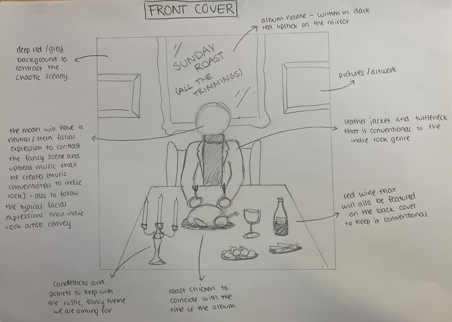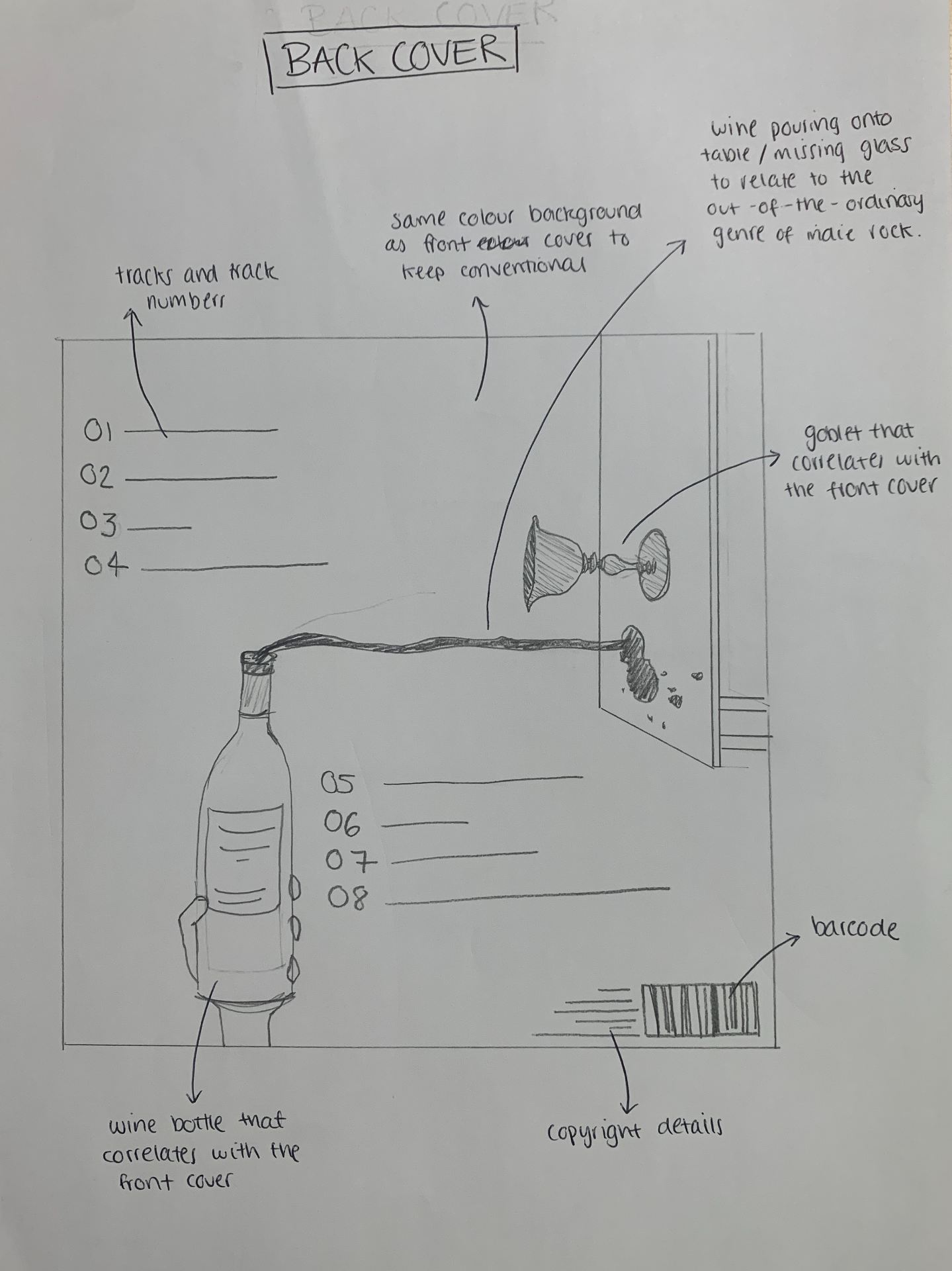
As a group we created a slideshow including a photographic mockup, colour schemes that we are looking to use as well as an explanation of what we want to name our album, and what we want to achieve on the front and back. In addition to this we have drawn exactly what we are planning on creating for our Digipak album. On the front cover, we want to convey our star image as someone who is controlled, yet unique. On the back of the album our star image will be communicated to the audience as someone who is anarchic and extraordinary. The wine being poured and missing the glass indicates the out-of-the-ordinary genre of indie rock.
This will all be achieved by using a repertoire of elements as well as considering the various conventions of indie rock – the anarchic, extraordinary, engaging themes that it communicates. By carrying out these conventions we will successfully attract our unique selling point to support their preferred readings, and ensure that our audience does not reject the text. We will have to encode the genre to such an extent that our target audience decodes the narrative in the way that we are looking for. We have a good understanding of what an indie rock album conventionally includes and due to this, our album should draw in the correct audience and be accepted.