Music Video – Conventions

click on image to view pdf

To create a good music video I needed to check out popular music videos and learn the conventions that they used to convey the narrative. I looked at a variety of different videos from many genres to gain a better understanding of the star image. I learnt about the three main narrative conventions that are used to portray the desired message, these include illustration, amplification and disjuncture. Illustration occurs when the video very closely echoes the lyrics and music, Amplification is when the narrative is inspired by the song but a new element is added to complement the song and Disjuncture is when the narrative seems to hold very little relationship to the song and appears quite random.

In order to do this I made a table where I analysed the videos that I watched and described the narrative conventions. This task was really helpful because it helped me to recognise the differences in the narratives.  For example, Beyoncé’s music video ‘single ladies’ may have appeared boring at first because it was just a video of three ladies dancing, however after studying it and acknowledging the MES, star image and the structure of the narrative I learnt that these techniques had been used on purpose as Beyoncé is so iconic that she doesn’t need a storyline to be appealing to the audience.

Focusing forward, this task will help me when I come to create my own music video because it has shaped my ideas and I know that I want to make a video that has disjuncture narrative.


Complete Magazine Draft 3

pls click on image to see pdf

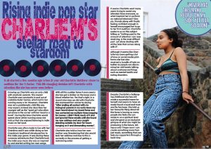
DPS-

What’s new?

  • Removed the ‘pg’ in the page number
  • Put a drop capital at the begging of the article
  • Edited any spelling mistakes and removed any dashes

What is next?

  • Remove the lines underneath the paragraphs
  • Drop shadow the vinyl images
  • Zoom in on the photo of my model, to make her more visible
  • Outline the text boxes


pls click on image to see pdf

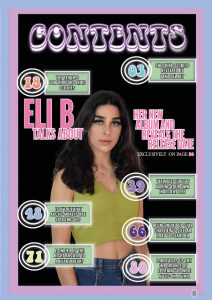
CONTENTS PAGE-

What’s new?

  • Changed the ‘contents’ title to a different font
  • Changed the font of the text in the boxes
  • Added circles to place the page numbers in
  • Changed the layout of the boxes so that they weren’t covering the model
  • Added a title that labels the model and advertises her page in the magazine
  • Changed the font of the page number to match the other page numbers

What’s next?

  • Change the spacing because it’s uneven
  • Highlight certain words to make them stand out
  • Check spelling
  • Take ‘contents’ over the boarder
  • Fit a couple more coverlines in


pls click on image to see pdf

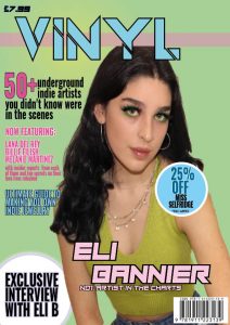
FRONT COVER-

What’s new?

  • Changed the picture of the model- to one with edited makeup and better cut out
  • Added a pink translucent line across the masthead
  • Changed the stroke on the masthead to make the black outline thicker and stand out more
  • Added more text t0 fill it out
  • Changed the fonts of some of the coverlines

What’s next?

  • Change the proportions of my front cover star, to make her look less stretched out
  • Make the masthead bigger and centre it
  • Spread out coverlines and make them white
  • Add more coverlines on the right side of the page
  • Move “£7.99” to the right corner
  • Include issue number and date
  • Move the plug

In order to improve on my magazine I will watch the screen castify below and add anything my teacher suggests would make it better:

Chosen Adverts

While, I appreciate this isn’t going to be marked, for the purposes of presentation, having an extra page in the magazine will help make the Flipsnack platform work better. It is important for magazines to promote branded products as it makes it more conventional, most magazines have specific adverts designed to entice and interest their target audience.

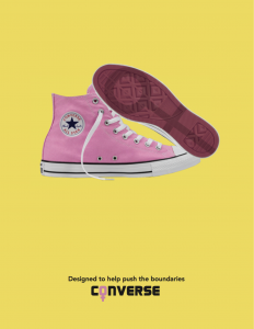
The first advert I have chosen is simplistic and I like it because I feel as though the colour scheme used will attract my psychographics and demographics. The contrast of the colours yellow and pink give it quite a youth feel, which is perfect because many of my demographics are teens and young adults. I also decided to choose ‘converse’ as the brand to promote, because this brand is commonly associated with the typical ‘indie’ style and will appeal to mostly teenage girls who are reading this. The tagline ‘designed to help push the boundaries’ is significant to this genre and my demographics because indie is often seen as being ‘alternative’ and ‘different’, often having fans who are wanting to rebel, and a lot of my psychographics are alternative, therefore the idea of ‘pushing boundaries’ with shoes, would appeal to them.

The second advert I have chosen is promoting ‘beats headphones’, and I picked this as I felt it was the perfect thing to advertise in a music magazine because I can pretty much assume all of the consumers are going to be interested in music. Specifically, I like this advert because Billie Eilish is seen in it and she is an icon in the indie-pop community. Billie Eilish has a huge fandom full of young teenage girls, who look up to her, and since young teenage girls make up a large proportion of my demographics, this advert is very well suited. While, beats can usually be quite costly, the issue date of my magazine is November, so this gives people the opportunity to ask for it for Christmas.


2nd Draft of DPS

pls click on image to see pdf

As displayed above here is the second draft of my double page spread. Despite preferring this version of my DPS, I have made some changes that I am not 100% sure about. For example, I can’t tell if I like the additional transparent box I put behind Charlie M’s name in the title

What is new?

  • The transparent pink box behind Charlie M’s name in the title
  • I’ve changed the font used in the paragraphs
  • Added boxes behind the paragraphs to make it more legible
  • Changed where I positioned Charlie M’s quote, changed the font, colour, text size and placed it in a box to make it stand out more
  • Added a page number

What is next?

  • Change the font of the page number to ensure it is the same font as I’ve used on the other page numbers in my magazine
  • Move the circle that I have put Charlie M’s quote in, further back so you cannot see the outline of the circle in the top corner
  • Fill any empty spaces on the second page
  • Read through my article, fix any spelling mistakes and put any quotations in bold

2nd Draft of Front Page

pls click on image to see pdf

Here is my second draft of my front cover. Even though I am very happy with the way I have designed this I still feel as though there is quite a few changes I need to add.

What’s is new?

  • Added new fonts, rather than only using two for the entire front cover
  • Added another pug and changed the way I displayed my pugs
  • Changed the position of the model
  • Changed the sizing and font of the plugs to make them stand out and easier to read

What is next?

  • Re-cut out the image of my model , refine their hair and edit her makeup
  • Fill any empty spaces
  • Add more coverlines

2nd Draft of Contents Page

pls click on image to see pdf

As shown above, this is my second draft of my contents page. I decided that I didn’t enjoy the layout of my first front cover so I changed quite a few things.

What is new?

  • I changed the background to black
  • I added borders around the edges
  • I changed the size and colour of the ‘Contents’ title, made it glow and centred it in order to make it stand out more
  • I changed the image of the model
  • I used a variety of fonts instead of just using one font for the entire page

What is next?

  • Centre the writing in the boxes
  • Check the page number aligns with the other page numbers in the magazine
  • Change the title so the end part isn’t blurry