Tour poster

Please click on image to see PDF

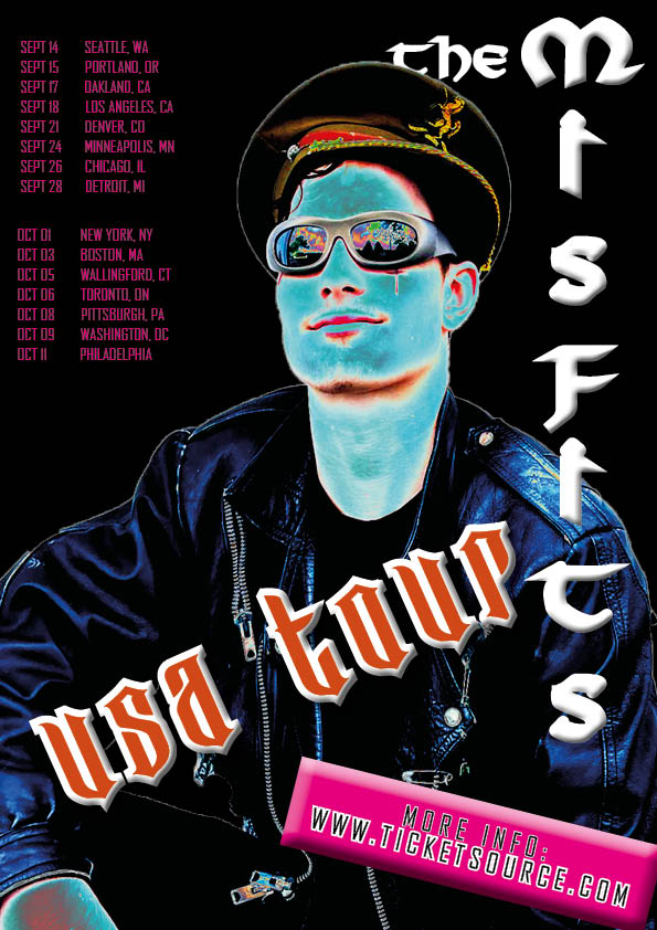
This is my tour poster using indesign, photoshop and my original Mise En Scene image to show how fonts, colours, language and images can all help create a narrative and convey a my punk genre in print.

My self assessment on my punk tour poster:

This will help me in future to create my music magazine because I now know how to use InDesign and photoshop to make my magazine and understand the importance of layout, colour scheme, images and all the conventions and denotations that the poster or magazine cover should consist of in order to be successful to your specific target audience.

My tour poster

Punk rock tour posters consist of different elements of media in order to attract, interest and desire their target audience. Examples of common convections for a tour poster genre are the colours, images, illustrations, graphics, fonts and typefaces. The colour palette that punk use shown in my poster examples consist of neon bright pinks, oranges, purples, blues, greens and also use black and white tones and shadows to create the dark and gothic like theme where as the bright colours are used to attract audience as they are eye catching and contrast the black and whites. The fonts used are bold and unique, again making the poster interesting  making people want to have a closer look.

This will help me to make my own punk tour poster because i now know the convections and design features that a punk tour poster consists of.