Author: eviebougourd
Final Digipak Draft

BRAND, STAR IMAGE, CONVENTIONS, COLOUR PALETTE, PHOTO MANIPULATION, GRAPHICS, ILLUSTRATIONS, FONT/TYPEFACE, MEDIA LANGUAGE, REPRESENTATION
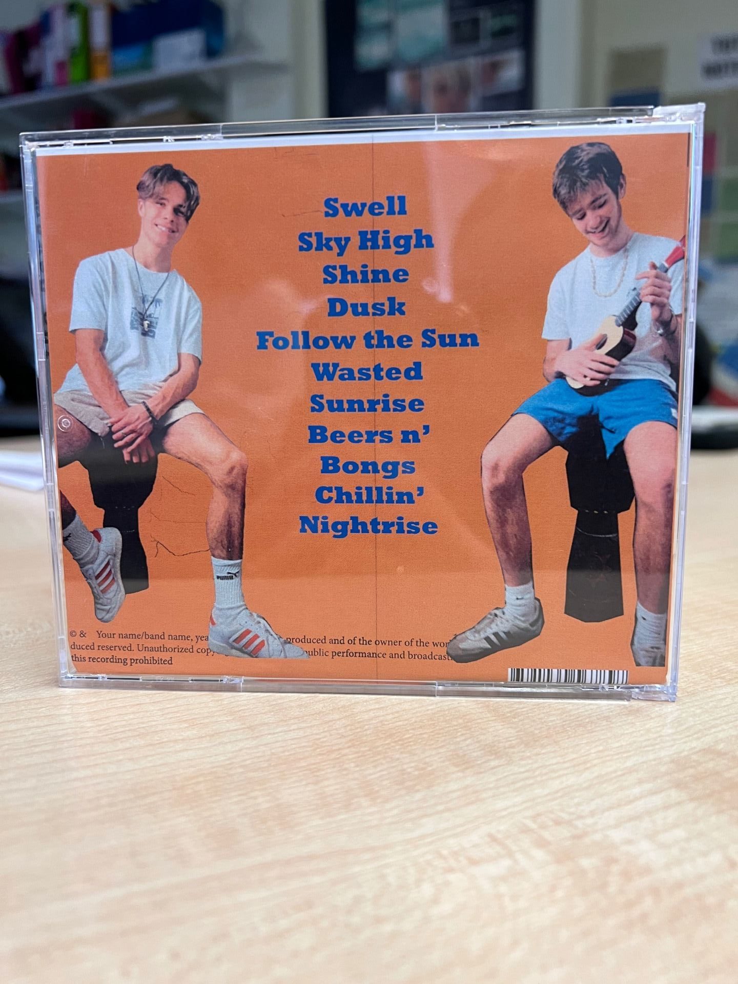
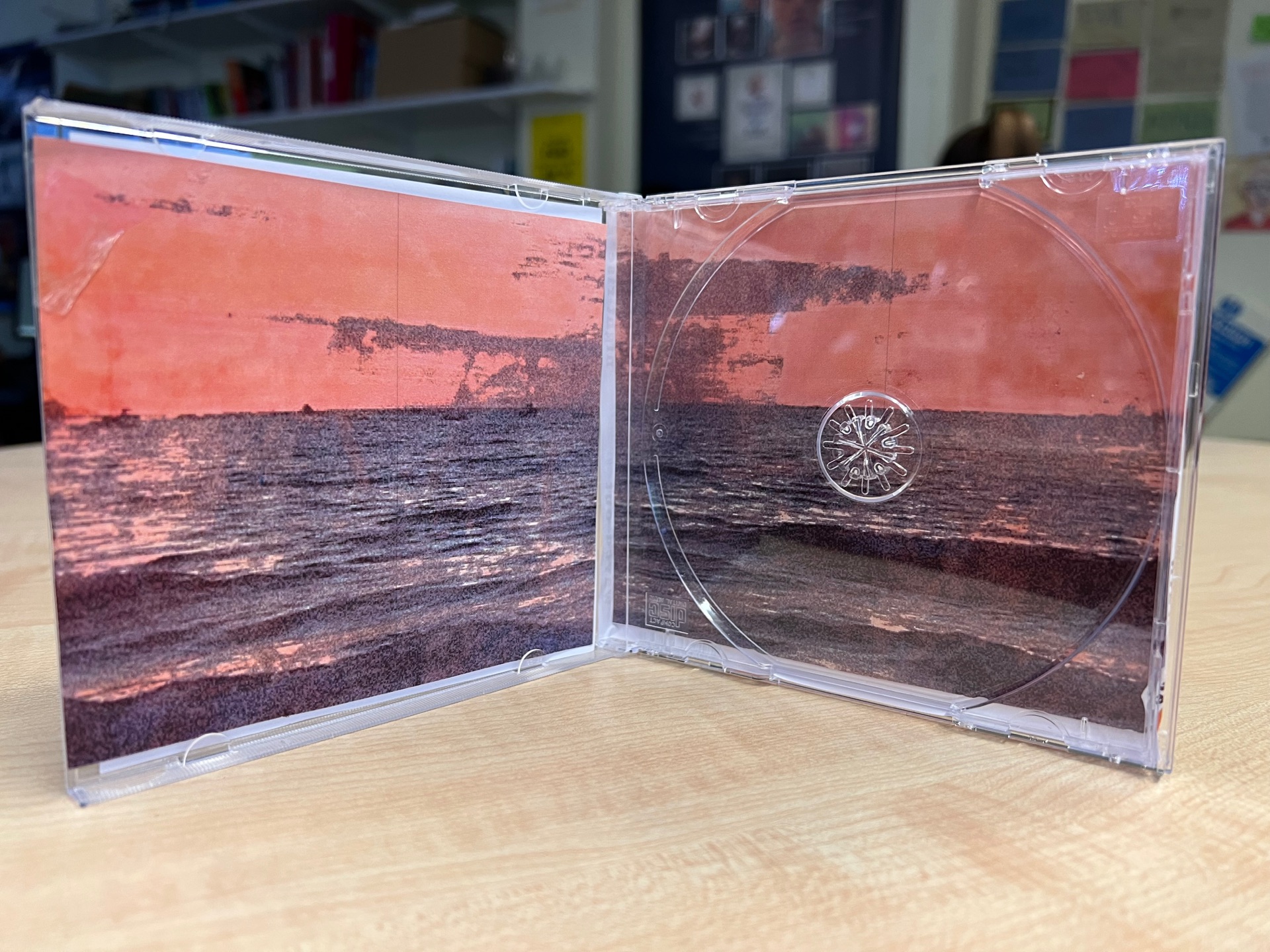
Digipak – Draft 3


Above is a printed version of draft three of our digipak, we printed it out and put it into a CD case which was really helpful to see how our final product will look and has helped us to see small improvements that we need to make which were harder to spot on the computer.
Below is a tally sheet we made and asked our class to write a tally next to the genre that they think our digipak represents.

This is the feedback that we received from our fellow media students. This was successful as they were able to guess or genre correctly meaning that we have represented our genre successfully. Moving forward, we still have a few tweaks to make to our digipak to fit to our genre even better and increase the overall popularity.
SMP – Draft 2
Above is a screen castify done by our teacher giving us feedback on our second draft of our social media page.
Teachers feedback;
- The two most recent posts are very similar to one another
- We need to add more stories on our merch, Q&A, ads and release dates highlights
- Post release dates and show the audience how they can download and access the music
- Add a guerrilla marketing campaign
- Add a game for audience engagement, such as, find the hidden ukulele in a picture to win a backstage pass at the next concert
- Need to collaborate with a brand or product
- Add more exciting posts – less of the band relaxing
We still have a long way to go with our social media page as this feedback was done during the start of our work. We will ensure to take Mrs Cobb’s improvements into account as we continue our work, we are also currently planning another photoshoot with our band models so that we are able to have pictures of them to use for ads and sponsorships etc. In creating a successful social media page that will increase the success and sales of our music it is important to include all of the important conventions.
Draft 2 Digipak – Teachers Feedback
Above is our second draft of our digipak which our teacher did a screen castify on helping us with improvements and targets.
Things to improve:
- Title bigger
- Album cover name written in a bigger font
- Coloured background, to create a gradient
- Change the colour of one of the boys’ T shirt
- Boarder more of a tribal vibe
- Copy-write is wonky on the back page
- Change the shot on the back page
Our colour scheme and overall feel of our digipak so far has represented the Indie Folk genre successfully, and we have contained the conventions correctly, such as; copy-write, barcode, and spines.
Focusing forward, these improvements will help us significantly as we know we have a long way to go. So far we have represented our genre well but these improvements will overall increase our success.
Timeline

In preparation for creating our social media page for our stars we wrote a timeline on post it notes. We wrote what we would post for our first 9 posts. We made sure to incorporate conventions such as, promotions, teasers, campaigns and different types of marketing, like guerrilla.
Focusing forward, this will help us to keep organised with our posts and not being overwhelmed with not knowing what to post. It will ensure that we remember to incorporate all these different conventions, which will later on improve our success.
Audience interaction with a social media page
In preparation for creating our own social media page, we explored and decoded Mumford & Sons instagram page. We chose to look at Mumford & Sons as they are a popular Indie Folk band, the same as our genre. In exploring their instragam page we looked for any technical conventions used. We found that AIDA is represented throughout their page as this is important in entertaining their target audience. We discovered many other technical conventions used such as, integrated advertising, promotions, guerrilla marketing, social interaction etc.
Looking forward, we now understand the conventions needed in order to create a successful social media page. We have discovered more subtle ways to present our marketing in a way that the audience will know without being too in their face. We will be sure to create our instagram page in a way that is the same but different.
Digipak – Draft 1


Here is the first draft of our digipak. So far this is just a rough copy as we know we need to change a lot more to improve it. Below I have marked this draft using the success criteria given;
The use of camera and photoshop to take and manipulate engaging images:
From our shoot we were able to get more images of our same models used in our music video to be on the front page of our digipak. After exploring other indie folk artist’s album covers we found that the band or singers were almost always on the front page but they tended to make the back page more simplistic and minimalistic. So we will take this into account when making our second draft and not put a set picture as the main focus on the back page. We also ended up not having enough time to cut out the pictures of our models on photoshop so we will be sure to do this for draft two so that we are able to place them on a more fitting background for our genre.
The selection of mise-en-scene in the photo and the meaning it communicates:
As our genre is indie folk we made sure to incorporate traditional things that would represent the genre well. After researching other indie folk music stars and looking at their album covers and music videos they often contained traditional instruments such as pianos, acoustic guitars and string instruments. Because of this we managed to get hold of some bongo drums and a ukulele for our shoot. These props are cultural codes (Barthes) for a particular genre of music in this case organic, traditional, indie folk. Following up from our shoot we should’ve brought more outfit changes for our models to wear so that we had a bigger variety of different shots that we could’ve also used for our social media page. We also should’ve thought about the colour of the boys’ shirts as because they are both white they will be more challenging to cut out on photoshop. For our second draft we will explore with a folky boarder as a frame to represent the genre and produce a better star image which will attract the target audience.
The create use of DTP to integrate images and text and the use of colour\types-faces:
Desktop publishing enables us to create our digipak in a layout where we can see how our final result will look. We are able to edit all on the conventions such as a bigger title, barcode, copywriter, spines etc. in a way that fits digipaks and a way which represents our genre well. Our current title is quite boring so we will edit this to make it bigger, and indie folk font and colour scheme.
Overall, I would mark our draft one at a C as it is clear that it is a digipak and so far I think represents our genre adequately. To increase our grade we cut out our models and place them on a background that presents our genre and our star image which will appeal to our target audience, increasing the overall success.
Contact Sheets


Following up from our digipak shoot we have made contact sheets of all of the shots we took. As Gian- Luca and Evan were the stars for our music videos we will make them our models of the front page of our digipak. We tried to get shots in many different positions and using different props to make the shots more interesting, we made sure to get different kind of shots as we will use some of these photos for our social media page as well as our digipak. Unfortunately the camera was too exposed to achieve the vintage, retro feel we wanted, so we ended up using an app on our phones which added a grainy, vintage feel filter.
Focusing forward, if we do another shoot we will make sure to bring a few different outfits for the boys to wear so we have more of a variety of completely different shots to use for our social media page and we would make sure that both the boys aren’t in white shirts as it made it more challenging to cut them out on photoshop.
Digipak Conventions Analysis
I chose to analyse and annotate Mumford & Sons album cover as they are a popular indie folk band. I decoded the technical elements of this album cover and learn the importance of including conventions such as a barcode, publisher logo, tracks, band name etc. The overall style on an album cover depend on the combination of colour, imagery and typography. This repertoire of elements conjugate together to create the desired effect and representation of the artist’s star image.
Decoding this album cover has helped my to understand the Indie Folk community deeper. I know now the certain repertoire of elements that Indie Folk bands consist of in order to reach their target audience and meet all of their needs. Such as, a simplistic design with simplistic imagery and text, and a neutral colour scheme. Learning this will help us to create our digipak in a way that is the same but different, appealing to the Indie Folk community and growing success.