Digipack Mockup:
In order to be able to visualise how me and my partner want our digipak design to look like for our star’s new album it is important to produce a deigipak mockup. This helps us to stay organised when it comes to producing our product; having set plans for photoshoots, all images we need to take as well as any fonts we would like to use.

Mockup Analysis:
When producing our mockup, certain elments were inspired from over album covers and blueprints. Although we have used inspiartion from these sources we have no intentions of copying them and will make our digipak original. When designing a rough draft of our digipak we had to think about key technical conventions of our genre in order fro our audience to accept the text, these include, bold fonts, the star featured on the cover, colour palette, songs titles and digital design.
For our front cover we hope to feature the cover star in the centre of the page using a direct mode of adress to connect the audeince with the product. A bold blocky font will be featured to display the album name, this allows it to stand out whilst following the repetoire of elements found on similar products. In order for our audience to decode our product to give of a mystifying and onbsure connotations we aim to use a projectore to give of a ‘trippy’ effet on the background and star’s face. This will help to connote the star image we our aiming for which is energetic, fun, mysterious and emotive.
The back cover will also feature our star, however it will be a long shot. The back cover will include both photography and digital design. The image above shows the star who will be in a fun gesture leaning on an old TV. The tv screen will have faces displayed it it which will be done by digital design, following a theme of our album name. The song titles will be featured on the left hand side with around 12 songs on the album. The star will not use direct mode of adress on this page but more to the side in order to intirgue the audience of what she is looking at.
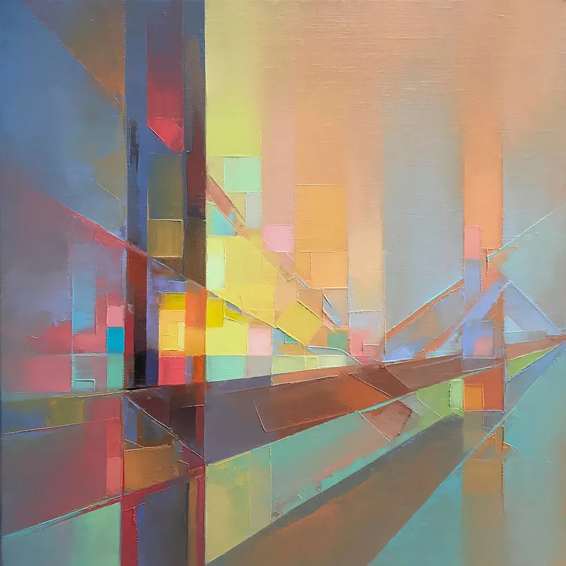
The inside two pages of the digipak will purley feature digital design. The first page will feature an eye looking into the audince to help make them feel involved. This will also bring a sense of emotion into the image. The background will be mixed colours from our colour palette seen below helping to create a ‘psychedelic’ approach. On the second side will just be the same background used as the other side to ensure continuity, with the CD covering the most part of this area.
Representation Of Our Colour Palette: