Component 1
CCR2- How does your product engage with audiences and how would it be distributed as a real media text?
Screen Castify:
In order to understand how my music magazine engages with my audience I have created a creen castify for my music magazine, I explain how my product engages with my targeted audience and how I would wish to distribute my magazine as a real media text, giving reasonings for my choices.
Question 4: How did you integrate technologies in this project?
CCR1 – Question 3 – How did your production skills develop throughout this project?
MP3 Recording:
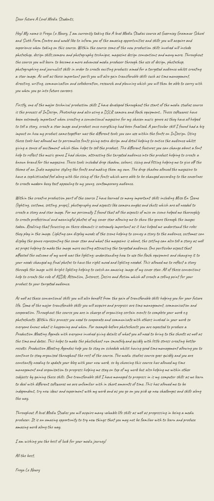
My Letter to future A Level Media Studies Students:
Final Magazine Drafts
Front Cover:

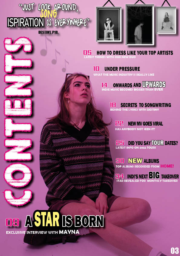
Contents Page:
Double Page Spread:

Changes:
Within my final drafts I have made changes based around my given feedback as well as to create the best product for my magazine:
- Minor changes have been made to my front cover and double page sread such as the colours, fonts and more coverlines to help give the targeted audience more detail.
- However for my contents page more changes have been made to improve the quality and design of the page. The image and background have been swapped for a better quality and more intresting colour to help create a selling point. I found this image worked better as the model is looking up towards other images helping to craete a focal point.
- I have made certain words and coverlines stand out on the page to help the audience find key details about each topic.
- I have experimented with different colours within certain design features to see what worked best for the pages.
Chosen Adverts
Chosen Adverts:


How They Appeal To My Targeted Audience:
The two adverts I have chosen appeal to both the demographics and phsychographics of my magazines targeted audience. My magazines target audience is primarily females in late teens who love to express their individual differences as well as learning new adventurous things.
Therefore these adverts fit the Indie music genre as well as the fashions and style of the music. The adverts are related to what the audiences intrests would be as well as matching the theme of a music magazine relating to my chosen genre. Dr. Martins relate to the audiences fashion and uniqueness as well as this brand being a huge brand, allowing the audience to understand how well known the magazine is too be supporting these types of brands. The Fender Guitar advert relates to the style of music as well as the audiences intrests helping them to be encouraged to read on throughout the magazine.
Why Would Advertisers Be Interested?
Indi magazine mission statement: “Indi brings together a community of indie music lovers to admire and cherish their all time favourite music. We reveal the new and exciting information on fashion, artists and exciting projects to our audience encouraging our fans to express and reveal their individuality and spark to the world. With the latest information you can find out everything about your favourite artists from home and become apart of our indie community with just a turn of a page.”
My mission statement will appeal to these advertisers as their audience share similarities within the magazines helping them to reach the right people their product is aimed at.
My 3rd Drafts
Front Cover:

What’s New?
- I have added a wider variety of colours to allow certain details to stand out as well as making the cover more intresting.
- Some of the coverlines have been changed to fit the music genre better.
- I have played with fonts and sizings to add extra design to the magazine cover.
- A price has also been added as well as a music note design to add extra graphics.
Contents Page:

What’s New?
- Within the double page spread I have added extra coverlines to fill the space as well as giving more detail to the audience.
- I have played with the sizings of the fonts to give extra design making certain key words stand out.
- I have also added drop shadow to certain objects to help the design.
Double Page Spread:

What’s New?
- On my double page spread I have changed the background design to a more simple one helping to keep the attention on the cover star and article.
- I have added extra designs such as music notes to add an extra touch and design.
- The article has been made smaller in order to minimise the space it takes up.
- A quote has been added for further detail.
- The masthead has also been made larger to make sure it stands out.
Mrs Cobb’s Screen Castify With Suggested Feedback:
- To move the cover star to the other side in order to have more room for coverlines.
- Move the main cover line doen to crete more room.
- Change the colour of the box behind the coverline, “Secrets to songwriting”.
- Move barcode to the right as well as the price.
- To add a plug for the magazine at the top explaining what the magazine does.
- Change the background of the contents page in order to make sure there isn’t too much pink.
- Make the imge bigger on the contents page.
- Add a page number to the contents page.
- Within the coverlines on contents page continue the theme of certain words standing out.
- Add s caption too the stars on the contents page.
- Make sure all numbers correspond.
- Experiment with colours on the contents page.
- Add captions to the smaller images.
- Attach PDF’s to blog.
- Make the standfirst visible on the double page spread.
- Make title bigger on double page spread.
- Add drop shadow to background behind cover star.
- Make sure the star image on double page spread is known.
2nd Draft Of Double Page Spread
My Second Draft:

What’s New?
Within my second draft on my double page spread I have made some changes and improvements in order to create a product that suits my magazine genre best:
- I have made the splash less harsh on the page in order to make sure it doesn’t take away the focus of the image and article.
- I have aslo added more details such as extra colours which allows tha page to stand out appealing the audience to read the article.
- The colour pallette of my double page spread now matches my magazines theme allowing the audience to recognise ‘indi’ allowing it to create a brand.
- The double page spread now also includes my own article for the magazine about ‘Secrets To Songwriting’ as well as a by line in the corner to show who has written it.
What’s Next?
Further possible changes I could make to my double page spread could be:
- Try and make the headline stand out even more and add a possible different colour to seprate it from the article.
- I would like to also experiment with different background colours to see if anything works better than white however I will still need to focus on making sure it is still simplistic for the audience and easy to read.
- To make the splash a slightly lighter cover in order to keep the focus on the other conventions.
- Experiment with different designs and details.
2nd Draft Of Contents Page
My 2nd Draft:

What’s New?
Changes I have made on my contents page are:
- The rearrangement of the coventions to make it more intresting and detailed.
- I have added an extra coverline allowing the page to provide more details and information for the audience.
- I have also changed the main photo to fit the page better as it worked around the text.
- It includes extra photos as well as a quote to make it more intresting for the reader as well as giving an insight to the magazine.
What’s Next?
Further improvements I could make to my contents page could be:
- Finish the album review in bottom left or change to a different convention.
- Add more designs to make it stand out but keep it simple.
- Experiment with different colours amongst the page as well as fonts to make the design more intresting.
2nd Draft Of Front Page
My 2nd Draft:

What’s New?
For my second draft of my magazines front cover I have made some improvements to make the dsign work better and easier to read:
- I have added extra coverlines however have still kept it simplistic to make the design the ‘same but different’ as this is typically seen on an Indie Alternative magazine.
- Another change I have also made is that the coverlines have bceome more conventional as I have moved the image slightly to create room for the writing and have taken away the purple circle to make it more ‘magazine like’.
- To make the cover more intresting I have added more colours within the writing to make key points stand out to it’s targeted audience helping them to know what will be included within the magazine.
What’s Next?
Future improvements I can make:
- Add extra coverlines without the magazine cover getting too crowded as the Indie style is typically seen to be simplistic.
- I could also experiment with different colours for the backgrounds and writings to see what works best as well as adding small details like the magazines selling price.
- Another convention which could change would be the main coverline moving down the page slightly I order to make sure the cover star is not covered.