Digipak Final Draft

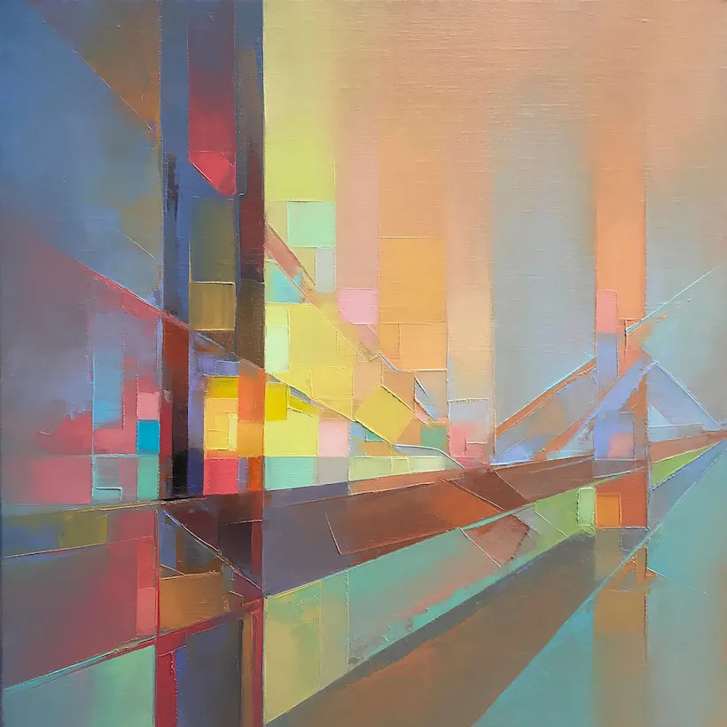
Me and my partner have now produced our final draft of our digipak. Overall we are really happy with how this product has turned out and we believe it connotes the brand we wanted to portray perfectly. Our brand portrays our star in an ‘ethereal, mysterious, quirky’ way which has been portrayed within our digipak.The digipak uses different types of media language to portray this brand. The bright colours give a kaliedescopic aura along with the unique designs connoting our brand. The digipak is coherent, following a consistent colour palette throughout which is vital in order for a successful brand package. The bold, modern sans serif text inlines with the demographics of our target audience- young adults (primarily females) as well as connoting a spiritual feeling through the use of a ghosting effect on the front cover. The desings are simple yet effective, creating excitment and attraction throughout.

The paradox of the star, proposed by Dyer, is represented as extraordnary within our digipak. Our star is seen with an expressionless tone on her face, portraying a sense of mystery. The effects and distinctive designs represent the fun and energetic nature of our star’s character. As Barthes sugeests, narrative codes can also be seen within our digipak. The headscarf on the artist may connote a Middle Eastern vibe towards specific cultures whereas in other cultures this may be read as a statment and classy piece giving the star a sense of style. In order to gain our preferred reading, a theory suggested by Hall, we needed to ensure the correct ‘vibe’ was portrayed and did not represent a Middle Eastern atmosphere. Therefore we did this by using modern sans serif fonts and within the rest of the digipak, highlighted the almost ‘pshchedelic’ and ‘freaky’ aura of the star.

Our star follows a multi-genre vibe as mentioned in our mission statment and we believe our digipak supports this statement perfectly; you are able to gather different genres of music within it through different technical conventions and elements. For example on pop digipak is is common that the fornt uses a close up of the star’s face using direct mode of adress in order to entice and hook the audience in. R&B digipak’s often feature god-like images portraying the star as very extraordinary whilst creating a feeling of power. Lastly electronica digipaks give of a hallucinogenic ambience. All three of these genres are represented within our digipak through the use of common technical conventions.

Digipak Final Draft:

Please click on image to view PDF.


What Has Changed Since Draft Three:

  • The title of ‘Freya’ has changed fonts to be inline with our social media page and othe products making her brand name coherent and consistent.
  • The middle left page’s colour has been changed to have a slightly more blue tone in order to follow the colour palette of the digipak.
  • The eye featured on the inside right has been edited slightly differently. Colours have been mixed to give a more exciting and psychedelic approach. As well as this the framing wround the eye has been edited to make it look as though it is almost closed behind soemthing.
  • The spines have been chnaged to inclsude the common font for ‘Freya’
  • The ‘Freya’ on the tv screen has been made more visible in order for the artists name to stand out.
  • The ‘Freya’ on thr frotn page has been centered.

Overall we belive our digipak coinsides with our mission statment perfectly. It expresses a multi-genre vibe towards our audience and demonstrates the stars quirky charcater throughout. We are very happy with our final product and believe our target audience will ‘accept the text’.

Digipak Draft Three

We have now produced our digipak draft three and it is starting to come together well. Within this draft we have made a few changes recommended from our last feedback. These include ghosting the title more,changing the background to add a halo effect, the inside two panes have been developed after experimenting with different images and the font on the back pane has been played with. For this draft we have put our digipak into an actual CD case, as seen below. Doing this has allowed us to see how it would actually look as a product enabling us to make any necassary changes within the next draft.

Digipak Draft 3:

Digipak Draft 3 In CD Case:

In order to know how our digipak design is represented to our audience is is important to gather relevent feedback. Below is a table which was presented to our peers with different music genres; they were asked which genre they thought our digipak represented. The results showed that we were able to get our preferred reading towards our digipak with the main three genres chosen being Electronica, R&B and Pop, which is exactly what we hoped for. This fits with our mission statement for our star image, as it states Freya gives a multi-genre vibe including the top three most chosen genres. Therefore the representation of these genres is evident within our digipak as the audience were able to guess the preferred reading.

Peer Feedback:

Focus Forward:

We now know that our digipak is on the right track as it displays the genres we hoped for towards our audience. This is due to us taking out the key repetoire of elements (Lacey) typically seen within these genres and used their technical conventions whilst still putting our own twist to it, making it ‘the same but different’. We can now finalise our product making any relevant changes needed.

Digipak Draft Two

Digipak Draft Two:

Producing our digipak draft two we had to consider the reflections we made from draft one. Within this draft we had time to play around with more images taken from our shoot, finding images which we think worked better and showed our photography skills well. As well as this, draft two, includes both inside panes of the digipak as well as the front and back, so we now have a complete rough digipak. This draft is nowhere near perfect but we believe we are on the right tracks of how we want our star and digipak to be portrayed and are happy with our progress made.

As we go along with the production of our digipak it is very important to recieve relevant feedback from others outside of our team to gain an audiences viewpoint on the product. Therefore our media teacher has created a screen castify, giving feedback on our product and what could be changed within the next draft to make it even better.

Teacher’s Screencastify:

Within this screencastify my teacher takes me through what she likes about the digipak and what could be worked upon within the next draft. So far we have recieved very positive feedback on our second draft and will ensure any necessary changes our made next time.

Positives:

  • The picture on the front pane is good and professional.
  • The echo effect on the font of ‘Faces In The Crowd’ is a good effect.
  • The back panes ‘vibe’ is good and modern.
  • Our teacher is very confident with the front cover as it is simple yet effective.
  • We would be able to enter it now and get a good mark however there are still improvments to be made.
  • Most typical digipak conventions are seen so far.

Improvements:

  • To get rid of text box on front cover- wasn’t meant to be there.
  • Enhance the echo effect on ‘Faces’ and ‘Crowd’.
  • Make sure the artists name is in the middle on the front cover.
  • Can the image be bigger on the back cover?
  • Faces In The Crowd needs to be one of the song tracks.
  • Include the artists name on the spines.
  • Include copyright on the back.
  • Slightly more sophisticated font on the back.
  • The middle slightly takes away the genre of the album and needs to be looked at to make it slightly less dark.

Focus Forward:

Now we have started to make good progress on our digipak, finalising it and tweeking certain aspects will be easy for our team. Generally we our happy with how our digipak is going but there are certain elements which need changing, adding and improving in order for it to be more successfull (as mentioned above). We believe that our digipak represents our star in a mysterious, ethereal and fun way, which we hoped to display within the product. The design and photography is coherent throughout whilst relating to our social media page also which is very important in order to create a brand image.

Digipak Draft One

  Front Cover:


Above is our first draft for our front cover of our digipak. This draft is nowhere near perfect but has allowed us to gather an idea of how our images will work on our front cover. When producing the first draft there was certain citeria which could be followed:

  • Use of camera and Photoshop to take & manipulate engaging images.
  • Selection of mise-en-scene in the photos and the meaning it communicates.
  • Creative use of DTP to integrate images and text and  use colour / typefaces.

In order to start to put together our first digipak draft we ensured we followed the criteria above. The use of a close up shot and direct mode of adress helps to engage the audience and make them feel a sense of involvement. In order to achieve our star image that we hope for (exciting, fun, mysterious, edgy) we had the star to use a neatural face to give away no emtion helping the audience to keep guessing what the album will involve. The bright colour pallettte also connotes a sense of excitment and fun characteristics towards our star imgage. The lighting and MES also helps to create a mysterious and ethereal atmosphere towards the image and the star. However the last section of the criteria is still a work in progress and will be shown more throughout the next draft of our digipak.

Back Cover:


Above is the first draft of our back cover fro our digipak. The same assessment criteria follows for the back cover as seen above. Within the back cover of our digipak we have included photography from our shoot however an effect has been added in order to give it an illustrative element. We have also included the song titles featured within the album aswell as a barcode on the backcover so far.

When it comes to doing our next draft we need to include the Music Group our artist is signed too as well as copyright information in order to follow the typical conventions seen. It is also important to consider playing around with other images, designs and colours to ensure what works best for your digipak, so therefore now we have time we will do this. Within our next draft we will also hope to complete the inside two planes aswell as the spine of the digipak to have a complete digipak so we can then focus on the whole thing and see how it comes together with different elements.

Draft One Assessment:

Focus Forward:

Now we have produced a basic draft of our digipak this will enable me and my partner to then go forward and continue to design our digipak and changing any necessary elemts within it. Although this draft is extremely simple and far from finished it is important not to rush into designing such an important project for your star and brand. As you go elements will fit together and certain parts are going to change to suit your genre and star within the post production aspect of the digipak.


Contact Sheets and Shoot Evaluation

 Photoshoot Contact Sheets:

Below are all of the images taken throughout or didipak photoshoot:

Above are all our images taken during our digipak photo shoot. It was important to consider all the typical convetnions we wanted to follow when shooting for the production of our digipak. Thes included bright colours which we used through a projector and low key lighting. Within our digipak we hope to display a unique and ethereal atmosphere towards our audience which we believe shows within our images.

As well as this it was important to gather some shots from various camera angles in order to give us a wider choice of images to use when experimenting with our digipak design. Therefore we gathered photos which used direct mode of adress, close ups, long shots, different gestures and poses as well as colours displayed in the background. the amount of images achieved will enable myself and my partner to have a varied choice of what we can use within our digipak helping to achive our visions to the best of our abilities.

Overall the shoot ran smoothly due to our pre organisation before the initla date. Everyone knew what they were responisble for in relation to costumes, props, makeup and lighting helping to use our time effectively and sufficiently.

PMA- Digipak Shoot

Production Metting Agenda For Digipak Shoot

To stay organised when producing our digipak it is important to create a PMA so me and my partner both know what is happening and when. This will help our shoot to run smoothly whilst using our time efficiently.

PMA Analysis:

To share the responsibilites equally between me and my partner we have alloacted specific areas for us to be responsible for during our shoot. As I am the model for the shoot I will be responisble for providing my costume and doing my makeup whereas my partner will bring the props needed. We will both hold responsibility for bringing the equiptment needed; camer tri pod and lighting sources.

As our shoot is within the school grounds neither of us need transport during this time. A risk assessment is also not needed as we are within the school premisies and minimal risks will be involved during the shoot.

Digipack Mockup

Digipack Mockup:

In order to be able to visualise how me and my partner want our digipak design to look like for our star’s new album it is important to produce a deigipak mockup. This helps us to stay organised when it comes to producing our product; having set plans for photoshoots, all images we need to take as well as any fonts we would like to use.

Mockup Analysis:

When producing our mockup, certain elments were inspired from over album covers and blueprints. Although we have used inspiartion from these sources we have no intentions of copying them and will make our digipak original. When designing a rough draft of our digipak we had to think about key technical conventions of our genre in order fro our audience to accept the text, these include, bold fonts, the star featured on the cover, colour palette, songs titles and digital design.

For our front cover we hope to feature the cover star in the centre of the page using a direct mode of adress to connect the audeince with the product. A bold blocky font will be featured to display the album name, this allows it to stand out whilst following the repetoire of elements found on similar products. In order for our audience to decode our product to give of a mystifying and onbsure connotations we aim to use a projectore to give of a ‘trippy’ effet on the background and star’s face. This will help to connote the star image we our aiming for which is energetic, fun, mysterious and emotive.

The back cover will also feature our star, however it will be a long shot. The back cover will include both photography and digital design. The image above shows the star who will be in a fun gesture leaning on an old TV. The tv screen will have faces displayed it it which will be done by digital design, following a theme of our album name. The song titles will be featured on the left hand side with around 12 songs on the album. The star will not use direct mode of adress on this page but more to the side in order to intirgue the audience of what she is looking at.

The inside two pages of the digipak will purley feature digital design. The first page will feature an eye looking into the audince to help make them feel involved. This will also bring a sense of emotion into the image. The background will be mixed colours from our colour palette seen below helping to create a ‘psychedelic’ approach. On the second side will just be the same background used as the other side to ensure continuity, with the CD covering the most part of this area.

Representation Of Our Colour Palette:


Digipak Conventions Analysis

In order to understand the technical conventions and repetiore of elements usually seen on a Pop/R&B soul/Electronica didpak it is vital to analysis a media text of the same genre. ‘Tinashe’ ia a an american singer, dancer and actress who describes her music as rythmic pop. Below is one of her albums, ‘Aquarius’ which was released in 2014, which has been analysed focussing on the blueprint, colours, conventions and what these connote towards the audience.

Digipak Analysis:

From this task, I have gained an understanding for the typical conventions/forms and repetoire of elements seen within my chosen genre. Analysing the design choices I have found that in order to connote a mysterious and ethereal atmosphere the use of lighting is typically used throughout this genre. Low key lighting is a huge element helping the audience to gather a mystifying feeling.  As well as discovering the typical tecniques used I have realised that doing ‘extraordinary’ conventions can work too in order to make your digipak be different and stand out. However if this is done it has to be done carfully and not be too dramatic in order for the audience to accept the text and not reject it. Within my group we hope to use slight ‘extraordinary’ conventions to represent out star within the media helping to portray the star image we want to.

Focus Forward:

Now understanding the repetoire of elements seen on Pop/R&B soul/Electronica digipaks, I will be able to follow these conventions when designing and producing our own digipak’s for our star. Being able to know what these competitors connote and denotate will help dramatically when producing our digipak, being able to portray similar meanings towards our audince with a individual unique style towards our star.

The Look Book- The Package

MoodBoard:


Made with Padlet


MoodBoard Reflection:

Above is a moodboard created by both me and my partner to show what would be appropriate towards our package. Included in the mood board is album design, fonts, colour pallettes, tour posters and artwork. To gather inspiaration towards our package this task is extremely important, it has enabled us to gather an understanding for what other competitors within the industry produce and how they design their porducts. Our strar’s genre is primarily pop however it also involves R&B sould as well as electronica. Therefore it was important for us to gather a range of images that represent theses genres and see what repetoire of elements they hold.

Representing your star within the media is a careful task, through the use of integrated advertising ,every apearance they have within the media allows audiences to form opinions and viewpoints about your brand image and star. Therefore we need to ensure that the style of our prodcuts connotes what we want our star to portray. As seen above in the designed moodboard, we have a range of core values and aims for our star to be represented as; emotive, quirky, playful, dramatic, powerful, commanding, high-spirited, eccentric and freakish. These descriptive words are what we aim for our star to be portrayed as towards our audience. Therefore the blueprints chosen above all display this through the photography and design. The theme throughout genreally involve vibrant colours, emotive gestures, constrasting images, good use of MES, direct mode of adress, psychdelic vibes, and good use of lighting to create atmosphere.

In relation to our overall mission statement our inspiration photos match this perfectly, creating an ethereal and emotive atmosphere. When looking at our digipak we want our preferred reading to have feeling of connection throught the use of emotionn and lighting. As well as this we want them to feel involved within the product and gain an extraordinary effect within the image in order to create excitment and a mysterious approach. We want our audience to accept the text and not reject it therefore we are folllowing simailar conventions and repetoire of elements typically seen within theses genres but wil be mixing them and adding our own approach.

Focus Forward:

After gathering a forming a mood board with inspiration blueprints on me and my partner now have a clear understanding of how we want both our star and product to be represented as. We can now also begin to start thinking about what we would look our digipak to look like through the use of these designs; do we want photography and design or just design, what lighting we will be using, the MES, and what fonts we can use in order to get our preferred reading across to the audience.

Our Mission Statement- The Package Brand

Our Slideshow Showing Our Mission Statement:

Slideshow Reflection:

Creating a star image is vital when promoting a new album, a star’s presence within the media is extremely important, every appearance an artists has online accounts to how cosumere view them and create opinions on the. To create a brand for your star or group there is a variety of techniques that take place; marketing stratagies e.g guerilla marketing, viral marketing and synergy, promotion and intergrated advertising. We have decided to display our star as a known but upcoming artist with the release of a new album being a major project for them in hope of growth of audience.

Our mission statement is as follows ‘ Freya offers a multi-genre vibe into the pop world. Mixing R&B soul, pop and electronica, freya’s emotive atmosphere and tones give an ethereal and quirky perfromance style, providing fans with an ocular kaleidoscope with a multicoloured and freaky aura. This new album ‘Faces In The Crowd’ features the new hit song ‘There Isn’t Much’ along with the most unique new songs. This extrordinary album is destined to rise to the top of the charts, connecting emotionally with fans across the world, leavinf everyone to want more.’ This mission statement leaves an extraordinary feeling allowing the audience to know what to expect from the artists but still leaving a snese of suspense. This allows people to understand what they are going to recieve in order for them to then not reject the text when it is released. As well as this the mission statment provides an insight of the package of our brand which will also be represented in our social media page.

As seen in the presentation above are unique selling point will include extraordinary convetions typicaaly seen in the pop genre industry. Our star is already established however is not one of the main name’s within the industry, this new album is one of the biggest projects she has done yet with the hope of gaining a wider and bigger following. This will feature both a mix of photography and design, which is untypically seen within this genre. To make these design ‘extraordinary’ we will use some different conventions, creating a meta narrative. This will include a slight ‘psychedelic’ look within the design to create a more mysterious and powerful atmosphere. By mixing different genre conventions will open up wider demographic of audiences, helping to gain a mass following. The inspiration pictures we have chosen all feature vibrant colours but with low key lighting, this helps to portray the emotion within the image, connecting the artist to the audience on a deeper level. The design aspects on some of the chosen pictures are trippy and freaky with the use of direct mode of adress, enticing incidviduals into the image, which we aim to do within our digipak. This USP is crucial when creating a package brand, if your artists products are the same as everyone else’s, people will become bored, they want something different and by mixing these elements and conventions will do just that.

As well as this the team behind and artist need to use conventional marketing techniques in order to gain intrest and for the product to be successful. Our main marketing straegy will be the use of synergy; this will include collaborating with different brands in order to gain a wider audience, benefitting both the brand an the artist. As well as this our products will aim to follow the Uses and Gratification theory, by Blumler and Katz, to help entertain, inform, create personal identity and create social interaction amongst the audience. However whilst doing this we will not inform the audience with too much both on our social media page and digipak, so there still lies a sense of mystery to intrigue the audience into finsing out more.

Focus Forward:

Creating a mission statement and package brand for our artist was a crucial aspect when wanting to increase a star’ audience and portary their star image in a certain way. This has helped us to gather an understading of how we would like our star to be portrayed within the media and what steps we will take to do this, creating a clearer path for this journey.