Category: Preliminary Print Tasks

My Tour Poster

Psychedelic rock involves a lot of bright colours, patterns and images which provides an eye-catching element to the CD, magazine and poster covers. The bright, young and interesting elements draw attention to its target audience through their interest of psychedelic rock. The desire of this genre of rock stands out from the crowd to its customers by its lively and vibrant side which expresses an action and narrative in each image. It provides a conventional but unique side. Which I will follow to make mine stand out and provide attention, desire, action and inspire my target audience.

Look at the different covers that relate to my specific genres and I saw how ‘conventional’ the colour palettes are for each cover.  When making my poster I will need to make sure I  follow the conventions but create an innovative and eye-catching poster.

My Tour Poster  


Click on the image above to see the image clearer.

My Magazine Front Page Swede

Please click on this image to see the clearer pdf


Original

  • My music magazine swede focused on Joe Strummer and the iconic magazine NME.  I worked my way around Indesign concentrating on the specific features.Three strengths :
  • I used the ellipse tool, and the yellow fill to create a plug,  this mimics the real magazine.
  • I focused on the placement of each word on the layout of the magazine and which ones need bold with stroke weight.
  • I also inserted the key features of the magazine such as the bar code and the cover star image filling the page.

    Three weaknesses
    :
  • I struggled with finding the correct font in order to use stroke to add weight alongside it and still look like original.
  • The sizing of the fonts are too small (especially the NME Mast Head)
  • The barcode is not as small and detailed as the original.

I have learnt the different component to be used in Indesign. For example, the ellipses tool, stroke weight, font type, colour and the placing of letters. This will help me when creating my own cover front as it provides the knowledge to edit my masthead, image, main cover and plugs.

3 videos on the part I could improve in Indesign :

Start from 9 minutes into the video


The Camera Talks

Below displays a mood board with my 9 favourite photos, and this includes the type of shot and features used through the denotation and connotations. For example, the photo in the middle left with a blue carpet. We used a high shot to convey how vulnerable and alone I am. We also added a look upwards which draws attention to how I look fearful and scared and presents a narrative to the picture. Even though I as the actor is in each photo, the use of photography through the features and also the Mise en Scene creates a narrative to each composition in order to create different feelings and apprehensions.

My favourite picture is the bottom right of my model behind a net with a long shot angle looking out into the camera. It provides a depth of field to the picture as it blurs the background to bring attention to my model. This provides a narrative by focusing on her facial expressions and inferring a mysterious and unease to the photo.

This will help me in my music magazine to analyse the different types of shot and the angles used to creative a narrative but also the depth of field or the aperture used and the proxemics of my model to create a narrative.

Technical Camera Terms

In preparation for our music magazine, we began to look at photography and how to work a DSLR. This gave me a great excuse to go around the school and explore with the functions of the camera and the angles we should use to tell a narrative (for example my model who was behind the bars we used a high angle in relation to the subject and a middle close up frame to represent the vulnerability of her enclosed behind bars). The composition provided an insight to the distance in proxemics to the subject and the depth of field through the :


  • Shutter speed (the length of time the shutter is open)
  • Focal lens/Aperture (control light level by size of the hole)
  • ISO (the camera sensitivity to light and grain)


My group got on very well and managed the setting of the camera. Below are the pictures we took. This is going to help in my media magazine as I know how to use the functions of the camera correctly and also consider :


  • Angles – high, low, canted x 3, aerial
  • Distance – ECU, MS, LS, ELS x 3
  • Composition – rule of thirds, lead space and Depth of Field x 3


All of this will provide a narrative for my Media Magazine in order to tell a story and make sure the signs, symbols and messages I want to convey are placed and highlighted correctly in the frame.

My image that uses mise-en-scene to communicate meaning


Made with Padlet

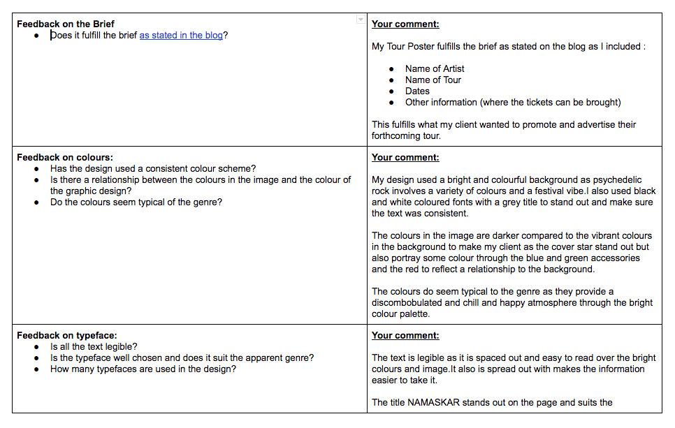
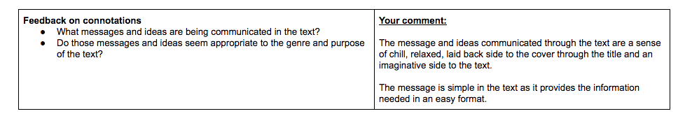
I was allocated a genre to research which was psychedelic rock. I found out that this included a great number of bright colours and a festival vibe. This is evident in my mood board with headbands, round glasses and tie-dye shirts. The man on my mood board stood very casually doing the peace sign gesture with a happy face, no makeup and slouched. This portrayed a cool and hipster vibe through the casual look which inferred that man was easy going and friendly with all the bright colours. Furthermore, the man seemed quite chilled and happy which fits the conventions of the commonalities of the genre as the different colours and symbols convey their love, peace, art and the different perceptions of the psychedelic culture.

Here is a picture of my model holding the connotations of a psychedelic rock person. They include: eccentric, energetic, natural and creative.

Click on the photo above to see more photos

Above you can see us models dressed in psychedelic rock. From our mood board, we learnt that we needed to wear lots of patterns and bold accessories, so we tried to recreate that. 

This made us look full of energy and creativity which our audience thought as you can see from post-it picture before. A member of the audience believed we also looked eccentric and I think this is because of the many bold accessories like the flower glasses but also the colours and patterns standing out from the normal and plain styles. By our glance and posture through acting, we can create the atmosphere through our facial expressions, for example, ours looks very friendly and chill bringing out the energetic festival vibes.

I have chosen this image because I feel like it portrays all the attributes in the category psychedelic rock, which includes: a chilled, creative, friendly, eccentric and energetic vibe. This is evident as my audience chose these words to describe us as actors. I also like this image because I think we look chilled and cool like the psychedelic rocker in my mood board clearly presenting the stereotype.

The audience feedback process and design decisions impact my future magazine as it gives an insight to the different types of music and the styles within through the makeup, props, posture and the atmosphere presented. This is done to clearly portray the content within by first glance of the cover. This task helped by seeing the different types of music and the advertising and textual analysis of each genre,

Print Media that Communicates Meaning

This task taught me how important every aspect is in media in creating the desired narrative, for example, the pale colours of her vest as a costume and natural makeup portraying an elegant and natural self glamour and worth. Furthermore, the cover provided a very fresh and friendly vibe to this uplifting cover. Moreover, the name of the album “sweetener” infers a femininity and youthful side to the album.

In this task, I analysed the mise-en-scene and thought of how these aspects added to the overall feeling of this individuals tour poster. This information will help me when creating my music magazine:

  • I know what needs to go on the tour poster, as using Blumler and Katz theory we can tell that this particular media has minimal text but is very eye-catching and easy on the eye.
  • I understand how the colours I use will convey a message and give off a specific vibe for the cover.
  • I understand about the effects of a model’s body language, costume and makeup.
  • I am able to choose a typeface that would suit the poster and convey the message I wanted to put across to the audience.

All of these aspects will make sure that my magazine is successful in portraying my ideas and that the artist has sales but also have an audience to perform to.