Posted on

Digipak – Feedback and targets

During our lesson we visited the Refectory and asked different students, media students and students that do not study the subject to evaluate what they like and what they did not like about our digipak. By asking these students it helped us to gain a wide variety of opinions. This has been really effective and now we know where we could improve.

Below is a link to a hand written document from the students:

screen-shot-2016-11-21-at-15-43-48

By doing this feedback it has really helped us to gain a better idea on what will work and what may not work so well on our digipak.

In general what did people like?

Overall the students liked how each cover of the digipak resembled and told a narrative between one and other, they also liked the idea of drawing onto of photographs and using our resources effectively because of living on a small island with plenty of beaches around us.

What did people not like so much?

No one really said they did not like our digipak as a whole which was really good and a massive confidence boost for our group! However if they were to choose something to change it would be the idea of the group sitting on the rocks because they believe it does not stick to the theme as well and could become quite bland compared to the other images.

Posted on

Digipak Photo mock- up

After creating our hand drawn version of our digipak we decided to create a more realistic version as shown below using existing images. This really helped to give us the idea on how our final product would look in a more realistic and true way.

screen-shot-2016-11-21-at-16-11-01

Our front cover:

For our front cover we have decided to create a wave within a triangle that will slightly over laps and escapes the triangle. The inner part of the triangle will be in colour and the outside to be in black and white as we really wanted to stick to the pale indie colour palette.

Inside left cover:

We decided to have a photograph of the band on the inside of the digipak because in general indie rock band leaflets include photographs of the band. To stick with our theme of water, we thought it would be nice to take photographs of the group on the beach sat and standing on the rocks.

Inside right cover:

Another illustration for this side, we have chosen to draw two catfish wrapping around each other to outline the circular shape CD. This idea actually came from my mood board, which shows creating mood boards was a really helpful way to come up with ideas. To create this side of the cover we will draw two catfish in white pen over a sea background.

Back cover:

For the back cover we really wanted to express the idea of quirkiness and how indie rock bands are unique and original. For this image we hope to photograph Sades’ half profile with fishing hooks hanging around his face and body. This is another idea from my moodboard, and I got this image from the photographer Kyle Thompson. Where he creates interesting, but strange photographs.

Posted on

Digipak mock-up

To begin our ideas for the digipak we created a hand drawn example displaying all of the sides of the album cover. To start our group really did not know what to include on our digipak however we liked the idea of including catfish on the right inside cover. We wanted all four sides to match each other in a particular way so, we created a mind map based on a water and sea theme due to fish living in water. Below is the mind map that we created:img_0571

After creating the mind map it really helped to grasp and come up with some ideas for our digipak. Below is our hand drawn digipak.

screen-shot-2016-11-21-at-15-43-36

Overall I am really happy with the outcome of our ideas because hey all flow, include illustrations and photoshop which are all conventions of a indie rock album cover.

Posted on

Digipak – Moodboard

Here is my personal mood board for an indie rock band album cover, this pdf suggests the colours, typeface, illustrations and photoshop work that is used to create a digipak. I added buzz words to emphasise the feelings, emotions and key themes shown with all covers from an indie band, words such as affectionate, unstable, unique, alternative and many more.

I noticed for almost all indie rock band album covers they include pale colours such as light greys, whites, light blues and pinks. This keeps the digipak simple, subtle and unique to other genres.

Indie rock band album covers are consistent with the heavy use of photoshop, illistrations to tell a narrative and strange and random props within the image, for example a hay bail and mirrors to create the idea of a body having no end. The band is rarely featured on the album front cover for indie rock digipaks.


screen-shot-2016-11-02-at-14-05-07

From this mood board I think that illustrations and photoshopped photos would work best for my genre. I like the idea of including a catfish in the digipak and a glass bottle resembling the idea of the band trapped in a world of their own. I also really like the idea of the hooks hanging around the model’s face because it connotes a strong hidden story, which could be he is trapped. I really like the idea of the triangle being black and white and involves into colour outside of the the 

I like the idea of more surreal photographs for the digipak because its different, strange yet oddly appealing to look at.

Below is the link to Chanel’s moodboard:

screen-shot-2016-11-21-at-08-49-25

Chanel’s mood board all represents a pale, black and white colour palette. I really like the colours she has used and they are also fairly similar to mine, as they are conventional of the indie rock genre. I am keen on the hand drawn illustrations especially the idea of drawing onto newspaper as it instantly gives a busy and interesting background. I like how she has incorporated images of band members as it will help us to take a photograph of our band.

Below is the link to Kris’ mood board:

screen-shot-2016-11-21-at-09-23-10

Kris’ mood board is extremely contrasting to mine and Chanel’s, through the use of vibrant contrasting colours. I do not believe the colours he has used are conventional to an indie rock band theme however the ideas using photoshop have worked well. I like the idea of the wrists having wires coming out of them, it gives a quirky and weird effect to the image.

Posted on

Digipak – Previous Students Work

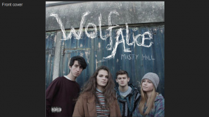
Below I have deconstructed a previous students digipak from last year, from the song ‘Bros’ by Wolf Alice. I decided to choose this piece as the genre is indie and henceforth similar to my genre of indie rock. I have also decided to look into this digipak because they reached a level 4, this meaning i am able to see what they did well and understand what to include to make a effective and highly marked digipak.

Below is a link to the mark scheme for the digipak:

screen-shot-2016-11-02-at-14-39-39

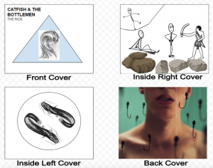
Here is the previous students work:
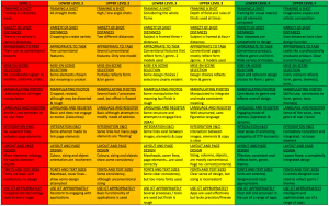
screen-shot-2016-11-14-at-17-29-30

Framing a Shot

I believe this digipak includes good framing especially with the band members on the front of the digipak almost looking down at the camera breaking the forth wall. However I think the overall composition is fairly basic and plain in an artistic point of view, this is because there is no exciting angles used and all images have been taken simple way with no parts of the image that automatically stand out from everything.

Shot Distances

All of the shots in this digipak are taken from the same distance all taken approximately at eye level. However for the genre of the album I feel there was no need to use different shot angles because the actual photographs are innovative and interesting through the use of paled down colours, and the sense of a older more vintage style.

Appropriate to Task

This digipak was definitely a professionally finished product due to each cover linking to one and other in a connecting way through the use of colours, rustic and urban effect.

Mise-en-scene Selection

A fantastic use of mise-en-scene, the band members look alternatively dressed, in pale colours which match each of the other covers of the digipak. You are able to see they have stuck with a certain colour scheme throughout the work which makes the digipak look really effective and fit into the genre of indie. Each side of the digipak includes a decayed theme with worn down walls, graffiti and broken window frames.

Manipulating Photos 

I like the slow shutter speed image of the sign post as it gives a skill full and innovative aspect to the digipak, with the only colour from that image popping out is the blue. You are able to see the theme of this band just through the use of digipak, they are of a indie genre, a group of friends and are alternative who stand out from the crowd. However indie band album covers normally include illustrations and photoshop rather than just photographs and they very rarely include the band on the front cover of the digipak.

Language and Register 

You are able to tell straight away the genre of the digipak because of the pale colours such as soft browns, blues and and whites used. You can see the tone of voice for the lead singer in the band due to the overall pale, calming and faded colours.

Integration

The overall digipak is well thought out and put together nicely, there is a nice broad mixture of images used yet they all flow and match each other in a way to make them link. There is no part shown on the digipak where there is random and unlinking aspects, this is good because the digipak works well together and almost tells a story or the band living a alternative lifestyle in a more urban run down area.

Layout and Page Design

A brilliant layout for a indie based digipak, all flowing and well edited to make all of the colours and locations work together. Each side of the digipak matches one and other and there is no missing or random parts to it.

Fonts and Texts Sizes

I am personally not so keen on the hand drawn title due to the rest of the digipak being made using photography, however illustrations is a key feature in indie digipak conventions. I like the bright white colours of the title as it stands out and gives a bold effect so the audiences’ eyes will focus directly onto the album cover. The font of the title works well with the genre as it is rustic and almost looks like graffiti as shown on one of the digipak covers. This links the digipak together as a whole. I believe the name of the album should stand out more as it almost blends in with the background.

Use ICT Appropriately 

The overall look of the digipak is professional and you are able to see the group have used photoshop to their advantage but in a rather basic way, by dulling down the colours and applying the title to the front cover of the album. However the use of photoshop was done well as the colourings are effective and it has helped the digipak come to life and become a clear indie band album.

Posted on

Digipak – Conventions Analysis

Digipaks are a key element to selling a album for a particular genre, this is because it is the first thing the customer looks at before buying their CD from the shop. Digipaks are designed to promote and support the release of a new album being released.

As I started researching indie rock band album covers I noticed that they are conventionally photoshopped images and illustrations to tell a meaningful narrative in a subtle way. The colours used are normally pale and subtle with a strong contrasting colour to bring the album to life.

It is conventional for a digipak in all genres to include a barcode, song list and publishing copyright on the back of the album cover, with the name of the band or artist along the spine of the case.

Digipaks include a front cover, inside covers, back cover and a spine. Each of these are used for different reasons for example:

*The front cover to catch the eye of the possible buyer,

*Inside covers, to have the lyrics of each song and band/artist information on the left of the inside cover including photographs of them too. This is normally a leaflet for the customer to open and read.

*Back covers are used to show the songs included in the album, barcode and publishing copyright.

*The spine, allows to the name of the band or artist and album name down the spine allows easy access to the album when placed on a bookshelf for example.


To begin our research and development on the digipak, we all individually went along and looked into a similar artist to our chosen music video artist. I decided to research Biffy Clyro’s album, Only Revolutions.

This helped us to understand the typical conventions and overall look of a album cover in our genre, ‘indie rock’.

I looked into the mise-en-scene how it includes strange, random props such as the flags flying and the fire in the background, the genre being clear straight from the first glance of the front cover. The font and lettering of the album cover connoting the floating flags in the air (The name of album and band above the flag in the sky). Representations are also clear in this album cover as you can see that it is interesting, innovative and original.

The below link explains in detail my findings the ways in which I have deconstructed the cover.

screen-shot-2016-10-31-at-11-25-37