Please click on the image to see the clearer PDF
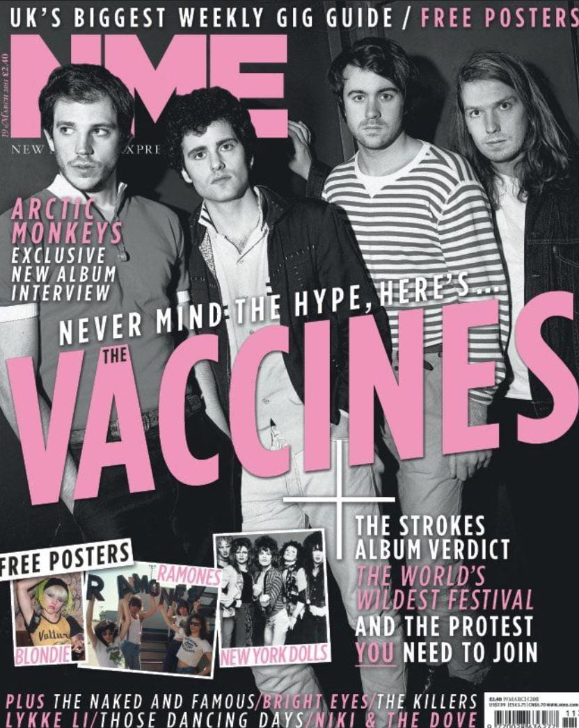
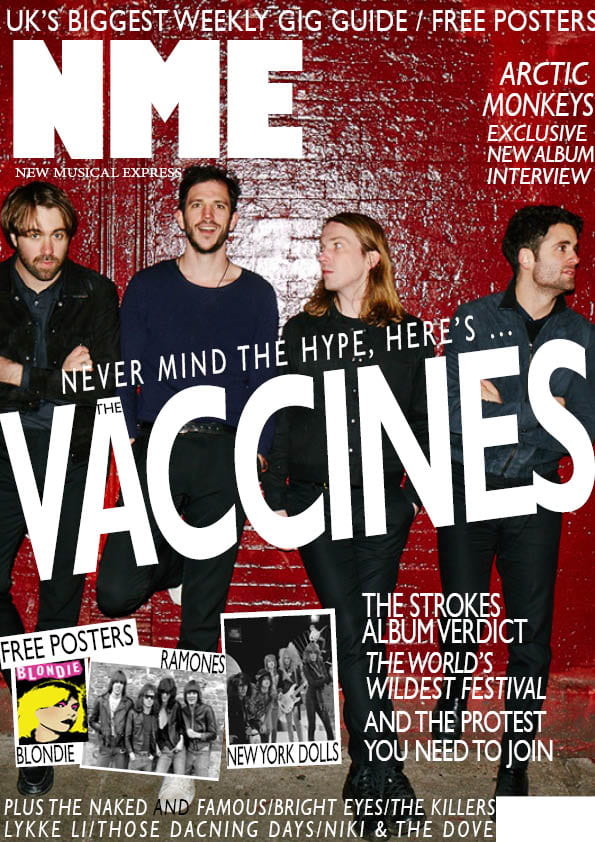
The two pieces shown above are the original magazine cover, then my mock up of the same magazine cover. As I couldn’t find the original image I had to find my own image to use, which meant changing the colors of the original text, and moving some of it around, for example the Arctic Monkeys cover line had to be moved so it didn’t obstruct a band members face. This task has helped me learn the basics of InDesign, as now I have a basic understanding of how I can create a piece of media, this will greatly benefit me when I am creating my tour poster.The task has also helped me reinforce my understanding of magazine layouts, like mastheads, cover lines etc.Below this you can see the strength and weaknesses of my mock up and its design process
Strengths
- The general placement of everything was sound, only 1 of the text boxes had to be moved at the end
- I think I did the main cover line quite well, all of the angles used are consistent and look good
- I created the posters found in the bottom right well, using several layers for them.
Weaknesses
- The Main cover photo is slightly lower in resolution, if I spent more time finding an image, I could have found a much more high quality one
- The Fonts are different compared to the original, as the original fonts are much more thicker and bolder
- Placement of the fonts could have been slightly tweaked, for example, on the plug at the top, the S is slightly cut off, this could have been easily fixed.
I have found some YouTube videos that I will watch prior to making the tour poster next week.