Here is our second print production draft. We have made improvements based on our peer’s feedback. I’m really happy with how it all looks, and I think we’ve stuck to conventions well. Researching and analysis professional work has been useful in understanding the folk genre fully, and it’s conventions.
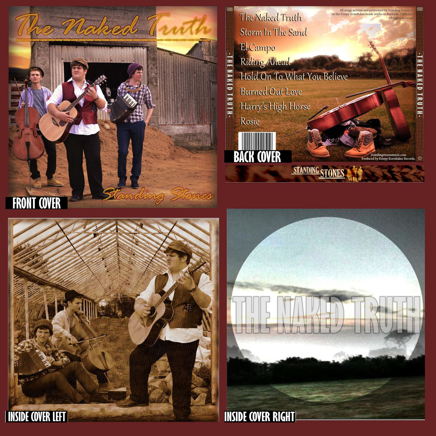
DIGI-PACK
Front:
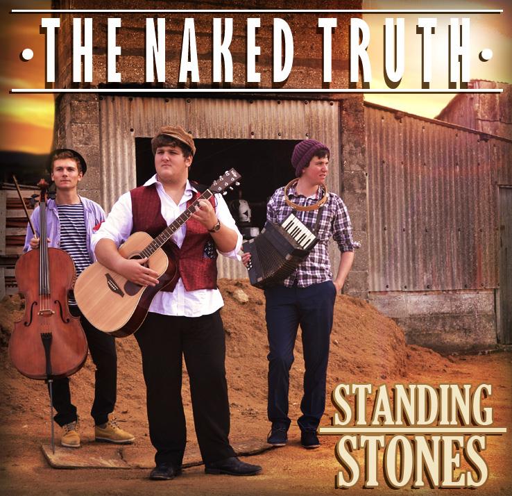
Here we have changed the text to a simpler,
easier to read font, and also created some
additional decoration.
Back:
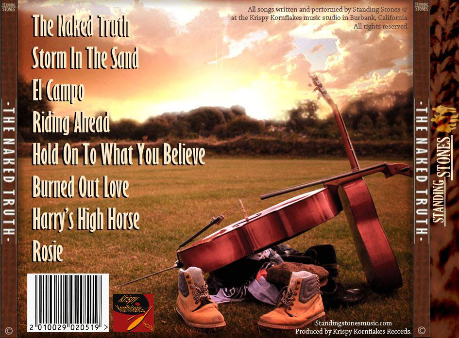
We changed the text on the back, as our first
feedback revealed it wasn’t popular. Also we
added our record company logo.
Inside Left:
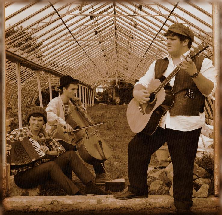
Here we increased some of the features like the
fabric and the colour, to make it stand out more.
Inside right:
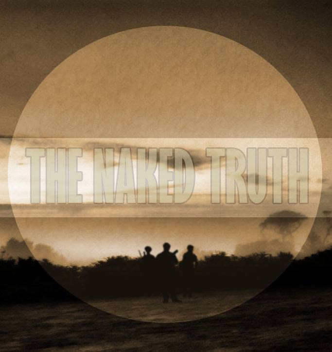
Finally, here we added in silhouettes of our band,
aswell as changing the colour to a monochrome
brown to match the inside left cover.
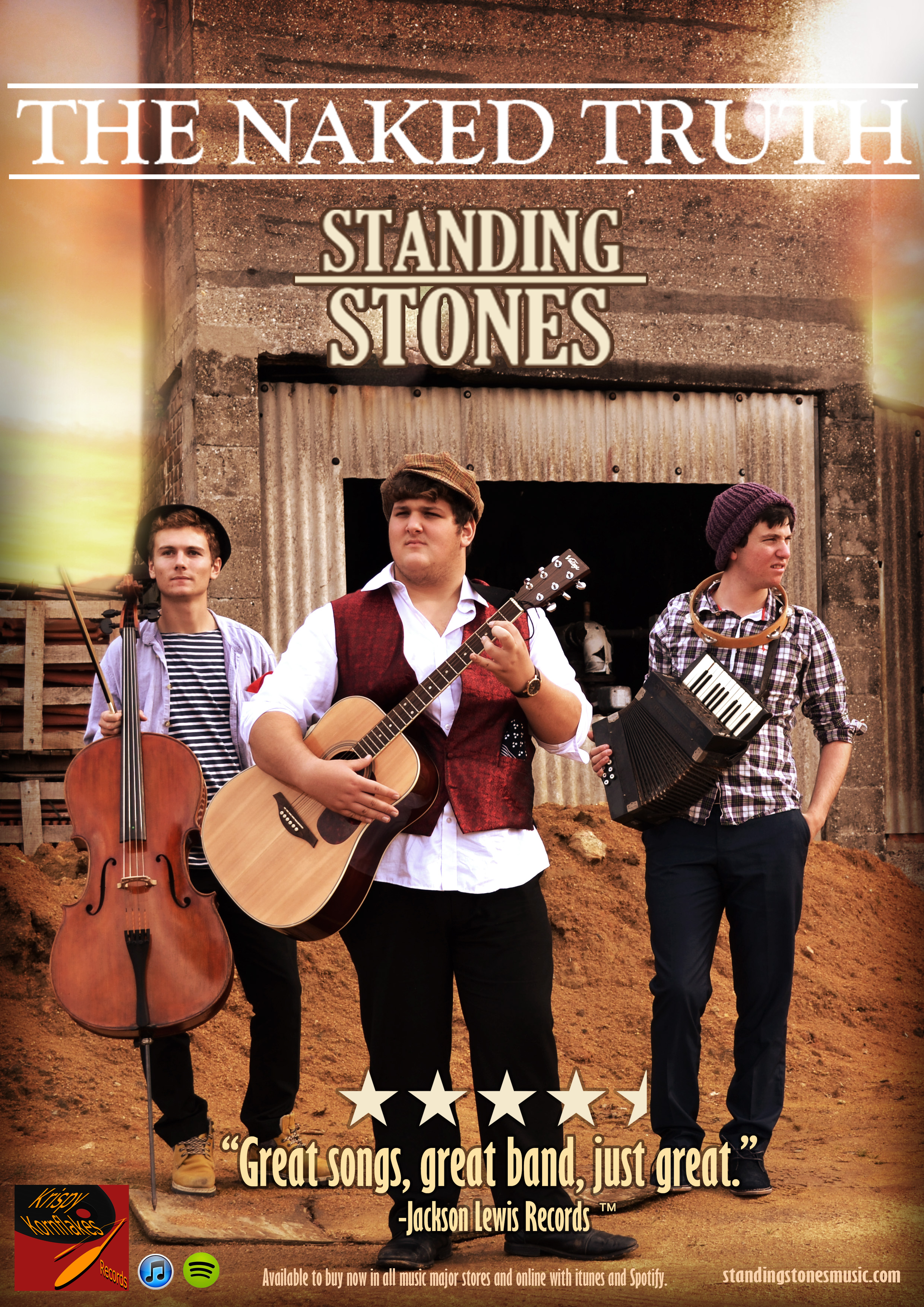
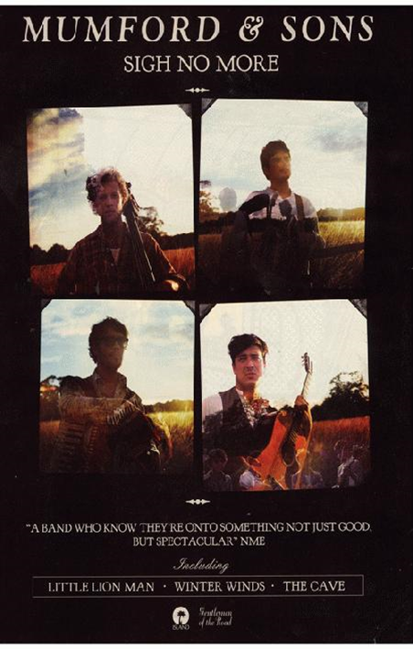
ADVERT:
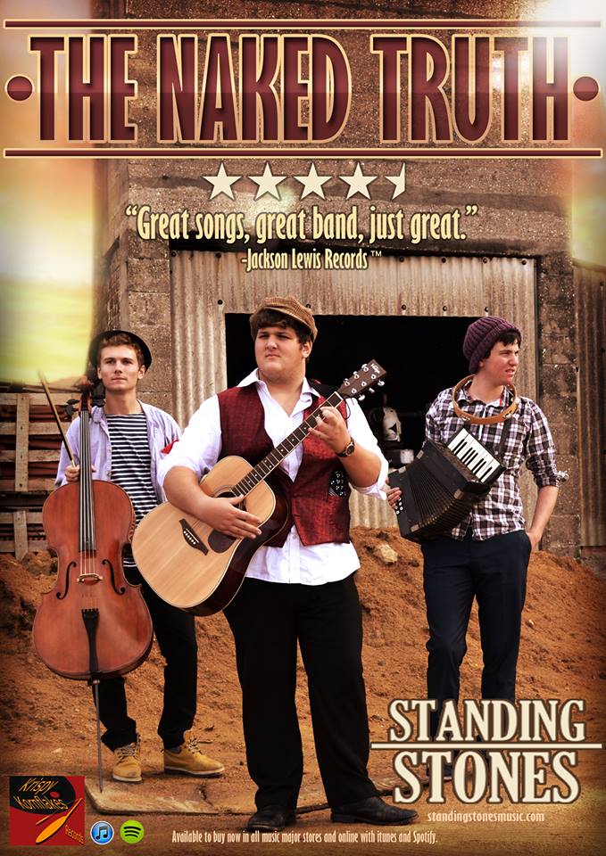
Here, we have changed the title text to a more intense font, with brighter colours.
Also, we moved the band’s logo down to the bottom right, and put the star review beneath the title, for a more conventional poster look. This looks alot better than our first draft, and comes across more professional and eye-peeling.
FEEDBACK:
Here is a short video featuring our peer’s feedback on our Print production draft 2.