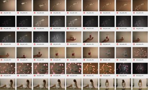
After having done the photo shoot for our digipack, we have created our first draft. We have created really contrived images through using Photoshop to distort and arrange them. I feel as though we need to take more time to edit them because they seem a little dull and not visually engaging.
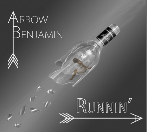
Front Cover
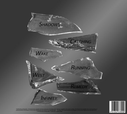
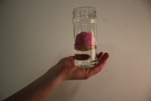
Back Cover
Inlay Left

Inlay Right