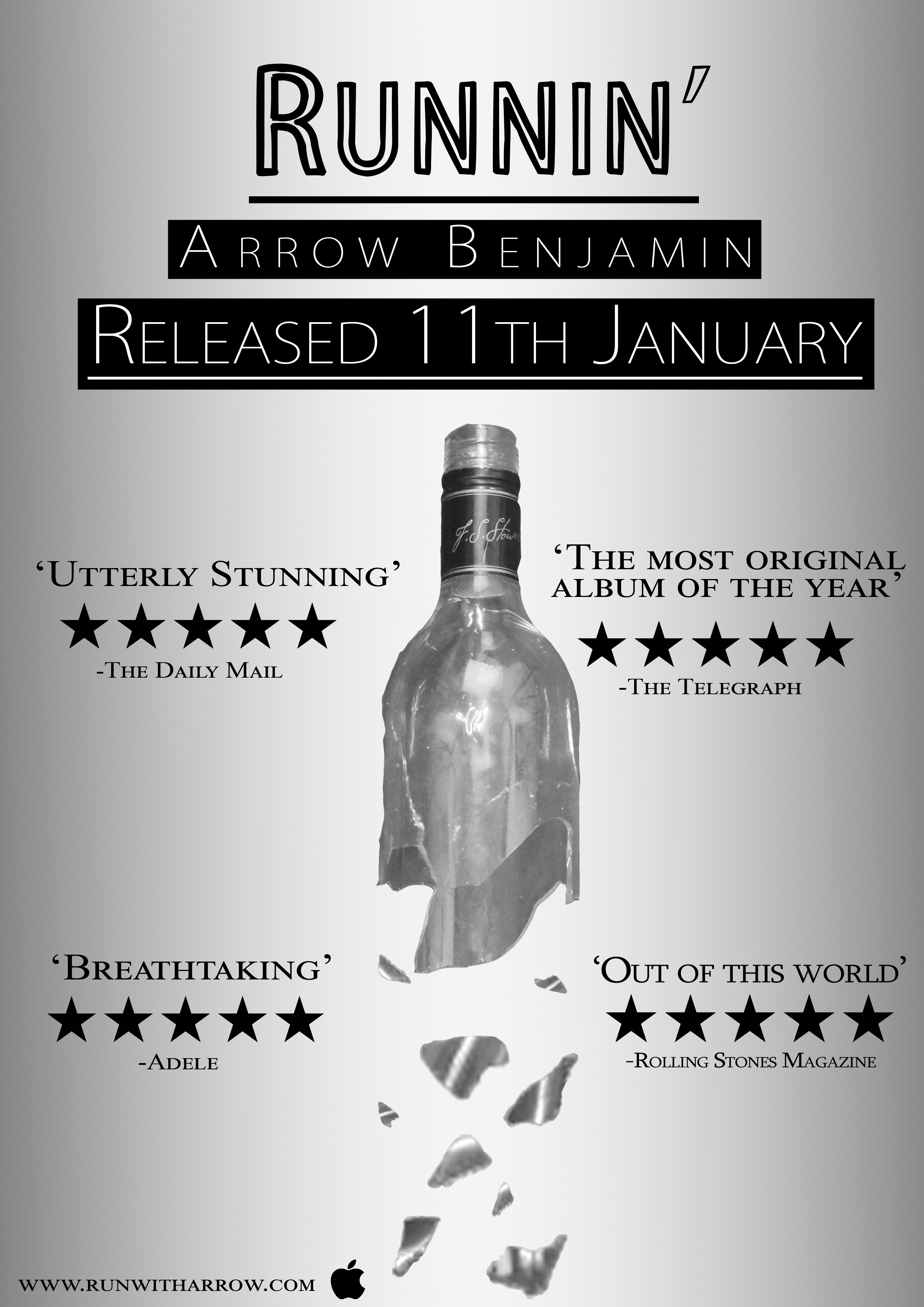
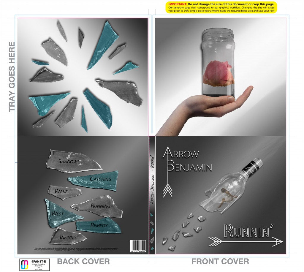
After having carefully considered the feedback we have received, we added more colour to our digipack and advert. The blues make it much more interesting and engaging as well as the drop shadows and highlighting we added. Below are our final print production products.
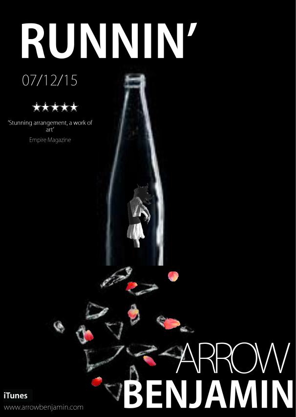
Advert
Digipack