After having carefully considered the feedback we have received, we added more colour to our digipack and advert. The blues make it much more interesting and engaging as well as the drop shadows and highlighting we added. Below are our final print production products.
Production
Advert Draft 1 Feedback
We asked one of our peers to look at our first draft of our advert and give us some feedback which you can watch below.
She gave us some targets which include:
- Make the background gradient darker to match the digipack and the ideology.
- Add a drop shadow to the bottle and smashed pieces of glass to make it stand out from the background.
- Perhaps add some colour to add visual interest, we were think perhaps overlaying some blue on the bottle to make the blue glass on the digipack.
Advert – Draft 1
We have produced our first draft of our advert which you can see below. We are pleased with the geometric elements behind the text, I think this adds visual interest and works with thematic ideas within our music video, of the Chinese philosophy with Yin and Yang, the blacks and whites being very complementary together.
Digi-Pack Feedback
We asked our teacher, Mr Gregson, to give us some feedback on our Digi-pack which was very useful to get some ideas for improvement. Below you can listen to the feedback he gives;
From this we aim to improve our Digi-pack by;
- Perhaps changing the font on the title of the album, ‘Runnin”, as he believes it doesn’t come across as bold and significant as it should.
- On the back cover the track-list doesn’t stand out very much, and he was thinking that it would look better if we used a thicker stroke and maybe coloured it differently.
- He also commented on the backgrounds, the gradient on the front cover seems a little too dark. However, this was something we did purposefully, as the dark outside covers juxtapose the light inside covers, and works with the yin and yang ideologies we created within the music video.
- He also suggested colouring the girls dress pink, to match pink flower in the jar, which is something we will consider.
Digipack Draft 1
After having done the photo shoot for our digipack, we have created our first draft. We have created really contrived images through using Photoshop to distort and arrange them. I feel as though we need to take more time to edit them because they seem a little dull and not visually engaging.
Digi-Pack Shoot Evlauation
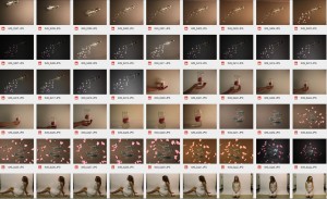
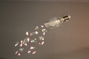
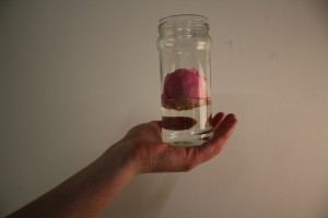
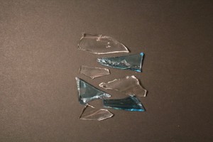
After having taken our digipack shoot, we found that we were a little bit disappointed with some of our photos. We really struggled with the lighting in the studio to get, and with reflections in the glass. It was difficult with the black background as the lighting made it appear grey, and evidently we were looking for black, but this can be corrected in post production. We used a variety of settings when taking the photographs, changing the aperture and ISO, and we found that we had some shots we thought could work well once we edit them in Photoshop which you can see below:
There were some shots that didn’t work very well because they were out of focus and the lighting was poor, which you can see below:
Digi-Pack Contact Sheet
After having taken our photos for the digi-pack, we uploaded them to the computer. You can see below the contact sheet with all the images we took. We used a range of different setting with both the lighting equipment and on the camera, changing the aperture and ISO to get a range of images which we could chose from accordingly.
Having looked at these images, we plan to use the ones shown below. We’re quite happy with the images we have, although we did have some trouble with the lighting. However this is something we can adjust when we edit the images in Photoshop. We plan to use the glass from the back cover to construct the inlay right cover, editing it so it spirals around the center.
Editing
To create our music video we used the editing software Premiere Pro, which helped us to produce the video we envisaged. Below you can see some of the editing techniques I have edited in post production.
Draft 1 – Feedback
We asked our teacher to watch music video so far and give us some feedback on how we could improve it. Below you can watch the feedback.
The main targets include:
- In the performance shots we could add some movement within the frame, the static camera doesn’t give it quite enough energy. We could do this within post production quite easily, just adding a slight dolly-look effect.
- In the shots which overlap each other, we could feather the edges of the shots, they seem a bit too harsh.
- Colour correction within the narrative, to give it a warmer look, would look good.
Our own additional targets include:
- Perhaps re-film the females performance to get more enthusiastic, realistic shots. We also think if we do re-film this then we should change what our performer wears, perhaps a white shirt and have her hair down.
- Add titles to the beginning of the video.
Draft 1
From the feedback we were given by our peers, we have continued to edit our music video making some of the changes they suggested. We are really pleased with how our video is looking, however we are thinking about re-filming the female performance as she isn’t quite as enthusiastic as we would like. Below you can watch our first draft.