Please click on the image to see a clearer pdf
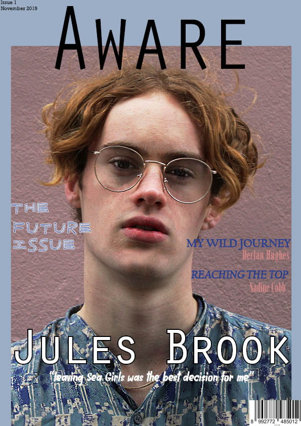
I definitely prefer this cover to my previous one as the image better fits the mise en scene. I think that it fits with the indie genre as the colour palette is pastel and the fonts give a carefree and nostalgic vibe. To improve my front cover the changes I made were:
- Changed my cover star photo
- Changed the font for the cover lines
- Got rid of the pug
- Changed the background colour
- Added cover lines
Even though this is a big improvement their are still things that I want to do to improve it. These include:
- Changing the positioning and size of the issue number and date
- Moving “the future issue” either at the top of the front page or in from the edge
- Change some fonts so that they fit together collectively
- Add something to the masthead to make it stand out more
These changes will hopefully make my target audience have a preferred reading to my front cover and will make them want to pick up my magazine.