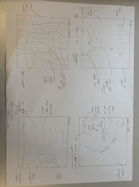
Planning what we want our digipak to look like before stepping into the studio is paramount so that we already now what kind of look and vibe we are going for. Below is our hand drawn mock up and colour palette which we will take into our shoot.
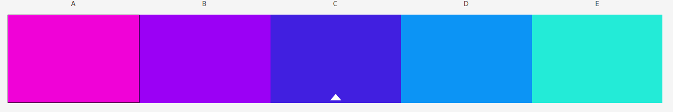
Within this we we made sure we included any technical conventions for example a title and a barcode as well as genre conventions of the electropop genre. These include a neon colour palette of colours shown below, graphics and a bold typeface.
This is important as if we encode the correct information for our target audience, they will have preferred reading making our digipak a success. This includes encoding the edgy and quirky side of the star and brand image.