Below is our second draft of our digipak.


From draft 1 we have made many changes to our digipak to reach this point, these include:
- Changing the moon on the inside right pane to an eclipse that we made in photoshop to fit more with the album name
- Added a border around our photo rather than having the pink glow as it looked messy
- Changed our inside left image to some soundwaves in conventionally electropop colours
- Added in spines and moved our track list to one side rather than having our star in the middle
Below is the video we used to help us to make the eclipse for our inside right pane.
Teacher feedback:
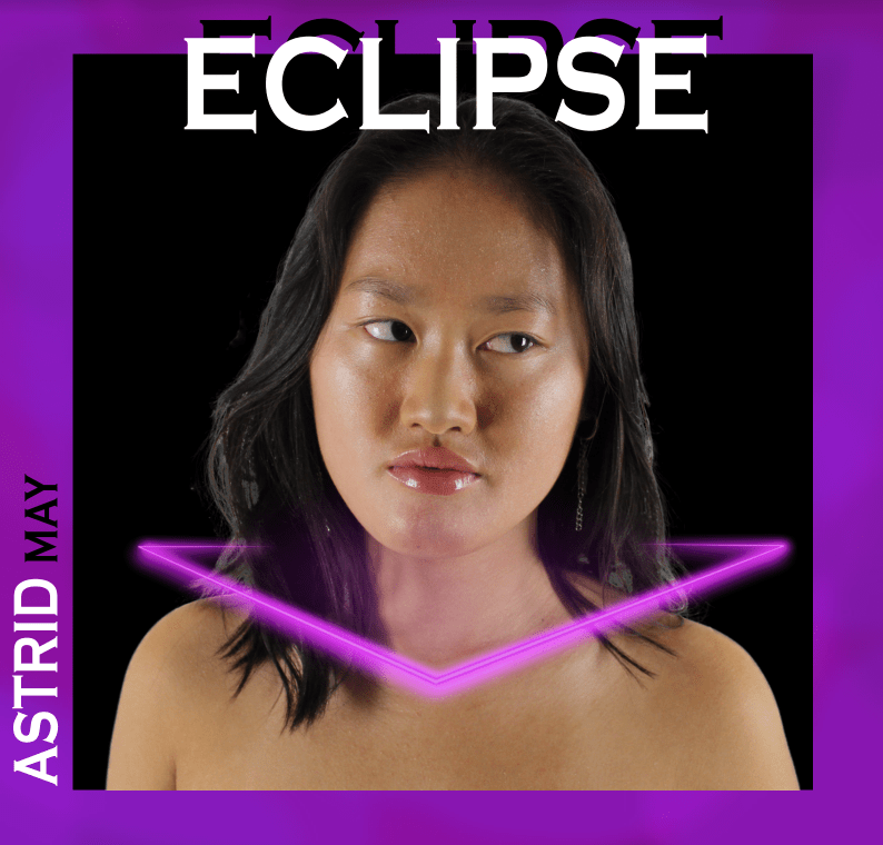
After we completed our draft 2, our teacher recorded a screencastify commenting on our digipak. There were many positives to take from it, for example she liked the neon collar and the artist name going up the side on the front pane, but of course there were improvements. Her main improvement was to add more details to create interest and perspectives but specific targets have been detailed below:
- Photoshop the front image more for example brightening her eyes and darkening her eyebrows
- Add something to the background so that it is not completely black
- Play around with and move the digipak title so that it is off centre
- Bring another neon colour in as it is very samey with the pink and purple
- Add a neon line similar to that on the inside right to the front pane to add interest
- On the back pane, make the picture of our star bigger
- Add another colour into the back pane e.g on the first letter on each track name
- Add the name of the album onto the spine
- Make inside right wider to fit in the cd cover frame