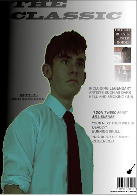
This is my first draft of my music magazine first page.I asked my friend what he thought and these are the points he told me to think about:
- Create a more professional looking background as it is quite basic and bland looking.
- Some of the photos and information are too block like and I need to make them blend in with the page better.
- Make sure the text is readable as some of the fonts and size of text makes some thing harder to read.
- The image outline isn’t the best and probably will need changing to look more professional.
What I definitely want to change is the main image colour and background. I also want to change how the smaller images fit into the page and make them look less block like. Finally another thing I want to change is the background so all text is clear and it works well with the image.